
List
This post is referring to Vahana 2 (beta version). To check the document for production, please go to vDesigner-v1.0
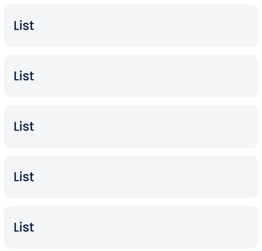
This list displays the items vertically by default. You can also configure the vertical list to display the list items in specific order or priority.
Usage
| When to use | When not to use |
| In the application, use the vertical list to display the list of products, exclusive items, states of country, etc. | Do not use the ?Vertical List? component when you want to display the long list of items. |
List Configuration
The “List” element consists of the following property:
- UI Configuration
UI Configuration
For the “List” element/component, you can configure the following UI properties:
| Tab | Property Name | Description | Mandatory | New Default Value | Visibility Rule |
| Basic | Reference Name | Specifies a unique name of the element. At the application level, an element is identified and managed by the reference name. | Yes | List View1 | |
| Basic | Input Source | This property allows you to configure the source location from where the data is displayed in the list. It provides two options as follows: 1). Data Source:- If you select this value, the Input Value box appears. In the Input Value box, you can define the JSON-based location. The list displays the data from the configured JSON path of the element store or entity store. 2). Enumeration:- If you select this value, the Select Master list appears. In the Select Master list, select the enumeration (list of values) from where the application will display the data in the list. 3). Static:- If you select this value, the Input Value box appears. In the Input Value box, enter the static value that you want to display in the list. | Yes | List View | |
| Basic | Input Value (With application tree ( )) )) | In this box: –> Click the application tree icon ( ), and then select the entity store or element store. –> In the entity store or element store, select a JSON path, and then the application will display the data in the list from the selected JSON path. | Yes | List View | If Input Source = Data Source |
| Basic | Input Value (Without application tree) | In this box, enter the static value that you want to display in the component. | Yes | If Input Source = Static | |
| Basic-Axis | Horizontal | If you click this tab, the application displays the list items aligned horizontally. | |||
| Basic-Axis | Vertical | If you click this tab, the application displays the list items aligned vertically. | |||
| Basic | Allow Scroll | This property allows you to configure the usage of the scroll bar as follows: Yes: – Select this option to allow the user to scroll through the list items. No: – Select this option to not allow the user to use the scroll bar. | No | Selected | |
| Basic | Scroll Bar | This property allows you to configure the availability of the scroll bar as follows: Yes: – Select this option to make the scroll bar available along with the list items for the user. No: – Select this option to make the scroll bar unavailable in the list. | No | Selected | |
| Basic | Separator | This property allows you to configure the availability of the separator. The separator is a line that separates the appearance of two adjacent list items in the list. To configure the separator, select any of the following options: Yes: – Select this option to make the separator available with the list. No: – Select this option to make the separator unavailable for the list. | No | ||
| Apply Filter | When you click this check box, a Business Rule drop down list comes into view. You can use this property to apply a business rule to display items in the list. | No | Clear Check box | ||
| Business Rule | Click this list to select the business rule. After you select the business rule, the app displays items in the list based on the condition defined in the business rule. | Yes | When Apply Filter check box is selected | ||
| Sorting | This property allows you to display the list items in ascending or descending order. Click this list to select one of the following values: 1. Sort Ascending Select this value to display list items in ascending order. 2. Sort Descending Select this value to display list items in descending order. | No | Sort Ascending | ||
| Basic | Highlight Selected | This property allows you to configure highlight effect for the selected list item as follows: Yes: – Select this option to impart the highlight effect when the user selects the list item. No: – Select this option to not impart the highlight effect when the user selects the list item. | No | Selected | |
| UI Properties | Styles | Allows you to select a specific style for the element from the list of pre-defined styles. The vDesigner module offers pre-defined styles that you can apply to the element | No | ||
| UI Properties-Background | Background Color | Click the Color box and then select a color to define the background color of the tile. | No | #161616 | |
| UI Properties-Background | Opacity | Opacity is the degree to which content behind an element is hidden, and is the opposite of transparency. While configuring the color, you can also configure the opacity in the percentage unit. | No | 100 | |
| UI Properties-Background | Elevation | This property allows you to configure the elevation of the background. The elevation is measured as the relative distance between two surfaces along the Z-axis. | |||
| UI Properties-Alignment and Spacing | Margin | Allows you to desirably define margin around each side of the component. It provides four different boxes to define the margin outside the right, left, top, and bottom border of the component. | No | Null | |
| UI Properties-Alignment and Spacing | Element’s Alignment | This property contains three tabs. You can use these tabs as follows: 1. Left:- By default, this tab is selected. It aligns the element to the left of the page. 2. Center:- If you select this tab, it aligns the element at the center of the page. 3. Right:- If you select this tab, it aligns the element to the right of the page. | No | Left | |
| UI Properties-Alignment and Spacing | Container Internal Alignment | This property offers the following alignment options to align an element in a container element. 1. First List:- It provides the following alignment options: a. Left b. Center c. Right 2. Second List:- It provides the following alignment options: a. Top b. Middle c. Bottom d. Space Around e. Space Between f. Space Evenly | No | Left, Top | |
| UI Properties-Shape and Decoration | Type | Under the Shape and Decoration section, this property has the two following options: Autofill:- If you select this option, the element will occupy the available space of the parent layout. Manual:-If you select this option, you can define a specific size of the element. | |||
| UI Properties-Shape and Decoration | Width Value | Allows you to define the width of the element. Enter the width of the element in the pixel unit or percentage unit. | No | Blank | |
| UI Properties-Shape and Decoration | Height Value | Allows you to define the height of the element. Enter the height of the element in the pixel unit. | No | Blank | |
| UI Properties-Shape and Decoration | X | Allows you to move the element along the X-axis; when the value increases, the element moves from left to right. | No | Current position along the x-axis | |
| UI Properties-Shape and Decoration | Y | Allows you to move the element along the Y-axis; when the value increases, the element moves from top to bottom. | No | Current position along the x-axis | |
| UI Properties-Shape and Decoration | Select Color | This property allows you to configure the color of a selected element. The selected element means that the end-user has selected the element. To configure the Select Color properties, see the Border Color property. | |||
| UI Properties-Shape and Decoration | Opacity | Opacity is the degree to which content behind an element is hidden, and is the opposite of transparency. While configuring the color, you can also configure the opacity in the percentage unit. | No | 100 |
Was this article helpful?
YesNo