
Grid List
This post is referring to Vahana 2 (beta version). To check the document for production, please go to vDesigner-v1.0
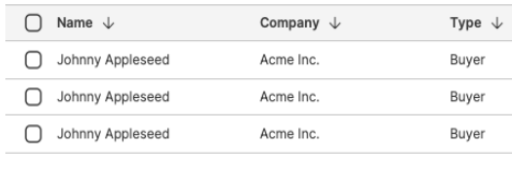
The “Grid List” is used to display large amount of tabular data. It is a better choice over tables if you want to display the data from multiple columns. The data grid displays the data uniformly if the schemas and sorting are important for comparison.
Usage
| When to use |
| Provide a data grid in the banking and other enterprise level apps where the user needs to collate the variety of data and browse reports frequently. |
Grid List Configuration
The “Grid List” element consists of the following property:
- UI Configuration
UI Configuration
On the “Grid List” element, you can configure the following UI properties:
| Tab | Property Name | Description | Mandatory | New Default Value | Visibility Rule |
| Basic | Reference Name | Specifies a unique name of the element. At the application level, an element is identified and managed by the reference name. | Yes | List View1 | |
| Basic | Count in Row | Allows you to configure the maximum number of items that a row can have in the grid list. | No | 2 | |
| Basic | Item Height | Allows you to define the permissible height of the item in the grid. | No | 200 | |
| Basic | Input Source | This property allows you to configure the source location for the following purposes: –> Fetch data from the source and the display it on the element. You can click one of the following tabs to configure the input source: 1) Data Store:- If you select this tab, the Input Value box appears. In the Input Value box, select an entity based array type JSON object. After you select an array type JSON object, the application will access the object and then perform one of the following functions: –> Fetches data from the object and displays it in the element 2). Static:- If you select this value, the Input Value box appears. In the Input Value box, enter the static value that you want to display in the list. | Yes | List View | |
| Apply Filter | When you click this check box, a Business Rule drop down list comes into view. You can use this property to apply a business rule to display items in the list. | No | Clear Check box | ||
| Business Rule | Click this list to select the business rule. After you select the business rule, the app displays items in the list based on the condition defined in the business rule. | Yes | When Apply Filter check box is selected | ||
| Sorting | This property allows you to display the list items in ascending or descending order. Click this list to select one of the following values: 1. Sort Ascending Select this value to display list items in ascending order. 2. Sort Descending Select this value to display list items in descending order. | No | Sort Ascending | ||
| Basic | Input Value | Click in this box and then select an array type object. After you select the object, the application will perform one of the following functions: –> Fetch data from the object and then display it in the element. | Yes | If Input Source = Static | |
| UI Properties | Styles | Allows you to select a specific style for the element from the list of pre-defined styles. The vDesigner module offers pre-defined styles that you can apply to the element | No | ||
| UI Properties-Background | Background Color | Click the Color box and then select a color to define the background color of the tile. | No | #161616 | |
| UI Properties-Background | Opacity | Opacity is the degree to which content behind an element is hidden, and is the opposite of transparency. While configuring the color, you can also configure the opacity in the percentage unit. | No | 100 | |
| UI Properties-Background | Elevation | This property allows you to configure the elevation of the background. The elevation is measured as the relative distance between two surfaces along the Z-axis. | |||
| UI Properties-Alignment and Spacing | Margin | Allows you to desirably define margin around each side of the component. It provides four different boxes to define the margin outside the right, left, top, and bottom border of the component. | No | Null | |
| UI Properties-Alignment and Spacing | Element’s Alignment | This property contains three tabs. You can use these tabs as follows: 1. Left:- By default, this tab is selected. It aligns the element to the left of the page. 2. Center:- If you select this tab, it aligns the element at the center of the page. 3. Right:- If you select this tab, it aligns the element to the right of the page. | No | Left | |
| UI Properties-Alignment and Spacing | Horizontal Spacing | Allows you to configure the distance between the item and the grid’s right and left edges. | No | 10 | |
| UI Properties-Alignment and Spacing | Vertical Spacing | Allows you to configure the distance between the item and the grid’s top and bottom edges. | No | 10 | |
| UI Properties-Shape and Decoration | Type | Under the Shape and Decoration section, this property has the two following options: Autofill:- If you select this option, the element will occupy the available space of the parent layout. Manual:- If you select this option, you can define a specific size of the element. | |||
| UI Properties-Shape and Decoration | Width Value | Allows you to define the width of the element. Enter the width of the element in the pixel unit or percentage unit. | No | Blank | |
| UI Properties-Shape and Decoration | Height Value | Allows you to define the height of the element. Enter the height of the element in the pixel unit. | No | Blank | |
| UI Properties-Shape and Decoration | X | Allows you to move the element along the X-axis; when the value increases, the element moves from left to right. | No | Current position along the x-axis | |
| UI Properties-Shape and Decoration | Y | Allows you to move the element along the Y-axis; when the value increases, the element moves from top to bottom. | No | Current position along the x-axis |
Was this article helpful?
YesNo