
An Introduction to Themes
In the Vahana cloud, the “Theme” is an advanced module. You can access it by clicking the VDLC icon in the top panel of the Vahana cloud portal. It allows you to design a visual pattern or a collection of visual patterns. These visual patterns impart a distinct look and feel to the application pages and UI (user interface) items in the page layout. Designing software applications with organized themes not only makes the application aesthetically interactive and beautiful but also increases its commercial viability in the marketplace.
When you access the Theme module, you find the following submodules or sections:
| Sub Modules | Description |
| Color | It provides multiple in-built color categories. In these color categories, you can use a color configurator to define a color and the color tone under the selected color. Apart from predefined categories, you can create a custom category with a desired color and color tone. You can use the color category to impart the background color to layouts and elements. |
| Typography | It also has multiple predefined categories of typography styles. A category of typography includes the style name, font family, italic, size, line height, line spacing, and font weight. You can also edit the default configuration of a predefined typography. While editing a typography, you can change the font family, the font’s size and weight, and others. You can apply typography to the label or title of the element. |
| Styles | It provides an inbuilt template of style. This predefined template is referred to as Default. Apart from the Default style, you can create a new custom style by using the following: a. Predefined colors of the predefined category b. Custom colors of the predefined color category c. Custom colors of the custom color category |
Accessing Theme Module
You can access the Theme module by using the VDLC icon. After you access the Theme module, the Vahana cloud portal displays the Themes page. The Themes page displays a record of the default theme, which is named Vahana Theme. On the Themes page, you can do one of the following:
- Use the default theme with default color settings, typography, and styles
- Use the default theme with custom color settings, typography, and styles
- Use a custom theme with custom color category and settings, custom typography, and styles
To access the Theme module:
- On the Vahana cloud portal’s dashboard, see the top panel.
- In the top panel, see the VDLC icon (
 ) to the right of the workspace name.
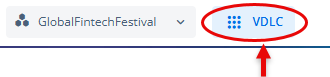
- Click the VDLC icon and then go to Design & Architecture>Themes.
- Under Design & Architecture, click Themes to display the Themes page.
Creating a New Theme
To meet the design-centric requirements of a software application, such as color patterns, typography, and overall look and feel, you can do one of the following activities on the Themes page (dashboard).
- Use the default theme and then
- Change the color code and tone in the predefined color categories
- Edit the configurations of predefined typography
- Edit the properties of the default style or create a new style
- Create a new theme and then define
- Custom color category with different colors and color tones (shades)
- Custom typography and,
- Custom style for page layout and elements
If the product design is supposed to undergo broad-level design-centric changes, you are recommended to create a new theme to meet the design-related requirements. It helps you to change you custom theme based feedback and product-related requirements.
To create a new theme:
- On the Themes page, click Create Theme to display the Create Theme dialog box.
- In the Create Theme dialog box, enter the following details of the new theme:
- Name of theme
- Tag (tag is a random value that is used as a name identifier for a theme)
- A brief description of theme
- After you enter details of a new theme, click Next to display a message box with the message, “Do you want to quickly set up theme?”
- In the message box, click one of the following:
- No, Thanks:- If you click No, Thanks, you cannot use the predefined color categories, typography, and styles to design a new theme.
- Setup:- If you click Setup, you can use the predefined color categories, typography, and styles to design a new theme.
Note:- Assume you click Setup to create a new theme.
- Click Setup to display the Quick Theme Setup dialog box.
- The Quick Theme Setup dialog box displays different color categories, such as Primary, Neutral, Red, Green, and others.
In the color category, you can define a color as follows:
Selecting a New Color and Typography
In the Quick Theme Setup dialog box, you can define a custom color in the predefined category as follows:
To define a new color:
- In a predefined category (for example, Primary), click the selected box to open the color configurator.
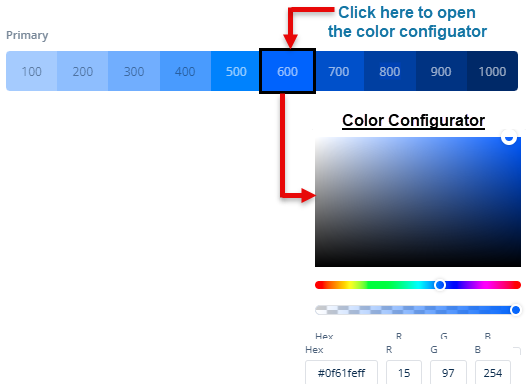
- In the color configurator, you can define a new color as follows:
- On the canvas, move the circle to define the color tone of the selected color
- On the upper bar (
 ), move the circle to select the color (for example, light blue).
 - On the lower bar (
 ), move the circle to define the transparency of the selected color.
Note:- When you move the circle on the color canvas, upper bar, or lower bar, the color configurator box dynamically displays the changeable hexadecimal values and RGB codes of colors. You can also use the hexadecimal value or RGB codes of the selected color in other themes.
- After you select a color in the predefined category, click Next to display the Primary Font Family box.
- Click the Primary Font Family box to select the font (for example, Aleo) that you want to use in the theme.
- After you select the color and primary font of a new theme, click Save to create a new theme.
After you click Save in the Quick Theme Setup dialog box, the Themes module displays the Colors dashboard. You can also access the Colors dashboard by clicking the Colors menu in the left panel on the Themes page.