
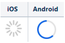
Radial Progress Bar
This post is referring to Vahana 2 (beta version). To check the document for production, please go to vDesigner-v1.0
The “Radial Progress Bar” element displays the activity’s status as an incremental Radial visual presentation.
Usage
| When to use |
| i. Always use it if the application has to display a huge amount of data. ii. Using a progress bar keeps users patient if the application takes the time to complete the job. |
Radial Progress Bar Configuration
On the “Radial Progress Bar” element, you can perform the following configuration:
- UI Configuration
UI Configuration
For the “Radial Progress Bar” element, you can configure the following UI properties:
| Tab | Property Name | Description | Mandatory | New Default Value |
| Basic | Reference Name | Specifies a unique name of the element. At the application level, an element is identified and managed by the reference name. | Yes | ProgressBar 1 |
| Basic | caption | Specifies the title of the element. | No | Progress Bar |
| Basic | Percentage | By default, this check box is selected. It means that the application will display the incremental value of the progress bar in percentage unit. If you click to clear this check box, the application will display the incremental value of the progress bar as a rational value (for example, 10, 20, or 30). | No | Selected check box |
| Basic | Value | In this box, enter the specific value that denotes the percentage of the total value that the progress bar represents.Enter the value in the following format: Static(“10”) In the above sample value, the “10” numeric value specifies that the progress bar will move forward by 10 units. | Yes | static(“50”) |
| Basic | Total Value | In this box, enter the maximum value to which the progress bar will move. In the Total Value box, enter the maximum value in the following format: Static(“100”) In the above sample value, the “100” numeric value specifies that the progress bar will move forward up to 100 units. | No | static(“100”) |
| Basic | Default Value | This property allows you to define the default value of an element. To define the default value: –> Click in this box, and it displays the list of the pre-define functions, attributes, and element IDs. –> In the list, select an attribute from which the application will fetch the default value and then display it in the element. | ||
| Basic | Visible | Allows you to define the default visibility of the UI element. | No | marked |
| Basic | Business Rule | Click this list and then select a pre-defined business rule that will determine the element’s visibility. If the user’s action satisfies the condition in the business rule, the application will display or hide the element. To define the business rule, access the Business Rule Manager module. | No | |
| Basic | Enable | Click this check box to make the element active or inactive. Selecting the check box makes the element active. The user can perform the function on the active element. | No | marked |
| Basic | Business Rule | Click this list and then select a business rule to make the element active or inactive. If the user’s action satisfies the condition in the business rule, the application will make the element active or inactive in the application. To define the business rule, access the Business Rule Manager module. | No | |
| UI Properties | Styles | Allows you to select a specific style for the element from the list of pre-defined styles. The vDesigner module offers pre-defined styles that you can apply to the element. These pre-defined styles are: –> Primary –> Secondary –> Success –> Warning –> Info –> Danger | No | Primary |
| UI Properties | Margin | Allows you to desirably define margin around each side of the element. It provides four different boxes to define the margin outside the right, left, top, and bottom border of the element. | No | Theme Variable (Margin) |
| UI Properties | Element’s Alignment | This property contains three tabs. You can use these tabs as follows: 1. Left:- By default, this tab is selected. It aligns the element to the left of the page. 2. Center:- If you select this tab, it aligns the element at the center of the page. 3. Right:- If you select this tab, it aligns the element to the right of the page. | No | Left |
| UI Properties | X | Allows you to move the element along the X-axis; when the value increases, the element moves from left to right. | No | Show & Disable |
| UI Properties | Y | Allows you to move the element along the Y-axis; when the value increases, the element moves from top to bottom. | No | Show & Disable |
| UI Properties | Color | Click the Color box and then define the color of the progress bar indicator that moves forward along the bar. | No | #e0e0e0 |
| UI Properties | Opacity | Opacity is the degree to which content behind an element is hidden, and is the opposite of transparency. | Yes | 100% |
| UI Properties | Bar Color | Click the Color box and then define original color of the progress bar element before the progress bar indicator starts moving forward. | No | Theme Variable(Primary) |
| UI Properties | Opacity | Opacity is the degree to which content behind an element is hidden, and is the opposite of transparency. | Yes | 100% |
| UI Properties | Bar Radius | In this box, define the radius of the bar. The bar’s radius determines the size of the radial progress bar. | No | 200 |
| UI Properties | Bar Thickness | In this box, enter the numeric value (For example: – 20) that specifies the thickness of the progress bar. | No | 18 |
| UI Properties | Show Tooltip | Click this check box to make a tooltip available with the element. | No | Clear Check box |
| UI Properties | Meessage | This property allows you to configure the message for a tooltip. To configure the message: Click in this box, and a smart selector expands. In the smart selector, you can select the following: 1. Static Function:- By using the static function, you can manually define the message inside the static function. 2. Element:- If you select the element, the application will fetch the message that is linked to the selected element. 3. Entity:- If you select an entity, the app will fetch the message from the entity. | Yes | {{fx}} |
| UI Properties | Color | This property allows you to define the color of the tooltip’s message. To define the message’s color: 1. Click the left Color box, a color canvas opens. 2. On the color canvas, move the circle on the upper bar to select the color of the tooltip’s text. 3. Move the circle on the lower bar to define the transparency of the selected color. | No | #6F6F6F |
| Data | Entity Path | This property allows you to map an attribute to the element. You define the JSON based attributes in the entity in the Data Modeler module. To define the entity path: –> Click in the Entity Path box, and a list expands. –> The list displays several attributes from the entity. –> In the list, select an attribute to map it to the element. After the user performs the function on the element, the application can perform the following functions: a. Fetches data from the attribute and then displays it in the element. b. Stores data in the attribute. | No | EntityName. |
Was this article helpful?
YesNo