
Text
This post is referring to Vahana 2 (beta version). To check the document for production, please go to vDesigner-v1.0
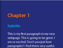
The “text” element makes a bold visual statement. Use them to create an impact when the main goal is to narrate a visual storytelling.
Usage
| When to use |
| You can use this element to display the news content, product information, content of a subject, and visual storytelling, in addition to displaying alerts and error messages on the screen/page. |
Text Configuration
The “Text” element consists of the following properties:
- UI Configuration
- Event Configuration
UI Configuration
For the “Text” element, you can configure the following UI properties:
| Tab | Property Name | Description | Mandatory | New Default Value | Visibility Rules |
| Basic | Reference Name | Specifies a unique name of the element. At the application level, an element is identified and managed by the reference name. | Yes | Text_1 | |
| Basic | Caption | In this box, you can enter the value of the “Text”element. The application displays the caption of the “Text” element on the screen. If you do not enter a value in the Caption box, the “Text” element displays $.{text} as a default value. | No | Sample Text | |
| Basic | Default Value | This property allows you to define the default value of an element. To define the default value: –> Click in this box, and it displays the list of the pre-define functions, attributes, and element IDs. –> In the list, select an attribute from which the application will fetch the default value and then display it in the element. | {{fx}} | ||
| Basic | Underline | It includes two options as follows: Yes: – Click this option if you want to underline the text. | No | unmarked | |
| Basic | Visible | Allows you to define the default visibility of the UI element. | No | marked | |
| Basic | Business Rule | Click this list and then select a pre-defined business rule that will determine the element’s visibility. If the user’s action satisfies the condition in the business rule, the application will display or hide the element. To define the business rule, access the Business Rule Manager module. | No | ||
| Basic | Enable | Click this check box to make the element active or inactive. The user can perform the function on the active element. | No | Selected | |
| Basic | Business Rule | Click this list and then select a business rule to make the element active or inactive. If the user’s action satisfies the condition in the business rule, the application will make the element active or inactive in the application. To define the business rule, access the Business Rule Manager module. | No | ||
| UI Properties | Styles | Allows you to select a specific style for the element from the list of pre-defined styles. The vDesigner module offers pre-defined styles that you can apply to the element. These pre-defined styles are: –-> Primary –> Secondary –> Warning –> Info –> Danger –> Success | No | Primary | |
| UI Properties- Alignment & Spacing | Margin | Allows you to desirably define the margin around each side of the element. It provides four different boxes to define the margin outside the right, left, top, and bottom border of the element. | No | Theme Variable (Margin) | |
| UI Properties- Alignment & Spacing | Element’s Alignment | This property contains three tabs. You can use these tabs as follows: 1. Left:- By default, this tab is selected. It aligns the element to the left of the page. 2. Center:- If you select this tab, it aligns the element at the center of the page. 3. Right:- If you select this tab, it aligns the element to the right of the page. | No | Left | |
| UI Properties- Caption | Font | Select the font type (For example – Arial) of the element’s caption. | No | Theme Variable (Font Family) | |
| UI Properties- Caption | Size | Enter the font size of the caption. | No | 12 | |
| UI Properties- Caption | Color | Select the color of the font of the caption. | No | Theme Variable (Caption) | |
| UI Properties- Caption | Bold | Enter the thickness of the character of the element’s caption in the range of values from 1 to 9. | No | 4 | |
| UI Properties- Caption | Style | Select the style of font (For example- Italic) of the caption | No | Normal | |
| UI Properties- Shape & Decoration | Width Value | Enter the width of the element in the pixel unit. | No | 100% | |
| UI Properties- Shape & Decoration | Height Value | Enter the height of the element in the percentage unit or pixel unit. | No | Set as ___ & Disable | |
| UI Properties- Shape & Decoration | X | Allows you to move the element along the X-axis; when the value increases, the element moves from left to right. | No | Show & Disable | |
| UI Properties- Shape & Decoration | Y | Allows you to move the element along the Y-axis; when the value increases, the element moves from top to bottom. | No | Show & Disable | |
| UI Properties- Shape & Decoration | Type | This property allows you to adjust the size of the element according to the layout. To configure the element, it provides the following options: 1. Autofill:- If you select this option, the element will automatically occupy the available space in the layout. 2. Wrap:- If you select this option, the element will wrap based on the characters’ length. 3. Manual:- If you select this option, you can define the size of the layout. | |||
| Data | Entity Path | This property allows you to map an attribute to the element. You define the JSON based attributes in the entity in the Data Modeler module. To define the entity path: –> Click in the Entity Path box, and a list expands. –> The list displays several attributes from the entity. –> In the list, select an attribute to map it to the element. After the user performs the function on the element, the application can perform the following functions: a. Fetches data from the attribute and then displays it in the element. b. Stores data in the attribute. | No | EntityName. |
Event Configuration
On the “Text” element, you can configure the following event:
- onClick
Was this article helpful?
YesNo