
vFlow Components
Introduction
This post mainly focuses on two vFlow entities: Components and Elements. As described earlier in the post: An Introduction to vFlow, the “component” entity works as a container in the vFlow module. The vFlow module incorporates several components. You can see these components in the left panel in the vFlow module’s dashboard. Each component contains one or several elements that you can use to create the interface design on the screen.
For instance:- If you want to use the digital calendar, you need to drag the Calendar component to the layout. If you want to add the check box to the layout, you can drag the FV component to the layout.
In the vFlow module, each component has a specific purpose to help you use available elements in the interface design. This post does not cover how to add a component. It only includes a brief definition of the available components and describes different properties that you can configure for the components and elements.
Note:- To know more about how to add a component and element to the layout, visit the post: An Introduction to vFlow.
List of Components
The following table contains a list of vFlow components, including their definitions and elements that are available in a specific component.
| Component Name | Component Description | Elements in the Component |
| Queue | It displays the statistical type of data by using different buckets. You can use a group of cards sequentially to display a set of data. After the end-user clicks a card, it displays a set of data to the user. | Queue |
| FV (Functional View) | The term “FV” stands for Functional View. It displays a list of records. When you use the FV component, the application displays the data in form of multiple cards, where the data is managed in the array of objects format. | Text, Number, Image, Tags, Hyperlink, CheckBox, Radio Button, Input Text, Toggle Button, TextArea, Image Slider, Video, Date, etc. |
| Form | On a page, the “Form” component works as a page layout where you can add a group of interfaces. You can use the “Form” component when you want to get the data from the end-user. For instance:- You can use the “Form” component for the data submission form, where the end-user enters his or her personal details, including address, contact information, etc. On the form, you can configure an API on the “Submit” button. After the end-user clicks the Submit button, the application calls an API. The API captures the data from the “Form” component and then stores it in the database. | In the Form component, you can add the following components: Row, Column, and Fieldset |
| Table | The “Table” component displays the data in the grid format. You can use the table component to display data reports, a specific type of data patterns, etc. The “Table” component follows the concept of the Angular Material Data Table that displays the data in the common tabular format, including a header row, data row, and footer row. | Text, CheckBox, Button, Toggle, Icon, Radio, Hyperlink, Document Enlisting, etc. |
| Card | The “Card” component is a tile or rectangular shape type surface. You can use it to display relevant and actionable information related to a single topic. Also, you can place text or image on the card to communicate the information to the end-user. | Text, Image |
| TreeView | The “TreeView” component is used to display the hierarchical data in the form nodes. In the web application, the tree of data is not common, but it is used to represent a file system or multi-level functionalities. When you implement the “Treeview” component, you need to add a specific JSON format by using the Add Data Source utility. The JSON format contains different nodes that the treeview displays to the end-user. To implement the navigation between the nodes, you need to configure the “On Node Click” event. | – |
| Gallery | You can use the “Gallery” component to display a collection of the images. When you add a gallery to application, it creates a collection of thumbnails from the images in a DAM folder. When the end-user clicks a thumbnail, the image viewer displays an actual picture in place of the thumbnail. The “Gallery” component is a collaborative component to upload the design work, in addition to getting feedback, tracking revision, etc.  | – |
| JV | The term “JV” stands for JSON Viewer. If you want to display the JSON based code or syntax to the user, you can use the “JV” component. The vFlow module offers the “JV” component as an integrated plugin. | – |
| JSON Editor | In the vFlow module, the JSON editor component allows the end-user to view a data source in the JSON format. In the JSON editor, you can also edit the data source. | |
| TimeLine | You can use the “TimeLine” component to display historical events in a chronological order. To display the event related description, you can use the “Card” component. You can use the “TimeLine” component to display the series of events horizontally and vertically.  | Timeline Date, Timeline Icon, Text, Number, Hyperlink, Check Box, Input Text, Radio Button, etc. |
| Calendar | The “Calendar” component displays a calendar in the application in the “monthly view” mode. You can use the “Full Calendar” component to view the calendar in the other following modes: –> Daily View –> Weekly View –> Monthly View | |
| Web View | You can use the “Web View” component to display a web page or web based content from within the application by using an iframe. It allows you to display the web page as a part of your activity layout. The “Web View” component has limited browser capabilities. You can use the “Web View” component to display the Google Map from within the application. Note:- To display web-based content by using Web View, you need to whitelist the external URL. | – |
| Chart | The “Chart” component displays the data in the graphical format. In the “Chart” property of the “Chart” component, you can define one of the following types of the charts: –> Bar –> Pie –> Line –> Scatter The vFlow module includes the e-chart library to define the data requirements, tag structure, and customize the look and behavior of the chart. | – |
| Tab | The “Tab” component organizes the content into different screens or views. When you use the “Tab” component, you can define multiple tabs in the “Tab” component. These “Tab” elements are clickable, and you can arrange them vertically (one under another) or horizontally (adjacent to each other). Each tab element is linked with a specific screen. After the end-user clicks a tab, the application displays the content or data in the linked view or screen. To view different contents, the user can switch among the tabs. | – |
| Stepper | The “Stepper” component displays the progress through a sequence of logical and numbered steps. They help user perform the function in the step-wise manner. It can also be used to present the navigation flow. By using the “Tab/Stepper Direction” property, you can configure the stepper’s alignment as follows: –> Vertical –> Horizontal | – |
| Accordion | The “Accordion” component is a content area that can be expanded or collapsed. It contains a vertically placed list of items. In the list, the “Accordion†component can have labels or thumbnails. Each item in the list can be expanded or collapsed to display or hide the content associated with that item. | – |
| Full Calendar | You can use the “Full Calendar” component to display a calendar in the following modes: –> Day View –> Weekly View –> Monthly View | |
| Document Viewer | You can use the “Document Viewer” component to display a variety of documents, such as PDF, .DOC, JPEG, and supported formats to the end-user. | – |
| Document Uploader | You can use the “Document Uploader” component to allow the end-user to upload the supported document formats to the application. | – |
| Query Builder | You can use the “Query Builder” component to display a “Query Builder” interface that allows the end-user to generate a SQL query if he or she wants to fetch the data from a database. | – |
| PV | The term “PV” stands for “Pair Value”. You can use this component when you want to display the values of an array based on the values of another array. To display the pair value, you need to maintain the data in the key-value format. | |
| FV Layout | You can use the FV (Functional View) layout to add a header at the top of the FV (Functional View) component. The “FV Layout” component is different from the “FV” component. If you add a header at the top of the “FV” component, the vFlow module creates a header at the top of each card. When you use the “FV Layout” component, it creates a single header at the top of the layout that contains all cards. | |
| Document Listing | This component displays the list of documents that you have uploaded to the application from the local device. | – |
| Pivot Table | The “Pivot Table” component is a library type component that allows you to display the Excel file’s data in the web based tabular format. It also allows the end-user to perform common Excel file’s functions on the tabular data. | – |
| Row | In the page design, the “Row” component is treated as a page-level layout. In the vFlow module, after you add a page, you add a row. Thus, you can perform the following functions in a row layout. To design a page: –> Drag a single column to the row and then drag other components to the column layout. –> Drag multiple columns to the row, and then drag other components to each of the added columns. | – |
| Column | In the vFlow application, the “Column” is a component-level layout. It means when you add a component to the page, you drag that component to the column layout. Thus, the “Column” component works as a parent container to other components in the page. To create multiple sections vertically in a page, you can add multiple columns to the row layout. | – |
Components Properties
This section describes different configurable properties of the vFlow components. You can configure a component based on application-specific requirements. Largely, most of the properties of the vFlow components are common. You can find a few properties that are component-specific. In the vFlow component, you can find different properties across the following categories:
- Basic
- Properties
- UI Properties
- Additional Properties
- Dependents
Let’s start with the common properties of the components:
Component Properties (Common)
Basic
| Property Name | Description |
| ID | This field displays the component’s ID. The “ID” property is also referred to as component ID. When you add a component, the vFlow module creates a unique component ID and then assigns it to the component. Also, the unique component ID is used to maintain the component in the database. |
| Component Type | This field displays the component’s type, which is a non-editable value. |
| Component Name | This field displays the default component’s name that you can change (if required). |
| Component Description | This field displays a default description of the component. You can change the component’s description (if required). |
UI Properties (Common)
| Property Name | Description |
| Form Field Appearance | After you click this list, it displays the following values: –> Default If you select this option, the page or form does not display the elements in the outlined box style. –> Outline If you select this option, the page or form displays the elements in the outlined box style. |
| Transparent | If you click this check box, the white card background of the form or other component (for example:- “FV”) will become transparent. |
UI Properties (Data Style)
| Propery Name | Description |
| Font, Background, Height, and Width | This group of properties allows you to configure the following: –> Width, height, maximum permissible height and width, background, and other properties of the container (component or element) that displays the data –> Data’s font type, size, text’s alignment (left, center, and right), etc. The application will display the data to the end-user based on the data’s configured properties. You can define the properties’ values in the following units: 1. Pixel 2. VH (Viewport Height) 3. Percentage |
| Margin | This property allows you to define the whitespace in the pixel, VH, or percentage units around each side of the data container. You can define the space around the following borders of the container: –> Top –> Left –> Bottom –> Right 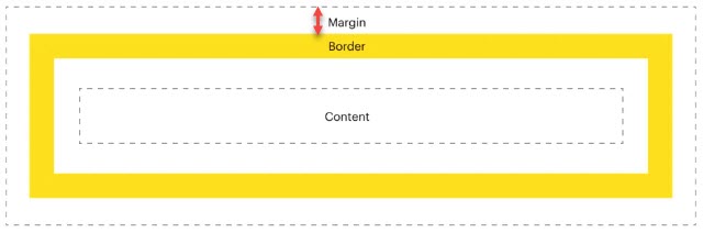 |
| Padding | This property allows you to define the inner space in the pixel, VH, or percentage units around each side of the data’s container. You can define the inner space around the following borders of the data container: –> Top –> Left –> Bottom –> Right Note:- For the container’s value, the inner space is measured by the distance between the value inside the container and the container’s border. 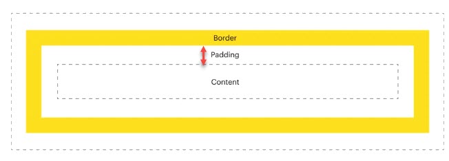 |
| Border Radius | When you configure this property, it makes the corners of the data’s container round. To make the corner round, you need to define the corner’s radius. You can enter the radius’s value in pixel, VH, or percentage units to make the following corners round: –> Top Left –> Top Right –> Bottom Left –> Bottom Right |
UI Properties (Label Style)
| Property Name | Description |
| Font, Background, Height, and Width | This group of properties allows you to configure the following: –> Width, height, maximum permissible height and width, background, and other properties of the container that displays the label. –> Label’s font type, size, text’s alignment (left, center, and right), etc. The application will display the label to the end-user based on the label’s configured properties. You can define the properties’ values in the following units: 1. Pixel 2. VH (Viewport Height) 3. Percentage |
| Margin | This property allows you to define the whitespace in the pixel, VH, or percentage units around each side of the label’s container. You can define the space around the following borders of the container: –> Top –> Left –> Bottom –> Right |
| Padding | This property allows you to define the inner space in the pixel, VH, or percentage units around each side of the label’s container. You can define the inner space around the following borders of the container: –> Top –> Left –> Bottom –> Right Note:- For the label, the inner space is measured by the distance between the label inside the container and the container’s border. |
| Border Radius | When you configure this property, it makes the corners of the label’s container round. To make the corner round, you need to define the corner’s radius. You can enter the radius’s value in pixel, VH, or percentage units to make the following corners round: –> Top Left –> Top Right –> Bottom Left –> Bottom Right |
UI Properties (Animation Style)
| Property Name | Description |
| Type | Click this list and then select the animation’s type. |
| Delay | Click this list and then select the time after which the application will play the animation. For instance:- In the Delay list, if you select 2 sec, the application will play the animation after 2 seconds. |
| Speed | Click this list to select the speed of the animation. |
| Repeat | Click this list and then select a number (For example:- 2). The application will play the animation for the selected number of times. |
| Add CSS Class | In this field, enter the class’s name (for example:- test-popup) that contains the CSS properties. When you configure the application’s settings by using the App Config utility before you publish it, you can define the CSS class. To define the CSS class: 1. On the vFlow module’s dashboard, see the upper top panel. 2. In the upper top panel, click App Config, and the App Config page opens. 3. On the App Config page, see the CSS Custom Classes area. 4. In the CSS Custom Classes area, click in the CSS Classes box and then define the CSS properties. 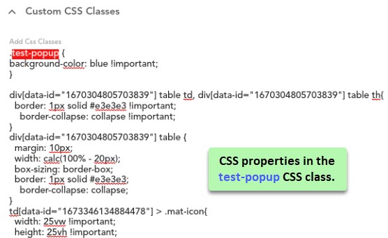 |
Dependents Properties
| Property Name | Description |
| Component Header | This field displays the list of the earlier configured headers. In the list, select a header that you configured earlier. To configure a header: 1. Under Dependents area, click Add Header, and the Edit/Delete Header dialog box opens. 2. In the Edit/Delete Header dialog box, in the Header Name field, enter the name of header. 3. In the Header Description field, enter a brief header’s description and then click Submit to create a header. After you create the header, you can configure the header’s content in the following ways: –> By using the data source property –> By adding element You can use the following cases to configure the header content: Case1:- (If you use the Data Source) 3. Click the down arrow left to Data Source area, and the Data Source area expands. 4. In the Data Source area, click the Source Type list and then select any of the following values: –> Fixed If you select this value: i. In the Header Display Label field, enter the header’s content, and then click Submit, and you successfully configure the header. ii. The application will display the header’s content that you have entered in the Header Display Label field. –> Object If you select this value: i. In the Header Display Label field, enter the business object’s path (for example:- getValue(“tempObject.headerName), and then click Submit, and you successfully configure the header. ii. The application will fetch the header’s content from the business object’s path. Case2:- (If you want to display the element in the header section) 5. In the Edit/Delete Header dialog box, click the Element tab, and the Edit Element area comes into view. 6. In the Edit Element area, click Add Element, and the Select Header Element dialog box opens. 7. In the Select Header Element dialog box, click the Select Header Element list and then select an element (for example:- Image). 8. After you select an element, click Add Header Element, the Edit Element area displays the newly added element’s properties. 9. In the Edit Element area, enter the following details of the element. i. Sequence:- In this field, enter a numeric value (for example:- 2). This numeric value specifies the sequence number of the element on the page. The application will display the element to the user based on its sequence number. ii. Name:- In this field, enter the element’s name. Note:- To configure element’s other properties, Visit the post: vFlow Elements. 10. After you enter the element’s details, click Submit, and you successfully add the element to the component’s header. |
| Component Footer | After you enter the element’s details, click Submit, and you successfully add the element to the component’s footer. To configure a footer: 1. Under Dependents area, click Add Footer, and the Edit/Delete Footer dialog box opens. 2. In the Edit/Delete Footer dialog box, in the Footer Name field, enter the name of footer. 3. In the Footer Description field, enter a brief footer’s description and then click Submit to create a footer. After you create the footer, you can configure the footer’s content in the following ways: –> By adding an element to the footer section To add an element to the footer section: 4. In the Edit/Delete Footer dialog box, click the Element tab, and the Edit Element area comes into view. 5. In the Edit Element area, click Add Element, and the Select Footer Element dialog box opens. 6. In the Select Footer Element dialog box, click the Select Footer Element list and then select an element (for example:- Image). After you select an element, click Add Footer Element, the Edit Element area displays the newly added element’s properties. 9. In the Edit Element area, enter the following details of the element. i. Sequence:- In this field, enter a numeric value (for example:- 2). This numeric value specifies the sequence number of the element on the page. The application will display the element to the user based on its sequence number. ii. Name:- In this field, enter the element’s name. Note:- To configure element’s other properties, Visit the post: vFlow Elements. 10. After you enter the element’s details, click Submit, and you successfully add the element to the component’s footer. |
| Events | This field displays the list of events that you configure on the component. To learn more about how to configure an event, visit the post: vFlow Advance. |
Component Properties (Specific)
Table
| Property Type | Description |
| Display Pagination | This property allows you to display the table’s data across multiple pages. To see the complete table, the user can navigate from one page to another page. |
| Global Search | After you click the Global Search check box, this property makes the “Global Search” element available in the component. By using the “Global Search” element, you can search the data in the “Table”, “FV”, and other components. |
| Search Bar | When you click the Search Bar check box to activate this property, it allows you to display the Search box with the table. |
| Fix Header | When you click the Fixed Header check box to activate this property, it makes the header row static. It means that you cannot scroll the header row. |
| Color Coding for Rows | When you click this check box, the application displays the row’s background color based on the configuration of the colorCode property in the “Table” component’s data source. |
| Make Row Clickable | When you click this check box, the end-user can click in the row’s cell. |
| Highlight Row | When you click this check box, the table displays the rows with a highlighted effect. |
| Table Header Row Height | In this field, you can enter the header’s row’s height in pixel, VH, or percentage units. |
| Row Height | In this field, you can enter the data cell’s row’s height in pixel, VH, or percentage units. |
| Is Visible | When you click this check box, the end-user can see the table on the application’s page. |
| Is Enable | When you click this check box, the end-user can perform the function on the table. |
| Number of pages on current page | In this field, enter a numeric value (for example:- 9) that specifies the number of rows that a table will displays to the user on the current page. In the Number of pages on current page field, if you enter the comma-separated values, such as 5, 10, or 20, the application will display these values in a dropdown list. In the list, the end-user can select a specific value to see the exact number of rows on the current page. |
FV Component
| Property Name | Description |
| Display Pagination | See the “Table” component’s specific properties. |
| Global Search | See the “Table” component’s specific properties. |
| Search Bar | See the “Table” component’s specific properties. |
| Highlight FV | When you click this check box, the application displays the “FV” component with the highlight effect. |
| Is Visible | See the “Table” component’s specific properties. |
| Is Enable | See the “Table” component’s specific properties. |
| Is Card Clickable | When you click this check box, the end-user can click the card to perform a specific function. |
| Card Width | In this field, enter the width of the card in pixel, VH, or percentage units. Note:- The “FV” component is used to display multiple sets of data on the card while the application fetches the data from the array of objects. |
| Card Height | In this field, enter the height of the card in pixel, VH, or percentage units. |
| Scroll Type | When you click this list, you can select one of the following values: –> Vertical If you select this value, the end-user can scroll cards vertically in the FV component. –> Horizontal If you select this value, the end-user can scroll cards horizontally in the FV component. |
| Set Background Color | You can use this property to define the cards’ background color in the “FV” component. In the Set Background Color field, enter the color name or color code that you have defined in the “FV” component’s data source. If you want to display different colors in different cards in the “FV” component, you can use the getVal ( ) function to fetch the color code or color name from the data source. 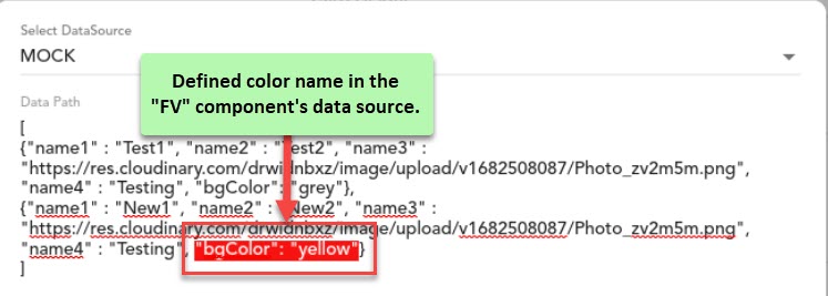 |
| Set Background Image | You can use this property to define the image as the cards’ background in the “FV” component. In the Set Background Image field, enter the image’s URL that you have defined in the “FV” component’s data source. If you want to display different images as the background on different cards in the “FV” component, you can use the getVal ( ) function to fetch images from the data source. |
| Search By Key | You can use this property to help the user search in the “FV” component based on a key or a group of multiple keys. In this field, you can enter a key value or several key values that are separated by commas. Before you enter the key in the Search By Key field, you must define the same key in the “FV” component’s data source. |
Tab
| Property Type | Description |
| Is Collapsible | If you click the Is Collapsible check box, the vertically aligned “Tab” component becomes collapsible. When the end-user clicks the collapsible tab, the tab expands and then displays the information or set of user interfaces. |
| Tab/Stepper Direction | Click this list and then select one of the following values: –> Vertical When you select this value, the application places the tabs one under the other vertically. –> Horizontally When you select this value, the application places the tabs horizontally adjacent to each other. |
| Tab Position | Click this list to place the tabs by using the following options: –> Right Select this option to display the vertically aligned tabs to the right of the screen. –> Left Select this option to display the vertically aligned tabs to the right of the screen. –> Top Select this option to display the horizontally aligned tabs at the top of the screen. –> Bottom Select this option to display the horizontally aligned tabs at the bottom of the screen. |
| Tab Width | In this field, enter the tab’s width in pixel, VH, or percentage units. |
Stepper
| Property Type | Description |
| Is Editable | If you click this check box, the end-user can edit the stepper’s content. |
| Is Linear | You see this property selected by default. If this property is selected or active, the end-user can perform the next function only after s/he has performed the current function. |
| Is Center Aligned | If you click this check box, this property aligns the stepper centrally. By default, the application displays the stepper left-aligned.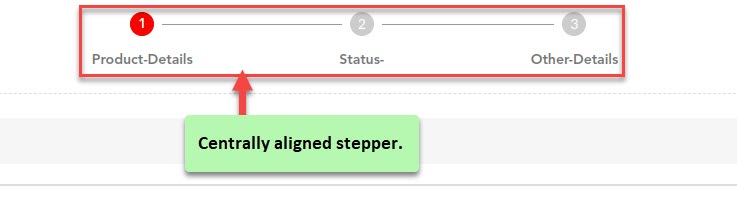 |
| Tab/Stepper Direction | Click this list and then select one of the following values: –> Vertical Select this value to display the stepper vertically aligned. –> Horizontal Select this value to display the stepper vertically aligned. |
| Stepper Label Position | Click this list and then select one of the following values: –> Top If you select this value, the application displays the stepper’s label at the top of the stepper’s icon. –> Bottom If you select this value, the application displays the stepper’s label under the stepper’s icon. |
Queue
| Property Type | Description |
| Is Enable | If you click this check box, the queue containing data becomes active, and the user can perform the function on it. |
| Is Visible | If you click this check box, the queue containing data becomes visible on the application. |
| Default Value | In this field, enter the default value that the queue will display to the end-user. Before you enter the default value in the Default Value field, you need to define the default value in the “Queue” component’s data source. |
| Custom Label | In this field, enter the custom label’s value that the application will fetch from the queue’s data source and display it in place of the element’s name. You can use the getVal ( ) function and then enter the custom label’s path or use the concatenate function as follows: CONCAT(“Hi”, getVal(“userId”)) |
| Leading icon (Icon Type) | Click this list and then select one of the following values: –> Mat Icon Select this value to display the image from the material.io library. The “Mat Icon” category includes the font-based icons and SVG icons. –> Image Select this value to display the bitmap-based images, including png, jpg, etc. When you use this property, the application displays the icon before the element or data. |
| Icon Name/URI | In this field, enter the icon’s name or URL. Before you enter the icon’s name or URL in the Icon Name/URI field, you need to define the icon’s name or URI in the “Queue” component’s data source. |
| Trailing icon (Icon Type) | Click this list and then select one of the following values: –> Mat Icon Select this value to display the image from the material.io library. The “Mat Icon” category includes the font-based icons and SVG icons. –> Image Select this value to display the bitmap-based images, including png, jpg, etc. When you use this property, the application displays the icon after the element or data. |
| Icon Name/URI | In this field, enter the icon’s name or URL. Before you enter the icon’s name or URL in the Icon Name/URI field, you need to define the icon’s name or URI in the “Queue” component’s data source. |
Document Listing
| Property Type | Description |
| Download Image | If you click this check box, the end-user can download the document that the “Document Listing” component displays to the user on the application. |
| Print Image | If you click this check box, the end-user can print the downloaded document. |
| Is Visible | By default, this check box is selected to make this property active. It makes the documents’ list visible to the end-user on the application. |
| Is Enable | By default, this property is also selected, which makes it active. This property allows the end-user to perform the functions on the documents’ list, including downloading the document. |
| Display Tags | If you click this check box, the application will display the tag’s name along with the documents’ list. The application will display the tag’s name if you have entered the tag’s name while uploading the document. |
| Display Information | If you click this check box, the application will display the other details with the documents’ list. |
Document Uploader
See properties in the “Document Listing” component.
Timeline
| Property Type | Description |
| Card Width | In this box, enter the card’s width in pixel, VH, or percentage units. In the “Timeline” component, a card displays the text or context of the event. |
| Card Height | In this box, enter the card’s height in pixel, VH, or percentage units. |
| Set Card Background Color | In this field, enter the color’s name or color code to define a color as the card’s background. Before you enter the color’s name or color code, you need to define the same color name or color code in the “Timeline” component’s data source. |
| Set Card Background Image | In this field, enter the image’s URL if you want to use an image as the card’s background. If you want to display different images as the background on different cards, you can use the getVal ( ) function to fetch images from the “Timeline” component’s data source. |
| Timeline Direction (Timeline Position) | Click this list and then select one of the following values: –> Vertical If you select this value, the application displays the timeline and its events vertically aligned. –> Horizontal If you select this value, the application displays the timeline and its events horizontally aligned. |
| Timeline Order (Timeline Position) | Click this list and then select one of the following values: –> Ascending If you select this value, the timeline displays different events chronologically from bottom to top. In ascending order, the timeline displays the first event at the bottom and the last event at the top. –> Descending If you select this value, the timeline displays different events chronologically from top to bottom. In descending order, the timeline displays the first event at the top and the last at the bottom. |
| Vertical | This property applies to the “Timeline” component if you have aligned it vertically. It allows you to display the vertical timeline by providing the following options: –> Left Select this option to display the timeline to the left. –> Center Select this option to display the timeline at the center of the screen. –> Right Select this option to display the timeline to the right. |
| Horizontal | This property applies to the “Timeline” component if you have aligned it horizontally. It allows you to align the timeline by providing the following options: –> Top Select this option to display the timeline at the top of the screen. –> Center Select this option to display the timeline horizontally at the center of the screen. –> Bottom Select this option to display the timeline at the bottom of the screen. |
Full Calendar
| Property Type | Description |
| Show Navigation Buttons | If you click this check box, the “Full Calendar” component will display the navigation button to navigate to the following: –> Previous month, week, or day –> Next month, week, or day |
| Show Calendar View Buttons | When you click this check box, the “Full Calendar” component will display three different push buttons to access the month, week, and day in a specific calendar year. |
| Show Indicator | When you click this check box, the “Full Calendar” component will display a red indicator on the current time. |
| Enter Calendar Height | In this field, enter the calendar’s height in pixel, VH, or percentage units. |
| Event Color | In this field, enter the event’s background color name or color code. Before you enter the color name or color code in the Event Color field, you need to enter the same color name or color code in the “Full Calendar” component’s data source. |
| Event Text Color | In this field, enter the event’s text description’s color name or color code. Before you enter the color name or color code in the Event Text Color field, you need to enter the same color name or color code in the “Full Calendar” component’s data source. |
| Initial View | Click this list and then select one of the following values: –> Month If you select this value, the calendar will display the data in “month-view” mode. In “month-view” mode, it will display the following: –> Dates of the current month displayed day-wise –> Days of the current month from 1st to 31st  –> Week If you select this value, the calendar will display the data in “week-view” mode. In “week-view” mode, it will display the following: 1. Dates and days of the currently month in a specific format (day mm/yy) column-wise 2. Time from 12am to 12pm displayed row-wise for each day of the week 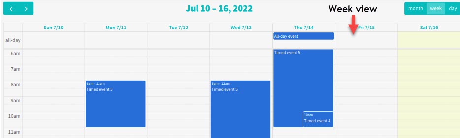 –> Day If you select this value, the calendar will display the data in “day-view” mode. In “day-view” mode, it will display the following: 1. Time from 12am to 12pm displayed row-wise for the current day (month dd, yyyy)  |
| Select First Day | After you click this list, it displays the following values: –> 0 If you select this value, the calendar will start the week from Sunday. –> 1 If you select this value, the calendar will start the week from Monday. |
#Sample Code for “Full Calendar” Component’s Data Source
[ { “id”: “0”, “title”: “All-day event”, “start”: “2022-07-14” },
{ “id”: “1”, “title”: “Timed event 1”, “start”: “2022-07-14T11:00:00” },
{ “id”: “2”, “title”: “Timed event 2”, “start”: “2022-07-14T17:00:00”, “end”: “2022-07-14T18:00:00” } ]
Chart
| Property Type | Description |
| Type | After you click this list, it displays the following types of charts: –> Bar –> Pie –> Line –> Scatter You can select one of these charts. |
| Set Chart Theme | Click this list to select one of the following themes for the chart: –> Dark –> Default –> Macarons |
Note:- Apart from the Type and Set Chart Theme properties, other properties are defined and configured in JSON format in the data source.
Pivot Table
| Property Type | Description |
| Date Pattern | This field displays the date format that you defined in the data source earlier. |
| Date Time Pattern | This field displays the date time format that you defined in the data source earlier. |
| Sorting | This property allows you to activate or deactivate the data’s sorting feature by providing the following options: –> On Select this option to activate the sorting feature. –> Off Select this option to deactivate the sorting feature. –> Rows Select this option to apply the sorting to the table’s rows. –> Columns Select this option to apply the sorting to the table’s columns. |
| Show Configurator Active | |
| Show Configurator Button | Click this check box to make the configurator button available to the user. |
| Show Aggregation | Click this check box to make the common aggregation functions such as MINX, MAXX, SUM, and others available to the end-user. |
| Show Default Slice | Click this check box to make the default slicer available to the end-user. The Excel spreadsheet software program offers the slice feature to filter and group a specific set of data based on the header columns or fields. |
| Show Aggregation Label | Click this check box to display the different labels related to the common aggregator functions in the pivot table. |
| Show Calculated Value Button | Click this check box to make a button available to the end-user. The button will display the calculated value after you apply an aggregator function to a group of data values. |
| Type | Click this list to select one of the following types of pivot tables: –> Compact –> Classic –> Flat |
| Total | You can use this property to display total number of rows and columns in the pivot table. You can use the following options: –> On Select this option to display the total number of rows (For example:- 5) and columns (For example:- 8) that the pivot table contains. –> Off Select this option to not display the total number of rows (For example:- 5) and columns (For example:- 8) that the pivot table contains. –> Rows Select this option to display the total number of rows (For example:- 5) that the pivot table contains in the application. –> Columns Select this option to display the total number of columns (For example:- 5) that the pivot table contains in the application. |
| showFilter | Click this check box to display the “filter” feature in the pivot table to the user. |
| showHeader | Click this check box to display the header row in the pivot table. |
| showHierarchy | Click this check box to make the “hierarchy” feature available in the pivot table. The hierarchy feature allows the user to establish a hierarchy among a group of the selected columns. For instance:- The user can use the “hierarchy” feature in a pivot table that contains the columns of country, region, state, city, etc. |
| showReportFilterArea | Click this check box to make the “Filter Data” feature available in the pivot table. By using the “Filter Data” and “Slicer” features together, the user can filter the pivot table’s data and then derive a data subset. |
| Drill Through | Click this check box to make the “Drill Through” feature available in the pivot table. By using the “Drill Through” feature, the user can access a subset of data by clicking a specific data value. |
Document Viewer
For the following components, you can see the specific properties in Queue component.
- Treeview
- Calendar
- Accordion
- Query Builder
- Pivot Table
- Document Viewer
- JV (JSON Viewer)
- JSON Editor
- Webview