
Column
The “Column” element aligns multiple other elements vertically. On a page where you want to place and align multiple elements vertically, you can use the column layout.
While designing an application, you can use a column as follows:
Virtual Column
You can use the virtual column to align elements vertically on a page. When you drag an element under another element, the vDesigner module does not create the virtual column automatically. And, it has two following reasons:
- In the vDesigner module, a page works in the default column mode
- On the page, you can create a virtual column only after the elements’ placement has a virtual row
Let’s learn to create a virtual column through elements’ placement.
To create a virtual column:
- Drag an element next to another element.
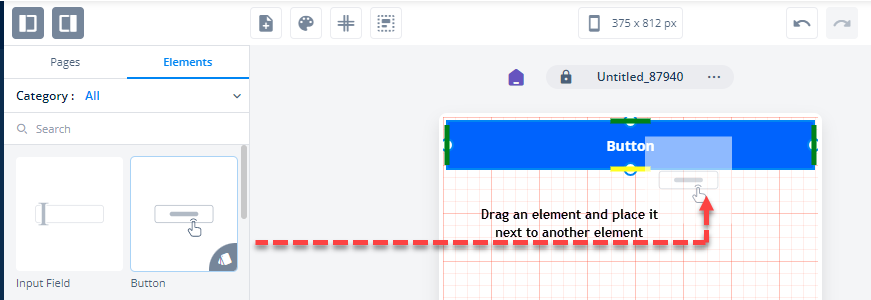
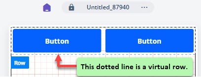
- After you drag an element next to another element, a virtual row is created.
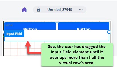
- Drag an element (For example:- Input Field) under recently added elements.
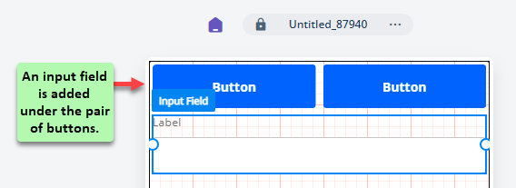
- After you drag the Input Field element to the canvas, drag it upward until it overlaps more than 80% of the virtual row’s area, and then release the mouse pointer.
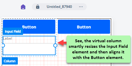
- After you release the mouse pointer, the virtual column feature resizes the Input Field element and then aligns it with the Button element.
Column
Apart from seeing and using the virtual column, you can use the “Column†element from the element’s category in the vDesigner module. Like virtual column, you can also use the Column element to align several other elements vertically.
To use a column:
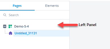
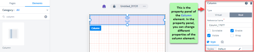
- On the vDesigner module, see the left panel.
- In the left panel, click the Elements tab, and the Category area displays the list of elements.
- Click in the search box and then enter: Column, and the Category area displays the Column element.
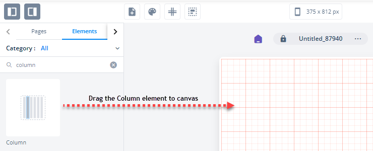
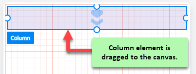
- Drag the Column element to the canvas.
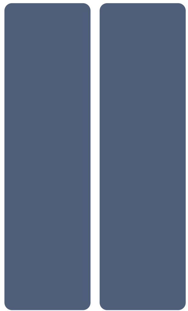
- After you drag the Column element, the Column element appears as a real column.
- After you drag the Column element to the canvas, you can change its different properties in the property panel.
Aligning Elements by Using Column Element
You can use the Column element to align other vDesigner elements vertically.
To align the elements:
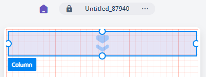
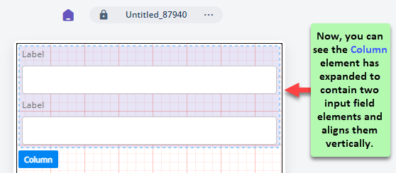
- Drag the Column element to the canvas.
- Drag an element (For example:- Input Field) and then place it in the Column element.
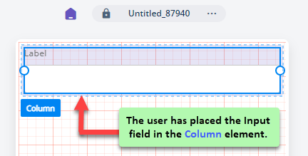
- Repeat step 2.
- After you place two input field elements in the Column element, you can see the column element successfully aligns the input fields vertically.
Usage
| When to use |
| Use the “Column” element when you want to display items or data in the different columns of the page. |
Column Configuration
The “Column” element has the following property:
- UI Configuration
- Event Configuration
UI Configuration
For the “Column” element, you can configure the following properties:
| Tab | Property Name | Description | Mandatory | New Default Value | Visibility Rules |
| Basic | Type | This property provides two options as follows: –>Virtual:- In case of virtual column, this tab is selected by default. When you drag the “Column†element to the canvas, the property panel displays the Virtual tab inactive. The inactive Virtual tab means that you cannot convert the column element into a virtual column after you drag it to the canvas. –> Real:- After you drag the Column element to the canvas, the property panel displays the Real tab selected by default. In case of a virtual column, if you click the Real tab, the virtual column is converted into a real column. Thus, the Virtual tab becomes inactive, and then you cannot change a column to a virtual column. | |||
| Basic | Reference Name | Specifies a unique name of the element. At the application level, an element is identified and managed by the reference name. | Yes | Column_XXXXX | |
| Basic | Scrollable | After you click this check box, a scroll bar becomes availble in the row element. The user can move the scroll bar to view different elements in the row. | No | Clear | |
| Basic | Enable | If you click to select this check box, the row element becomes active on the screen. You can perform the function on the active element. | No | Selected | |
| Basic | Business Rule | Click this list and then select a business rule to make the element active or inactive. If the user’s action satisfies the condition in the business rule, the application will make the element active or inactive in the application. To define the business rule, access the Business Rule Manager module. | No | ||
| Basic | Visible | If you click to select this check box, the row element becomes visible on the screen. | No | Selected | |
| Basic | Business Rule | Click this list and then select a pre-defined business rule that will determine the element’s visibility. If the user’s action satisfies the condition in the business rule, the application will display or hide the element. To define the business rule, access the Business Rule Manager module. | No | ||
| Basic | Wrap | After you click this check box, the row element starts resizing its shape based on the number of elements in the row layout. | No | Clear | |
| UI Properties | Styles | Allows you to select a specific style for the element from the list of pre-defined styles. The vDesigner module offers pre-defined styles that you can apply to the element. | No | Default | |
| UI Properties-Background | Background | Allows you to configure the element?s background by providing the following options: –> Color –> Image | No | Color | |
| UI Properties-Background | Color | Allows you to configure the background color of the element. To configure the background color: –> In the Background Color box, click the left color box (  ), and a color canvas open. ), and a color canvas open.–> On the canvas, on the horizontal bar, move the circle to select the color. –> In the upper section, move the circle to select the tone of the color. | No | #2883F3 | If ?Background? = ?Color? |
| UI Properties-Background | Image Source | This box becomes visible after you click the Image tab. To configure an image as the element?s background, you can use one of the following options: –> None –> URL –> Asset Library | No | None | If ?Background? = ?Image? |
| UI Properties-Background | Image URL | This box becomes visible after you select URL in the Image Source list. In the Image URL box, enter the URL of an image. The application fetches the image from the URL-based location and then displays it as the element?s background. | No | URL | If ?Image Source? = ?URL? |
| UI Properties-Background | Select Asset | This box becomes visible after you select Assets Library in the Image Source list. This property allows you to configure an image as the element?s background from the Assets Manager module. To configure the image: –> Click the asset library icon (  ), and the Select Asset dialog box opens. ), and the Select Asset dialog box opens.–> In the Select Asset dialog box, select an image and then click Select, and you successfully configure the image as the element’s background. | Yes | No File Selected | If “Image Source” = “Asset Library” |
| UI Properties-Background | Elevation | Allows you to configure the elevation of the background. The elevation is measured as the relative distance between two surfaces along the Z-axis. | No | 0 | |
| UI Properties- Alignment & Spacing | Padding | Allows you to desirably define padding around each side of the element. It provides four different boxes to define the padding around the right, left, top, and bottom side of the element. | No | Theme Variable (Padding) | |
| UI Properties- Alignment & Spacing | Margin | Allows you to define a margin around each side of the element. It provides four different boxes to define the margin outside the right, left, top, and bottom borders of the element. | No | Theme Variable (Margin) | |
| UI Properties- Alignment & Spacing | Element’s Alignment | This property contains three tabs. You can use these tabs as follows: 1. Left:- By default, this tab is selected. It aligns the element to the left of the page. 2. Center:- If you select this tab, it aligns the element at the center of the page. 3. Right:- If you select this tab, it aligns the element to the right of the page. | No | Left | |
| UI Properties- Alignment & Spacing | Container Internal Alignment | This property offers the following alignment options to align an element in a container element. 1. First List:- It provides the following alignment options: a. Left b. Center c. Right 2. Second List:- It provides the following alignment options: a. Top b. Middle c. Bottom d. Space Around e. Space Between f. Space Evenly | No | Top, Left | |
| UI Properties-Shape & Decoration | Type | Under the Shape and Decoration section, this property has the two following options: Autofill:- If you select this option, the element will occupy the available space of the parent layout. Manual:- If you select this option, you can define a specific size of the element. | No | Autofill | |
| UI Properties-Shape & Decoration | Width Value | Enter the width of the element in the pixel unit or percentage unit. | No | ||
| UI Properties-Shape & Decoration | Height Value | Enter the height of the element in the pixel unit. | No | ||
| UI Properties-Shape & Decoration | X | Allows you to move the element along the X-axis; when the value increases, the element moves from left to right. | No | Current X Co-ordinate | |
| UI Properties-Shape & Decoration | Y | Allows you to move the element along the Y-axis; when the value increases, the element moves from top to bottom. | No | Current Y Co-ordinate | |
| UI Properties-Shape & Decoration | Border Radius | Allows you to define the radius of the element?s corners. Defining the radius of the corner makes the element?s corner round. | No | Theme Variable (Border Radius) |
Event Configuration
On the “Column” element, you can configure the following event:
- onClick