
An Introduction to vFlow
Definition
The vFlow module is a web based visual drag and drop application that has the capability to build enterprise-level web applications for back office functions, operations, and other business functions.
vFlow Features
The vFlow module incorporates the following features:
- Easy-to-use drag and drop facility to design cost effective applications quickly
- Connected and seamless journey by using different interconnected entities through unique ID(s)
- Provides several in-built templates to design user-centric workflow
- Allows users to configure multiple landing pages based on different user-roles
- Includes layout engine to design functional behavior at the page, form, and modal level
- Allows the users to create multiple sections and field sets in a page layout
- Offers re-rendering that allows users to reuse a page, components, or element.
- Helps integrate the front-end application with the vConnect middleware to transport data between client and server
- Allows user to configure events such as click on, blur on, change on, etc.
- Incorporates theme-based templates with multi-color options
- Easy and instant configuration-level migration across multiple environments on the Vahana platform
vFlow Entities
In the vFlow module, the term “entity” means different components and objects that you can use to build an application. The vFlow module contains four major entities:
- Page
- Layout
- Component
- Element
An entity is an object that exists. In database administration, an entity can be a single thing, person, place, or object. Data can be stored related to these entities.
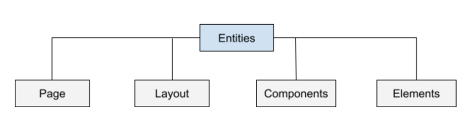
The entities are broadly described as follows:
Page
A page is a single screen in the application. It may contain text, graphics, and hyperlinks to other pages and files. A page provides information to viewers, including pictures or videos to help understand important topics.
In the vFlow module, you can create three types of pages:
| Page Type | Description |
| Page | In the vFlow module, a page is the largest entity. In a page, you can add other entities such as components and elements. In a page, the collection of elements and components imparts functional behavior to the application. |
| Subpage | A sub-page is used to design a layout at the element level. You can add several components to a page such as form, tab, stepper, and others. Designing a layout means that you are creating multiple sections in a page. These sections can include the left panel, middle section, top navigation panel, footer, etc. |
| Popup | The popup section that is also referred to as a dialog box appears in the foreground of the main application as a result of user-action. The popup is used to display the information. Also, you can include a popup to get input from the end-user. In the vFlow module, a popup appears as a modal window. A modal serves as a graphical control element that appears as a subordinate window to the main window. |
Layout
When you design an application in the vFlow module, you can use a layout to define different sections in the page. These sections include left panel, top panel, footer, right panel, middle section, etc.
Adding layout to a page defines how the page is divided into different rows and columns. The layout’s design is completely dynamic, configurable, and customizable. Layout is a pattern (or framework) that defines a web application structure. In the layout, you can add multiple elements and components to impart functional behavior and navigation on the page.
Components
In the vFlow module, the component is also a type of entity. The vFlow module contains different types of components to impart a specific type of functionality to the application. For instance:- If you want to display a set of data in tabular or grid format, you can use the “Table” component.
If you want to take the end-user’s input on the page, you can use the “Form” component. After you add a “Form” component to a page, you can add different “Input Text” and “Button” elements to the form component. Thus, in the context of an application’s design, the component also serves as a container where you can add several elements to impart structure and functional behavior to the application.
Elements
In the hierarchy of entities that are available in the vFlow module, the element is the lowest level of entities. You add an element to the layout and component for two main reasons:
- Providing information to the user in the form data and content
- Asking user to perform the function on the application
By adding elements to the page, you impart structure to the page. In the page, the elements are placed based on interface design or application wireframe.
Note:- You are recommended to first create a well-defined interface design or application wireframe before you start designing an application in the vFlow module.
On the application page, the element is used as a smallest entity. For instance:- To display a data value, the column that displays the data is treated as an element in the “Table” component.
Similarly, you can add an “Input Text” element to the “Form” component.
Behavior
In the vFlow module, each entity, including page, layout, component, and element, has a set of properties. You can change these properties to impart a specific look and behavior to the entity.
In the entities, you can categorize these configurable properties into two types:
- Basic Properties:- These are the common properties in several entities.
- Specific Properties:- They are entity-specific properties. A property that is the part of an entity may or may not be the part of another entity.
Getting started with vFlow
The Vahana cloud portal, which is a web based application, includes the single sign-on feature. The single sign-on feature is a single authentication mechanism. The single sign-on authentication method enables the user to access multiple applications and services by using a single set of credentials.
To access the vFlow application, you first need to become a registered user with the Vahana portal. After you log in to the Vahana portal, you need to create an application. Creating an application means that you are creating an application or project that you will design in the vFlow module. Until you create an application on the Vahana portal, you cannot access the vFlow module
While creating an application, you provide the name or title of the application. When you access the vFlow module, you can see the application’s name at the top of the vFlow module’s home page. You can treat this application name as the project name of the application that you are going to design in the vFlow module.
Note:- Before you start designing an application in the vFlow module, you are recommended to create and enter the application’s name based on the client’s organization. It will help you distinguish the application’s name when you are designing multiple applications in the vFlow module.
Accessing Vahana Portal
After you become a registered user with the Vahana portal, you need to access the Vahana portal.
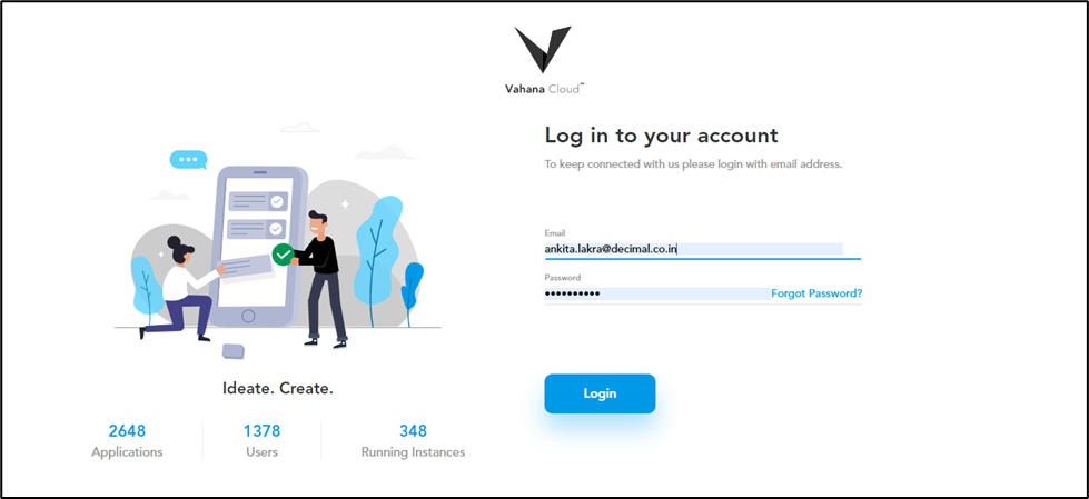
- Open the Internet browser.
- In the Address box, enter the Vahana portal’s URL.
- Press Enter, and the login page opens.
- On the log-in page, in the Email address box, enter your registered email ID.
- Click Continue, and the Password box appears.
- In the Password box, enter your Vahana account’s password.
- Click Login, and the Vahana portal’s home opens.
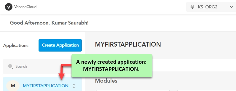
Creating a New Application
After you successfully access the Vahana portal, you need to create an application. Creating an application means that you are creating a virtual application that will enable you to access other resource that the Vahana cloud incorporates. Until you create an application, you cannot access the Vahana cloud-incorporated applications and services.
To create an application:
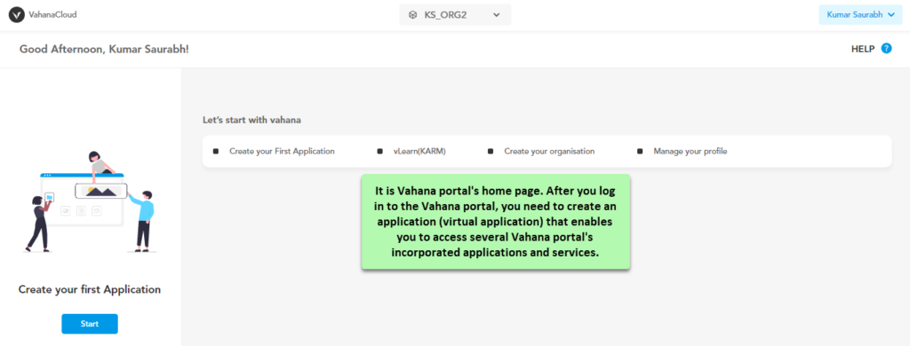
- On the Vahana portal’s home page, in the top panel, click the list and then select the organization (workspace) where you want to create the application.

- After you select the organization (For example:- KS_ORG2), see the right panel.
- In the right panel, click Create your First Application, the Create Application dialog box opens.
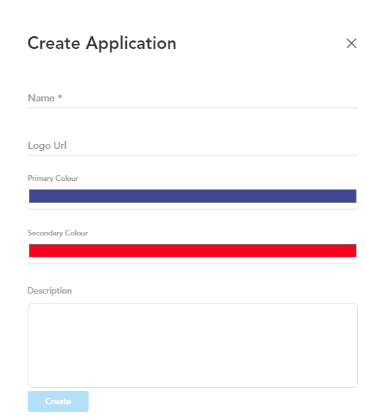
- In the Create Application dialog box, enter the details as follows:
| Property | Description |
| Name | In this field, enter the name of the application (For example:- MyFirstApplication). Note:- Using space in the application name is not permissble. |
| Logo URL | In this field, enter the URL of the image that you want to display as the application’s logo. |
| Primary Colour | You can use this property to define the primary color in your application. The primary colour is used in the application frequently. The application displays the screens and other components in the primary color. To define the primary color: i. Click the Primary Colour bar, a canvas opens. ii. On the canvas, on the horizontal bar, move the circle to select the color. iii. In the upper section, move the circle to select the tone of the color. |
| Secondary Color | To define a neat and clean application’s look and feel, you can use the secondary color that accentuates and distinguishes the elements and other UI items from main screens, panels, and others. Though using secondary color is optional, you can use it to accentuate a specific part of the user interface. You can use the secondary color for the following types of elements: –> Floating Action buttons –> Sliders and Switches –> Highlighted selected text –> Progress bar and –> Links and headlines |
| Description | In this box, you can enter a brief description about application. |
- After you enter the application’s details as described in the last table, click Create, and the Vahana portal creates a new application.
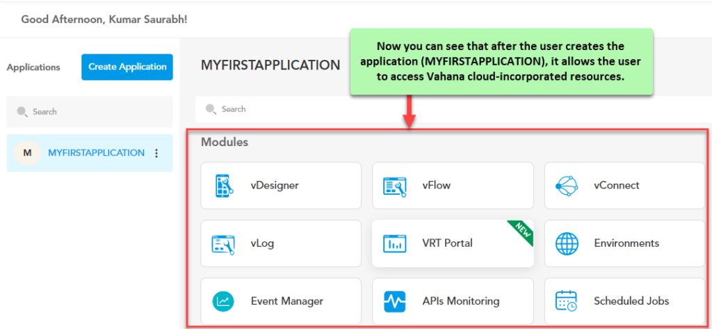
Accessing vFlow Module
After you create your first application in your Vahana account, it lets you access Vahana cloud incorporated resources. You can access these resources without using your Vahana credentials.
To access the vFlow module:
- After you log in to the Vahana portal, the Vahana portal’s home page opens.
- On the home page, see the top panel.

- In the top panel, click the list to select the organization (workspace) in which you want to access the newly created application.
- After you select the organization, the Vahana portal displays the application’s dashboard.
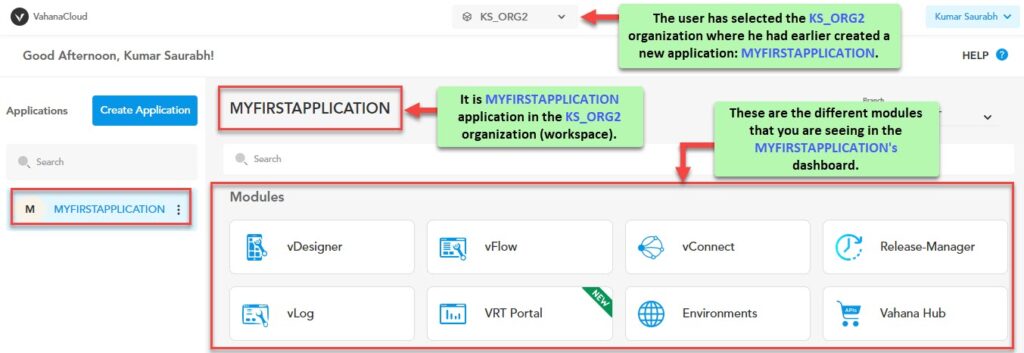
- The application dashboard displays different modules (applications and services) that you can access.
- Scroll down the application dashboard and find the vFlow New module.
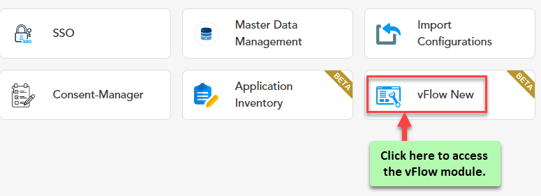
- Click vFlow New, the vFlow Designer’s home page opens.
Note:- The vFlow module is also referred to as vFlow Designer.
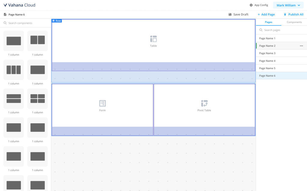
vFlow Module’s Dashboard (At a Glance)
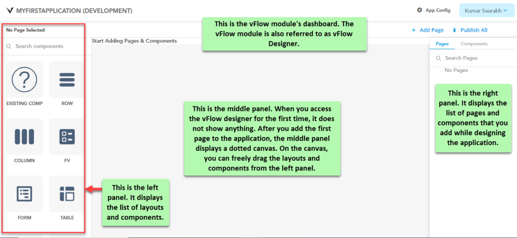
The vFlow module’s dashboard contains the following panels and utilities:
| Section/Panel/Utility | Description |
| Left Panel | It displays the list of layouts and components. |
| Middle Panel | After you add the first page to the application, the middle panel displays a dotted canvas. On the canvas, you can easily drag the layouts and components to design an application. |
| Right Panel | This panel displays the list of pages and components that you add while designing an application. In a way, this panel helps you view and track what you have added to design the application. The right panel contains two following tabs: –> Pages:- In the right panel, this tab is selected by default. This tab displays the list of pages that you add while designing an application. –> Components:- In the right panel, when you click this tab, it displays the list of components that you add to a specific page. |
| App Config | After you click App Config, the App Config page opens. On the App Config page, you can configure the application build-level properties when you publish your application. |
| Upper Top Panel | The upper top panel contains the following utility/data: –> Name of application (MYFIRSTAPPLICATION) –> App Config functionality –> Application user’s name |
| Lower Top Panel | It contains the following functionalities: –> Add Page:- You can click this functionality to add a new page. –> Publish All:- If you click Publish All, the vFlow module creates the application’s build. |
Adding a New Page
After you access the vFlow Designer, you can see that you are ready to design an application. The application’s name in the top panel is the project name of the new application. Thus, you can start designing your application.
Let’s start with adding a new page or first page of your application. You can start with landing page or home page of the application.
After the end-user will access the application, it will take the end-user to the home page or landing page.
Note:- The vFlow module’s usability scope does not restrict its usage only to experienced IT professionals. If you want to proficiently use the vFlow module, you must have prior basic knowledge of wireframing or interface design.
To add a new page:
- On the vFlow module’s dashboard, see the lower top panel.
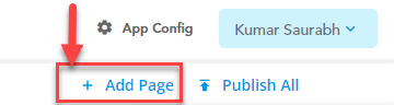
- In the lower top panel, click Add Page, and the Edit Page Config dialog box opens.
- On the Edit Page Config dialog box, you can configure several page-related properties as follows:
| Property Category | Basic |
| Property Type | Description |
| Page Category | In this list, select one of the followings: Private:- Select this option to make the page a private page. The end-user can access the private page through successful authentication. Public:- Select this option to make the page a public page. Each end-user can access the public page. |
| Type | Click this list to select one of the following options: i. Page:- Select this option to make the page as a page. The page is the largest entity in the vFlow module. On the page, you add layouts, components, and elements. ii. Sub Page:- A sub-page is used to design a layout at the element level. You can add several components to a page such as form, tab, stepper, and others. iii. Pop Up:- The popup window that is also referred to as a dialog box appears in the foreground of the main application as a result of user-action. The popup is used to display the information. Also, you can include a popup to get input from the end-user. |
| Page Title | In this field, enter the title or name of the page. |
| Page URL | In this field, enter the page’s URL (for example:- /www.xyz.com). When you enter the page’s URL, prefix it with the forward slash character (“/“). The page URL specifies the page’s path. When you access a page in the application, the browser’s address bar displays the page’s URL. |
| Breadcrumb | In this field, enter a random alphanumeric value (for example:- homepg). This random value helps the end-user view and track the navigation map through which the user has reached the current page.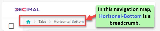 |
| Page Description | In this field, you can optionally enter a brief description of the page. |
| Property Category | UI Properties |
| Property Type | Description |
| Enter Tooltip for Popup close icon | In this field, enter the tooltip text that will appear when the end-user places the mouse pointer on the Close button in the popup screen. |
| Data Style | This group of several properties allows you to configure the look and feel, background, and size of the text that the page will display. You can configure the following properties: 1. For the data that the page displays to the user –> Font Family –> Font Size –> Text Align (left, center, right) –> Text Transformation (uppercase, lowercase) 2. For the Page –> Height and Width (Component’s height and width) –> Padding –> Margin –> Animation Style, etc To define the text-related properties, you can enter the property’s value in the “pixel”, “VH”, or percentage units. In the list of UI properties, a few complex properties are briefly described as below: i. Padding:- It defines the padding (inner space) around each side of the page. ii. Margin:- It defines the margin (whitespace) around each side of the page. iii. Border Radius:- It defines the radius of the entity’s edges. Defining the edge’s radius makes the edge round. iv. Add CSS Classes:- In this field, enter the class’s name (for example:- test-popup) that contains the CSS properties. When you configure the application’s settings by using the App Config utility before you publish it, you can define the CSS class. To define the CSS class: 1. On the vFlow module’s dashboard, see the upper top panel. 2. In the upper top panel, click App Config, and the App Config page opens. 3. On the App Config page, see the CSS Custom Classes area. 4. In the CSS Custom Classes area, click in the CSS Classes box and then define the CSS properties. 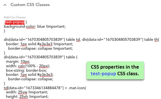 |
| Property Category | Properties |
| Property Type | Description |
| is Enable | When you click this check box, the page becomes active in the application. On the active page, the end-user can perform the function. |
| Both Browser Button Disable | When you click this check box, the application displays the current page with inactive Back and Forward buttons. It means that you cannot navigate from the current page by clicking the Back or Forward buttons. |
| Disable Message | In this field, you can enter a brief message text to tell the user why the page is turned inactive (disable). Note:- You can configure this property when you do not click the is Enable check box. |
| Webview Whitelist URL | In this field, you can enter the URL(s) that you want to whitelist. To enter more than one URL, you can separate two URL strings by a comma. Whitelisting a URL means that you can access the URL from within your application. |
| Background Image | In this field, enter an image’s URL. After the application loads the page on the device, it displays the image in the background of the page. |
| Property Category | Dependents |
| Property Type | Description |
| Page Header | This field displays the page header’s content after you configure the header’s content by clicking Add Header. |
| Page Footer | This field displays the page footer’s content after you configure the footer’s content by clicking Add Footer. |
| Events | This field displays the event that you configure by clicking Add Event. |
- After you configure these properties, click Submit, and the vFlow module successfully creates the page.
Note:- When you add a page, it is not necessary that you configure all properties in the Edit Page Config dialog box. You can configure a group of properties based on application related functional requirement. For instance:- When you add a page to the application, you can configure an event on the respective page later.
Adding Layout to a page
In the vFlow module, designing an application is a user-friendly and clutter-free experience. If you have the basic details of the application wireframe or interface design, you can build the application merely by dragging components and elements. To implement the functionality, you can configure several events on the page, component, or element level.
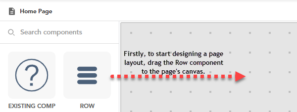
Let’s understand what and how to perform the next function after you add the first page to the application. To define a layout on the page, you first add a row to the page.
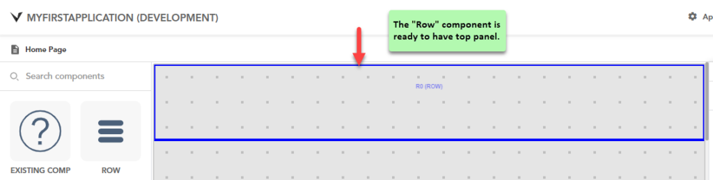
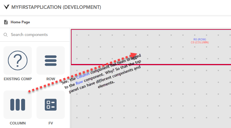
After you add a row, you need to add a column to the row. Now the question arises: why a column? Why not a component that you can directly add to the row? The answer for this question is as follows:
In the application design mechanism through the vFlow module, adding a component to a page requires a parent container. And the “Column” layout serves as a parent container for each component that you add to the page. Thus, If you want to add three components to a page, you first need to drag a column to the row layout and then drag these components to the column layout.
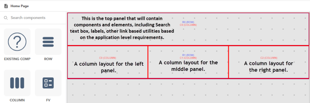
Let’s assume a case where you want to have the following sections in the application:
- Top panel
- Left navigation panel
- Middle panel
- Right panel
To design such a specific layout:
- In the right panel, under Pages tab, double-click the page (For example:- Home Page), and the middle panel displays the page’s canvas.
- In the left panel, find the Column component.
- Drag the Column component to the Row component.
- Drag another Row component to the canvas under first row.
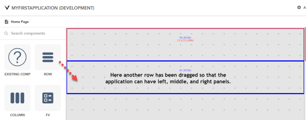
- After you drag the second row, drag a column to the second row for the left panel.
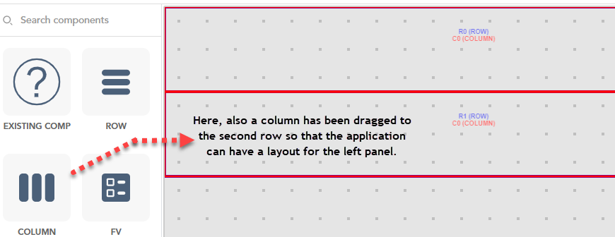
- Drag more two columns to the second row for the middle and right panels.
Adding Component to a Layout
After you add multiple layouts to a page based on wireframing or a planned interface design, your next work is to add a component to a layout. At the entity-level, the vFlow module treats a component as a special container that has one or more elements.
Based on usage, each component has different types of elements. For instance:- In the list of components, the “Tab” component is used to add the “Tab” element. In the software application, a tab is used to display different set of information or group of elements (interface) in a layout.
Similarly, the “FV” component, which is referred to as “Functional View” component, contains several elements that you can use in the application. The “FV” component contains text (label), image, hyperlink, button (push button), check box, etc.
Let’s design the left panel by adding a component to the extreme left layout.
To add a component to the layout:
- On the vFlow module’s dashboard, see the left panel.
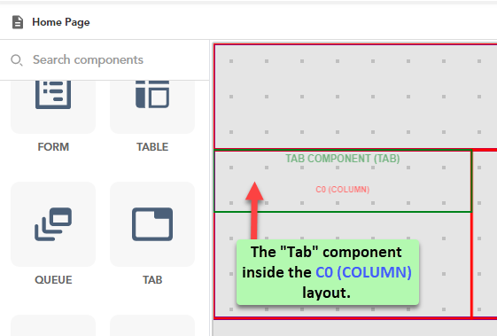
- Scroll down the left panel and then see the Tab component.
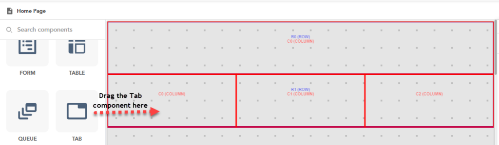
- Drag the Tab component to the left layout (for example:- c0 (column)), and the left layout starts displaying the Tab component.
- Click in the Tab component, and a pop-up window opens.
- In the pop-up window, find the Tab component.
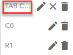
- After you find the Tab component, click the adjacent Edit icon (
 ), and the Tab Component panel opens.
 - In the Tab Component panel, you can perform the following functions:
- Change the component’s basic properties, UI properties, dependents properties, etc.
- Configure an event on the component, etc.
- View the list of elements
- Add the elements to the application
- Configure event on the element, and others
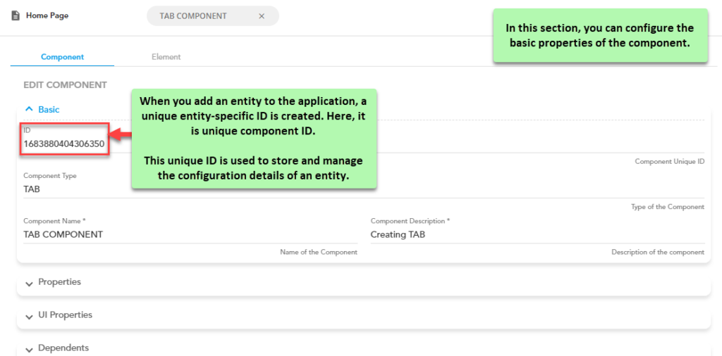
In the Tab Component panel, under Component tab, you can also change the UI and Dependents properties. In the UI properties, you can change the font, background, and animation related properties, including applying the CSS properties, etc.
In the Dependents properties, you can configure entity’s header’s and footer’s content, and configure the available event (for example:- On Load).
Note:-
To read and understand the components related properties at a broad level, you can visit the post: vFlow Components and Elements.
Adding Element to a Layout
After you drag a component to the column layout, you can add one or more elements in the layout based on functional requirement of the application. Thus, dragging the component to the layout depends on the elements that you want to use in the layout. Using the element in the layout depends on the functional requirements of the application that you are developing.
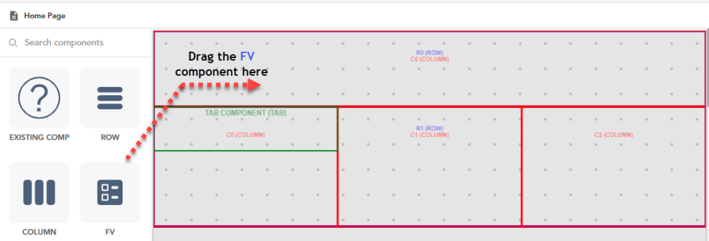
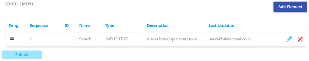
This section describes how to use the FV component to add several common elements to the layout. Assume you want to add a text box for the search function in the top panel that has the R0 (Row) and C0 (Column) layouts.
To add the element:
- On the vFlow module’s dashboard, see the left panel.
- In the left panel, search the FV component.
- After you find the FV component, drag it to the top panel (R0 (Row) C0 (Column)), and the top panel starts displaying the FV component.
- Click in the FV component, and a popup window opens.
- In the popup window, find the FV component.
- After you find the FV component, click the adjacent Edit icon (), and the FV Component panel opens.
- In the FV Component panel, under Edit Component, configure FV component-related properties as described in the section: Adding Component to a Layout.
- After you configure FV component-related properties, click the Element tab, and the FV Component panel displays the Edit Element area.
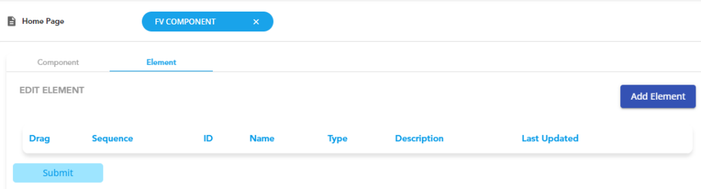
- In the Edit Element area, click Add Element, and the Select Element dialog box opens.
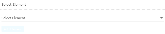
- In the Select Element dialog box, click the Select Element list, and the list expands and displays several available elements in the FV component.
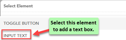
- Scroll down list and then select an element (for example:- Input Text) to add it to the layout.
- After you select the element (for example:- Input Text), click Add Element, and the Edit Element area displays the following properties’ tabs:
- Basic
- Properties
- UI Properties
- Additional Properties
- Events
Note:- Let’s learn how to add an element to the layout by entering minimum and mandatory information.
- In the Edit Element area, see the expanded Basic tab.
- Under the Basic tab, enter the element’s details as follows:
| Tab | Basic |
| Property Type | Description |
| Sequence | In this field, enter a numeric value (for example:- 2). This numeric value specifies the sequence number of the element on the page. The application will display the element to the user based on its sequence number. While adding an element: –> If the device width, including laptop, mobile, and tab, is 100 percent, the application will display the element from the top at the specified sequence number. –> If the device width, including laptop, mobile, and tab, is less than 100 percent, the application will display the element from the right at the specified sequence number. |
| Element Name | In this field, enter the element’s name (for example:- Search). |
| Element Description | In this field, enter a brief description of the element. |
- After you enter the element’s details, scroll down and then click Submit, and the vFlow module displays the details of the newly added element.
- Under the element’s details, click Submit, and the vFlow module adds the element to the layout.