
Accordion Header
This post is referring to Vahana 2 (beta version). To check the document for production, please go to vDesigner-v1.0
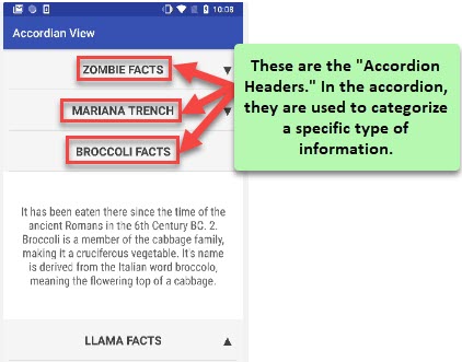
The “Accordion Header” is a part of the “Accordion” element. The “Accordion Header” is placed on top of the “Accordion” element. It is used to display the thumbnail or label. In the “Accordion Header” element, a thumbnail or label specifies the topic or title of written information or data in the “Accordion” element.
Accordion Header helps you manage and categorize a set of data (information) under different topics or headings in the “Accordion” element.
Usage
| When to use |
| –> Use the accordion header to categorize a group of data or information. –> Use accordion header as a topic or parent header so that the user can access the intended information. –> Use small words as a topic name or thumbnail in the accordion header. |
Accordion Header Configuration
The “Accordion Header” element has the following property:
- UI Configuration
UI Configuration
For the “Accordion Header” element, you can configure the following properties:
| Tab | Property Name | Description | Mandatory | New Default Value | Visibility Rules |
| Basic | Reference Name | Specifies a unique name of the element. At the application level, an element is identified and managed by the reference name. | Yes | ||
| UI Properties-Background | Background Color | Allows you to configure the background color of the accordion header element. To configure the background color: –> In the Background Color box, click the left color box (  ), and a color canvas open. ), and a color canvas open.–> On the canvas, on the horizontal bar, move the circle to select the color. –> In the upper section, move the circle to select the tone of the color. | No | ||
| UI Properties-Background | Image | Allows you to configure an image as the background of the accordion header. | No | ||
| UI Properties-Background | Image Source | This box comes into view after you select Image in the Background list. To configure an image as the accordion header’s background, you can use one of the following options: –> URL –> Asset Library | When Background = Image | ||
| UI Properties-Background | Image URL | This box comes into view after you select URL in the Image Source list. In the Image URL box, enter the URL of an image. The application fetches the image from the URL-based location and then displays it as the accordion header’s background. | Yes | When Image Source = URL | |
| UI Properties-Background | Select Asset | This box becomes visible after you select Assets Library in the Image Source list. This property allows you to configure an image as the element’s background from the Assets Manager module. To configure the image: –> Click the asset library icon (  ), and the Select Asset dialog box opens. ), and the Select Asset dialog box opens.–> In the Select Asset dialog box, select an image and then click Select, and you successfully configure the image as the element’s background. | Yes | When Image Source = Asset Library | |
| UI Properties-Background | Opacity | Opacity is the degree to which content behind an element is hidden, and is the opposite of transparency. While configuring the background color, you can also define the opacity in the percentage unit. | No | 100% | |
| UI Properties-Alignment & Spacing | Padding | Allows you to desirably define padding around each side of the element. It provides four different boxes to define the padding around the right, left, top, and bottom side of the element. The padding defines the space between the element’s content and element’s border. | No | Theme Variable (Padding) | |
| UI Properties-Alignment & Spacing | Margin | Allows you to define a margin around each side of the element. It provides four different boxes to define the margin outside the right, left, top, and bottom borders of the element. The margin property defines the space around each side of the element’s border. In other words, it creates extra space outside the element’s border. | No | Theme Variable (Margin) | |
| UI Properties-Alignment & Spacing | Container Internal Alignment | This property offers the following alignment options to align an element in a container element. 1. First List:- It provides the following alignment options: a. Left b. Center c. Right 2. Second List:- It provides the following alignment options: a. Top b. Middle c. Bottom d. Space Around e. Space Between f. Space Evenly | No | ||
| UI Properties-Icon | Choose Icon | This property allows you to select an icon for the accordion header from the material.io design system. | No | ||
| UI Properties-Icon | Size | Allows you to define the icon’s size in pixels. | No | 16 | |
| UI Properties-Icon | Color | Allows you to define the icon’s color. To define the icon’s color: –> In the Color box, click the left color box (  ), and a color canvas open. ), and a color canvas open.–> On the canvas, on the horizontal bar, move the circle to select the color. –> In the upper section, move the circle to select the tone of the color. | No | ||
| UI Properties-Icon | Margin | allows you to define the space outside the icon’s border. | No | [0, 0, 16, 0] | |
| UI Properties-Icon | Position | Allows you to place the icon to right or left of accordion’s header’s text. To position the icon, it provides the following options: a. Left b. Right | No | Right | |
| UI Properties-Shape & Decoration | Width Value | Enter the width of the element in the pixel unit or percentage unit. | No | ||
| UI Properties-Shape & Decoration | Height Value | Enter the height of the element in the pixel unit. | No | ||
| UI Properties-Shape & Decoration | X | Allows you to move the element along the X-axis; when the value increases, the element moves from left to right. | No | ||
| UI Properties-Shape & Decoration | Y | Allows you to move the element along the Y-axis; when the value increases, the element moves from top to bottom. | No | ||
| UI Properties-Border | Border Color | Allows you define the color of the element’s border. To define the color: –> In the Border Color box, click the left color box ( ), and a color canvas open.–> On the canvas, on the horizontal bar, move the circle to select the color. –> In the upper section, move the circle to select the tone of the color. | |||
| UI Properties-Border | Border Radius | Allows you to define the radius of the element’s corners. Defining the radius of the corner makes the corner of the element round. | |||
| UI Properties-Border | Border Weight | Allows you to define the thickness of the accordion header’s border. | |||
| UI Properties-Border | Opacity | Opacity is the degree to which content behind an element is hidden, and is the opposite of transparency. While configuring the background color, you can also define the opacity in the percentage unit. |
UI Configuration (Accordion Header Text)
| Tab | Property Name | Description | Mandatory | New Default Value | Visibility Rules |
| Basic | Reference Name | Serves as a unique identifier for the accordion header’s text. At the application level, the header’s text is identified and managed by the reference name. | Yes | Page63972_Text_1 | |
| Basic | Text | Allows you to define the accordion header’s text. | No | <<text value>> | |
| Basic | Default Value | Allows you to configure the default value of the header’s text. To configure the default value, you can use the following methods: 1. By using Static function: To define the default value by using the Static function: a. Click in the Default Value box, and a smart selector expands. b. In the smart selector, enter Static, and the Static function appears in a list. c. Select the Static function.  d. In the Static function, click the Number parameter, and a list of different data types opens. e. In the list, select String. 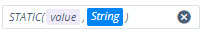 f. In the Static function, click the value parameter and then enter a default value (for example, Please enter a header’s text) in place of the value parameter. 2. By using entity: To define the default value by using the entity: a. Click in the Default Value box, and a smart selector expands. b. In the smart selector, select the entity. When the application loads the accordion header, it fetches the header’s default value from the entity. 3. By using element: To define the default value by using an element: a. Click in the Default Value box, and a smart selector expands. b. In the smart selector, select the element When the application loads the accordion header, it fetches the element’s value and then displays it as the default value of the header text. | No | ||
| Basic | Underline | If you click the Underline check box, the app will display the accordion header’s text with the underline effect. By default, this check box is clear. | No | Clear Check box | |
| UI Properties-Text | Font | Click this list and then select a font (for example, Arial) for accordion header’s text. | No | Roboto | |
| UI Properties-Text | Size | In this box, enter a value to define the font’s size in pixels. | No | ||
| UI Properties-Text | Color | Allows you to define the header text’s font’s color. To define the color: 1. Click in the left Color box (  ), and a color canvas opens. ), and a color canvas opens.2. On the canvas, on the horizontal bar, move the circle to select the color. 3. In the upper section, move the circle to select the tone of the color. | No | #000000 | |
| UI Properties-Text | Weight | Allows you to define the thickness of the header text’s font in pixels. | No | ||
| UI Properties-Text | Line Height | In this box, enter a numeric value in pixels (for example:- 18). This value specifies the character’s height in the input text. | No | ||
| UI Properties-Text | Letter Spacing | In this box, enter a value in pixels. This value specifies the space between characters in the input text. | No | 0 | |
| UI Properties-Text | Text Alignment | Allows you to align the header’s text by providing the following options: a. Left b. Center c. Right | No | Left | |
| UI Properties-Shape and Decoration | Type | Under the Shape and Decoration section, this property has the two following options: Autofill:- If you select this option, the text will occupy the available space of the accordion header. Manual:- If you select this option, you can define a specific size of the header’s text. | Yes | Autofill |
Data Configuration
| Tab | Property Name | Description | Mandatory | New Default Value | Visibility Rules |
| Data | Entity Path | This property allows you to configure an entity path. You can configure an entity path when you want to store the header’s text in an entity. To configure an entity: a. Click in the Entity Path box, and a smart selector expands. b. In the smart selector, select an entity to store the header’s text’s value in it. | No | {f{x}} |
Event Configuration
On the accordion header’s text, you can configure the following event:
- onClick
Was this article helpful?
YesNo