
Getting Started with vDesigner
Introduction
This post covers and broadly describes all basic functions in vDesigner. A beginner (new user) can perform these basic functions to learn the vDesigner. Later, the user can hone the skills to design the enterprise-grade robust mobile applications. These basic-level functions serve as a stepping stone to the advanced features that user can use to implement complex algorithms and functionalities.
Throughout its complete functional scope, the vDesigner module offers an interactive list of features and the lucidity to navigate between different components to design clutter-free enterprise-grade applications. These basic functions are described as below:
vDesigner Toolbar
The vDesigner toolbar is a group of most frequently used functionalities that a user can perform to develop an application. When you design an application on vDesigner, you can find the icons of important functionalities on the vDesigner toolbar. To design an application, you can directly access these functinalities on the toolbar.
On the vDesigner toolbar, you can use different icons to:
- Add a new page
- Add new element
- Make the left panel appear or disappear
- Make the property panel appear or disappear
- Apply a theme
- Enable or disable the grid
- Make the layout appear or disappear, and others.
The toolbar functionalities are briefly described as below:
| Tool (Icon) | Description |
 (Toggle Leftbar) (Toggle Leftbar) | Clicking this icon makes the left panel appear or disappear. The left panel displays the application tree. |
 (Toggle Sidebar) (Toggle Sidebar) | Clicking this icon makes the property panel of the UI block (Page, layout, element) appear or disappear. |
 (Create Page) (Create Page) | Click this icon to add a new page to the application. |
 (Theme) (Theme) | Click this icon to apply a theme to the application. After you click this icon, the Theme panel opens. |
 (Grid) (Grid) | After you click this icon, the Grid box opens. On the Grid box, you can: –> Change the size of grid –> change the color of grid’s line –> Move the handle to make the grid disappear or appear The grid helps you position the element on the canvas. The vDesigner toolbar provides a baseline grid of 4 dp (density-independent pixels), which can be changed to 8, 12, or 16 dp, or the user can create a custom grid. |
 (Layout Toggle) (Layout Toggle) | Clicking this icon makes the row or column layout appear or disappear. |
 (Undo) (Undo) | This function allows you to erase last five changes that you perform on the current page. |
 (Redo) (Redo) | This function allows you to restore last five changes that you erase by using the ?Undo? function. |
 (Sync Module) (Sync Module) | Clicking this icon syncs the configuration of the application with the configuration details that are stored in the data store. At the application-level, the configuration details include: –-> Configuration of different pages –> Configuration of elements on different pages –> Events and tasks level configurations |
 (Save) (Save) | Clicking this icon saves the application along with the new changes that you incorporate into it. |
 (Preview) (Preview) | Clicking this icon displays the current application page in “Preview Mode“. |
 (Publish) (Publish) | Click this icon to publish the application. After you publish the application, the vDesigner module creates a build of the application. |
 | This icon displays the size of the canvas where you design the application. |
Create a New Page
To start with the vDesigner application, you first create a page in the app or application (vDesigner project). Thus, you can create multiple pages in the application.
To create a page:
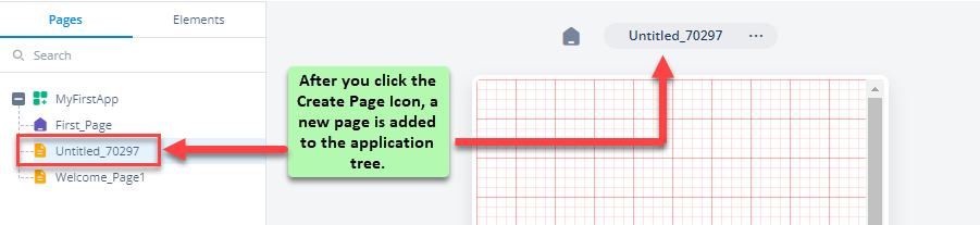
- On the home page of the vDesigner application, see the upper Quick Access Toolbar.
- On the toolbar, click the Create Page icon (), and a new page is added to the application tree.
Assign a Title to Page
After you create a page, you can assign a title to the page.
To assign a title to the page:
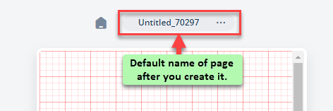
- At the top of the mobile phone canvas, see the default name of the screen.
- Double-click the default name of the screen to select it, and the default name becomes editable.
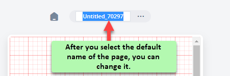
- In place of the default name, enter a suitable title for the page and then press Enter, and the page’s title is successfully changed.
Add a New Element
After you add a page to the application, you can add multiple elements and components to the page based on project-specific requirements.
To add a new element:
- On the vDesigner dashboard, see the left panel.
- The left panel displays the application tree.
- In the left panel, under the Pages tab, in the application tree, select the page (For example:- Home_Page) where you want to add the element.
- After you select the page, click the Elements tab, and the left panel displays different elements in the card format.
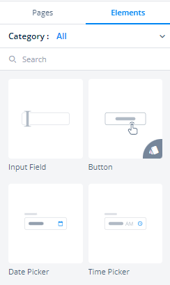
- In the search box, enter the name of the element to find it.
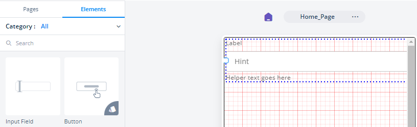
- After you find the element (For example:- Input Field), drag it to the canvas.
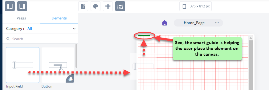
- After you drag the element to the canvas, the element is added to the canvas.
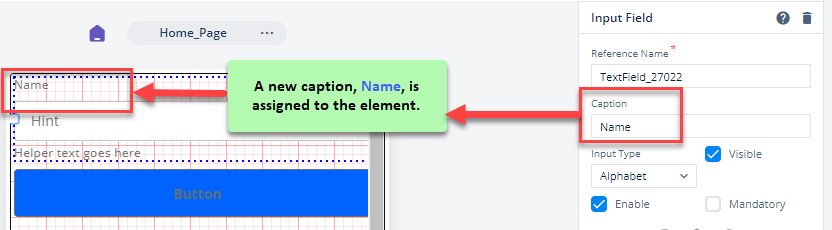
Assign a Caption to Element
After you add an element to a page, you can configure multiple properties for that element. For instance:- you can provide caption to the element, change the background color of the element, change the dimensions (width and height) of the element, etc.
This section describes how you can change the caption of the element. On the application page, the caption serves as the title of the element. By its caption, you can identify an element.
To assign a caption to the element:
- In the middle pane (mobile phone canvas), on a specific page, click the element (For example:- Input Field), and the Input Field property panel of that element opens.
- In the Input Field property panel, find the Caption box.
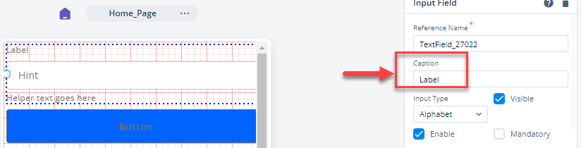
- In the Caption box, enter the caption of the element (For example:- Name), and then click Apply, and a new caption is assigned to the element.
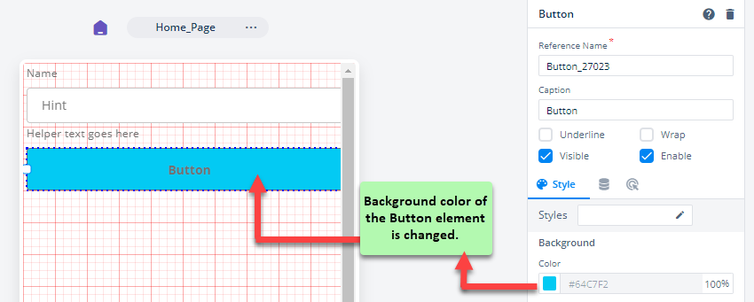
Change Background Color of an Element
When you configure different properties of an element, you can also change the backgroung color of the element. Let us understand this function by changing the background color of the button.
To change the background color:
- In the middle pane, click the element (For example: – Button), and the Button property panel opens.
- In the Button property panel, see the Style tab (
 ).
). - Under the Style tab, see the Background area.
- Under Background, see the Color box.
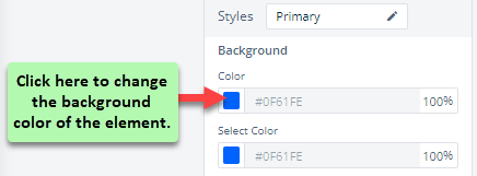
- In the Color box, click the left most section, and a color canvas opens.
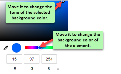
- On the color canvas, you can move the circle of the multicolor bar to select the new background color of the element.
- On the color canvas, you can move the circle to change the tone of the selected background color.
- After you select the background color, click Apply, and the background color of the element is changed.
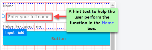
Assign a Hint Text to Element
When you design an application’s page, you sometime provide a hint text along with the element. The hint text helps the user perform the function on the element. Let us understand this function by assigning the hint text to the Input Field element.
To assign a hint text:
- In the middle pane, click the element (For example:- Input Field), and the Input Field property panel opens.
- Scroll down the Input Field property panel and then find the Hint area.
- Under Hint, see the Text box.
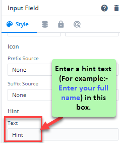
- In the Text box, enter a hint type text (For example:- Enter your full name), and then click Apply, and the Input Field element displays the hint text.
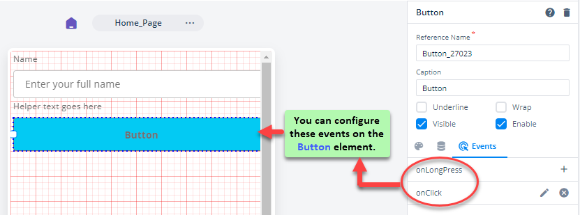
View List of Events for an Element
vDesigner offers one or more events for different elements. On an element, these events can be configured with respect to the user action. When an end-user performs the function on the element, the configured event on that respective element triggers and then performs the intended function. For the elements, vDesigner offers a variety of events such as onClick, onLongPress, onCompletion, etc.
When you start working with vDesigner, you can find multiple elements that provide one or more events that you can configure on that respective element. Also, you can find a few elements that do not provide any event that you can configure. The availability of the event with a specific element depends on the usage of the element for designing the application.
For instance:- While the “Button” element provides the onClick and onLongPress events, the “Row” element does not provide any event to configure. The reason behind this is that the user can perform the function on the button element. The row element is used as a layout to place other elements horizontally or vertically.
To view the list of events:
- In the middle pane (Mobile phone canvas), click the element (For example:- Button), and the Button property panel opens.
- In the property panel, find the Events icon (
 ).
). - Click the Events icon (), and the property panel displays the list of events that you can configure to the button element.
Miscellaneous Functions on Element
Apart from managing look and feel and other UI-related properties, you can perform several common functions to control and manage the position of the element. You can perform these functions by right-clicking the element. After you right-click the element, a context menu opens. The context menu has the following functions:
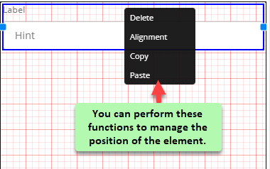
| Function | Description |
| Delete | Click it to delete the element from the WYSIWYG editor. |
| Alignment | After you point to Alignment, you can click one of the followings: –> Left:- Click it to align the element to the left. –> Right:- Click it to align the element to the right. –> Centre:- Click it to align the element to the center across its horizontal position. |
| Copy | Click it to copy the element to the same page or another page. |
| Paste | Click it to paste the copied element to the same page or another page. |