
LOV (List of Values) Seekbar
This post is referring to Vahana 2 (beta version). To check the document for production, please go to vDesigner-v1.0
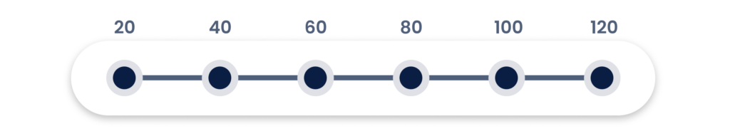
The LOV Seekbar contains a list of values. It allows the user to define the specified values from the available list of the values.
Usage
| When to use |
| Use the LOV Seekbar if the user needs to select more than one value by moving the Seekbar. LOV Seekbar works best if you want to use the alphanumeric and character based values as the list of values. |
LOV Seekbar Configuration
The “LOV Seekbar” element consists of the following properties:
- UI Configuration
- Event Configuration
UI Configuration
For the “LOV Seekbar” element, you can configure the following UI properties:
| Tab | Property Name | Description | New Default Value | Visibility Rules |
| Basic | Reference Name | Specifies a unique name of the element. At the application level, an element is identified and managed by the reference name. | lovSeekBar 1 | |
| Basic | Caption | Specifies the title of the element. | LOV Seekbar | |
| Basic | Input Source | This property allows you to configure the source location for the following purposes: –> Fetch data from the source and the display it on the element. –> Store data in the source. You can click one of the following tabs to configure the input source: 1) Data Store:- If you select this tab, the Input Value box appears. In the Input Value box, select an entity based array type JSON object. After you select an array type JSON object, the application will access the object and then perform one of the following functions: –> Fetches data from the object and display it in the element –> Stores data in the object 2) Enumeration:- If you select this tab, a Select Master list appears. Click the Select Master list, and then it displays a list of enumeration objects from the Data Modeler. In the list, select an enum object. After you select an enum object, the application will perform one of the following functions: –> Fetch data from the enum and then display it on the element –> Store data in the enum Note:- To use the enum object, you need to define enumeration in the Data Modeler. | ||
| Basic | Input Value | Click in this box and then select an array type object. After you select the object, the application will perform one of the following functions: –> Fetch data from the object and then display it in the element. –> Store data in the object. | {{fx}} | When Input Source = Data Store |
| Basic | Tooltip | This property allows you to configure the tooltip feature as follows: –> Yes:- Selecting this value activates the tooltip feature for the LOV Seekbar. –> No:- Selecting this value deactivates the tooltip feature for the LOV Seekbar. | marked | |
| Basic | Save LOV Object As Output | Use this property to store the pair of key (code) and value as an object in a key. You can define a key (a named variable) in the property panel of the element. After you select this check box, the Key Name For Code and Key Name For Value input fields come into view. The key (code) and value are primarily stored in the enum object or JSON array. When a user selects a value in the element, its key (code) and the selected value are stored in the named variables (key). You define the named variables in the Key Name For Code and Key Name For Value input fields. | ||
| Basic | Key Name For Code | In this box, enter a key (for example, age_code). This named variable, age_code, will store the key (code) (for example, CH) after the user selects 15 in the element. | ||
| Basic | Key Name For Value | In this box, enter a key (for example, age_value). This named variable, age_value, will store the value (for example, 15) that a user selects in the element. | ||
| Basic | Visible | Allows you to define the default visibility of the UI element. | marked | |
| Basic | Business Rule | Click this list and then select a pre-defined business rule that will determine the element’s visibility. If the user’s action satisfies the condition in the business rule, the application will display or hide the element. To define the business rule, access the Business Rule Manager module. | ||
| Basic | Enable | Allows the user to enable/disable an element. You can decide whether the element needs to be clickable and usable. | marked | |
| Basic | Business Rule | Click this list and then select a business rule to make the element active or inactive. If the user’s action satisfies the condition in the business rule, the application will make the element active or inactive in the application. To define the business rule, access the Business Rule Manager module. | ||
| Basic | Mandatory | Allows you to configure the element as a mandatory element. | unmarked | |
| Basic | Message on Failure | This property becomes visible when you select Yes under Mandatory. In the Message on Failure box, enter the error message that the application will display if the user does not perform the function on the element. | Required | when mandatory = checked |
| Basic | Default Value | This property allows you to define the default value of an element. To define the default value: –> Click in this box, and it displays the list of the pre-define functions, attributes, and element IDs. –> In the list, select an attribute from which the application will fetch the default value and then display it in the element. | {{fx}} | |
| Basic | Parent Element ID | In this list, you can select the ID of an element. Based on the selected ID of an element, the current element will display the list of values. To select the element ID: i. Click in this box, and it displays the list of the pre-defined functions, attributes, and element IDs. ii. In the list, select an element’s ID. | {{fx}} | |
| UI Properties | Styles | Allows you to select a specific style for the element from the list of pre-defined styles. The vDesigner module offers pre-defined styles that you can apply to the element. | No | Default |
| UI Properties- Alignment & Spacing | Margin | Allows you to desirably define margin around each side of the element. It provides four different boxes to define the margin outside the right, left, top, and bottom border of the element. | Theme Variable (Margin) | |
| UI Properties- Alignment & Spacing | Element’s Alignment | This property contains three tabs. You can use these tabs as follows: 1. Left:- By default, this tab is selected. It aligns the element to the left of the page. 2. Center:- If you select this tab, it aligns the element at the center of the page. 3. Right:- If you select this tab, it aligns the element to the right of the page. | No | Left |
| UI Properties- Caption | Font | Select the font type (For example: – Arial) of the element’s caption. | Theme Variable (Font Family) | |
| UI Properties- Caption | Size | Enter the font size of the caption. | 12 | |
| UI Properties- Caption | Color | Select the color of the font of the caption. | Theme Variable (Caption) | |
| UI Properties- Caption | Bold | Enter the thickness of the character of the element’s caption in the range of values from 1 to 9. | 4 | |
| UI Properties- Caption | Style | Select the style of font (For example:- Italic) of the caption | Normal | |
| UI Properties- Shape & Decoration | Type | Under the Shape and Decoration section, this property has the two following options: Autofill:- If you select this option, the element will occupy the available space of the parent layout. Manual:- If you select this option, you can define a specific size of the element. | ||
| UI Properties- Shape & Decoration | Width Value | Enter the width of the element in the pixel unit or percentage unit. | 100% | |
| UI Properties- Shape & Decoration | Height Value | Enter the height of the element in the pixel unit. | Set as ___ & Disable | |
| UI Properties- Shape & Decoration | X | Allows you to move the element along the X-axis; when the value increases, the element moves from left to right. | Show & Disable | |
| UI Properties- Shape & Decoration | Y | Allows you to move the element along the Y-axis; when the value increases, the element moves from top to bottom. | Show & Disable | |
| UI Properties- Shape & Decoration | Pointer Font Size | In this box, enter the value (For example: – 18) that specifies the font size of the text/value that the pointer of the LOV Seekbar displays. | 12 | |
| UI Properties- Shape & Decoration | Select Color | Click the Color box and then define the color of LOV Seekbar when the user places the mouse pointer on the LOV Seekbar to select a value. | Theme Variable (Primary) | |
| UI Properties- Shape & Decoration | Opacity | Opacity is the degree to which content behind an element is hidden, and is the opposite of transparency. While configuring the color, you can also configure the opacity in the percentage unit. | 100% | |
| UI Properties- Shape & Decoration | Unselect Color | Click the Color box and then define the color of the LOV Seekbar when the user does not place the mouse pointer on the LOV Seekbar. | #e0e0e0 | |
| UI Properties- Shape & Decoration | Opacity | Opacity is the degree to which content behind an element is hidden, and is the opposite of transparency. While configuring the color, you can also configure the opacity in the percentage unit. | 100% | |
| UI Properties- Shape & Decoration | Thumb Color | Click the Color box and then define the color of the thumb of the LOV Seekbar. The user moves the thumb to select the value on the LOV Seekbar. | Theme Variable (Primary) | |
| UI Properties- Shape & Decoration | Opacity | Opacity is the degree to which content behind an element is hidden, and is the opposite of transparency. While configuring the color, you can also configure the opacity in the percentage unit. | 100% | |
| UI Properties- Shape & Decoration | Pointer Color | Click the Color box and then define the color of the pointer of the LOV Seekbar. | ||
| UI Properties- Shape & Decoration | Opacity | Opacity is the degree to which content behind an element is hidden, and is the opposite of transparency. While configuring the color, you can also configure the opacity in the percentage unit. | 100% | |
| UI Properties- Shape & Decoration | Active Color | Click the Color box and then define the color of the LOV Seekbar when the LOV Seekbar element is active and the user can use it. | Theme Variable (Primary) | |
| UI Properties- Shape & Decoration | Opacity | Opacity is the degree to which content behind an element is hidden, and is the opposite of transparency. While configuring the color, you can also configure the opacity in the percentage unit. | 100% | |
| UI Properties- Shape & Decoration | Inactive Color | Click the Color box and then define the color of the LOV Seekbar when the LOV Seekbar element is inactive and the user cannot use it. | #1068eb | |
| UI Properties- Shape & Decoration | Opacity | Opacity is the degree to which content behind an element is hidden, and is the opposite of transparency. While configuring the color, you can also configure the opacity in the percentage unit. | 100% | |
| UI Properties- Shape & Decoration | Pointer Text Color | Click the Color box and then define the color of the value that the pointer of the LOV Seekbar displays to the user. | #161616 | |
| UI Properties- Shape & Decoration | Opacity | Opacity is the degree to which content behind an element is hidden, and is the opposite of transparency. While configuring the color, you can also configure the opacity in the percentage unit. | 100% | |
| UI Properties-Tooltip | Show Tooltip | Click this check box to make a tooltip available with the element. | No | Clear Check box |
| UI Properties-Tooltip | Message | This property allows you to configure the message for a tooltip. To configure the message: Click in this box, and a smart selector expands. In the smart selector, you can select the following: 1. Static Function:- By using the static function, you can manually define the message inside the static function. 2. Element:- If you select the element, the application will fetch the message that is linked to the selected element. 3. Entity:- If you select an entity, the app will fetch the message from the entity. | Yes | When the Show Tooltip check box is selected |
| UI Properties-Tooltip | Color | This property allows you to define the color of the tooltip’s message. To define the message’s color: 1. Click the left Color box, a color canvas opens. 2. On the color canvas, move the circle on the upper bar to select the color of the tooltip’s text. 3. Move the circle on the lower bar to define the transparency of the selected color. | No | When the Show Tooltip check box is selected |
| Data | Entity Path | This property allows you to map an attribute to the element. You define the JSON based attributes in the entity in the Data Modeler module. To define the entity path: –> Click in the Entity Path box, and a list expands. –> The list displays several attributes from the entity. –> In the list, select an attribute to map it to the element. After the user performs the function on the element, the application can perform the following functions: a. Fetches data from the attribute and then displays it in the element. b. Stores data in the attribute. | {{fx}} |
Event Configuration
For the “LOV Seekbar” element, you can configure the following event:
- onSeek
Was this article helpful?
YesNo