
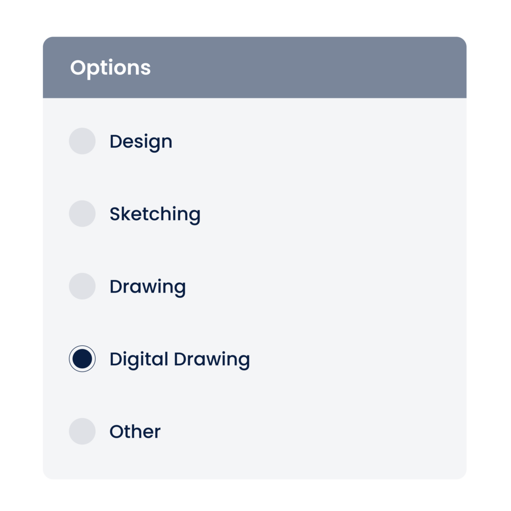
Radio
This post is referring to Vahana 2 (beta version). To check the document for production, please go to vDesigner-v1.0
The radio buttons represent a group of mutually exclusive options. In the group of radio buttons/mutually exclusive options, the user can select only one option.
Usage
| When to use | When not to use |
| When you have a very few options to display on the screen and want the user to select one of them. | Radio button is visible on the screen so do not use it if you have a long list of options to select from. For example:- Do not use the radio button if you want the user to select a city from the list of cities in a state.In this case, you must use the dropdown list. |
Radio Button Configuration
The “Radio Button” element consists of the following properties:
- UI Configuration
- Event Configuration
UI Configuration
For the “Radio Button” element, you can configure the following UI properties:
| Tab | Property Name | Description | Mandatory | New Default Value | Visibility Rules |
| Basic | Reference Name | Specifies a unique name of the element. At the application level, an element is identified and managed by the reference name. | Yes | RadioButton 1 | |
| Basic | Caption | Specifies the title of the element. | No | RadioButton | |
| Basic | Max in Row | This property allows you to configure number of rows that will display the radio button descriptor. | No | 1 | |
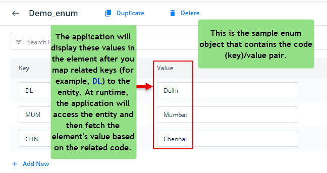
| Basic | Input Source | This property allows you to configure the source location for the following purposes: –> Fetch data from the source and the display it on the element. –> Store data in the source. You can click one of the following tabs to configure the input source: 1) Data Store:- If you select this tab, the Input Value box appears. In the Input Value box, select an entity so that the application fetches the data from the entity and then displays it in the element. Note:- To define the entity, you can refer to the Sample Array of Objects screen capture at the end of the post. 2) Enumeration:- If you select this tab, a Select Master list appears. Click the Select Master list, and then it displays a list of enum objects from the Data Modeler module. In the list, select an enum object. After you select an enum object, the application will access the enum object to fetch the data and then display it in the element.  Note:– To use the enum object, you need to define the enum object in the Data Modeler. For reference, see the screen capture at the end of the post. | Yes | ||
| Basic | Input Value | Click in the Input Value box, and a smart selector expands. In the smart selector, select the entity so that the application can fetch data from the entity and then display it in the element.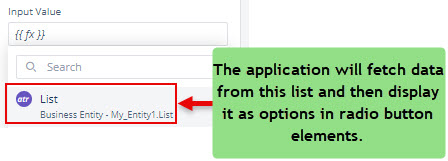 Note:- To view the code of a sample list (array of object), see the Sample Array of Objects screen capture at the end of the post. | Yes | {{fx}} | When Input Source = Data Store |
| Basic | Mapping | This property allows you to map the key or attribute of an entity. | No | When Input Source = Data Store | |
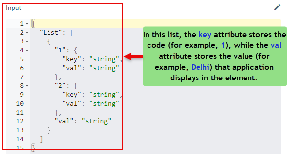
| Basic | Code | In this box, enter the attribute’s name that contains the code of the value. Note:- To understand how to define an attribute that stores a code, see the Sample Array of Objects screen capture at the end of the post. | Yes | When the Mapping check box is selected | |
| Basic | Value | In this box, enter the attribute’s name. This attribute stores the actual value that the application displays in the element. Note:- To understand how to define an attribute that stores the element’s value, see the Sample Array of Objects screen capture at the end of the post. | Yes | When the Mapping check box is selected | |
| Basic | Save LOV Object As Output | Use this property to store the pair of key (code) and value as an object in a key. You can define a key (a named variable) in the property panel of the element. After you select this check box, the Key Name For Code and Key Name For Value input fields come into view. The key (code) and value are primarily stored in the enum object or JSON array. When a user selects a value in the element, its key (code) and the selected value are stored in the named variables (key). You define the named variables in the Key Name For Code and Key Name For Value input fields. | |||
| Basic | Key Name For Code | In this box, enter a key (for example, city_code). This named variable, city_code, will store the key (code) (for example, DL) after the user selects Delhi in the element. Note:- If the user selects multiple values in the element, the key (named variable) will store multiple codes separated by commas. | |||
| Basic | Key Name For Value | In this box, enter a key (for example, city_value). This named variable, city_value, will store the value (for example, Delhi) that a user selects in the element. Note:- If the user selects multiple values in the element, the key (named variable) will store these multiple values separated by commas. | |||
| Basic | Wrap | Allows you to wrap the element around the radio button descriptor. | No | unmarked | |
| Basic | Visible | Allows you to define the default visibility of the UI element. | No | marked | |
| Basic | Business Rule | Click this list and then select a pre-defined business rule that will determine the element’s visibility. If the user’s action satisfies the condition in the business rule, the application will display or hide the element. To define the business rule, access the Business Rule Manager module. | No | ||
| Basic | Enable | Allows the user to enable/disable an element. You can decide whether the element needs to be clickable and usable. | No | marked | |
| Basic | Business Rule | Click this list and then select a business rule to make the element active or inactive. If the user’s action satisfies the condition in the business rule, the application will make the element active or inactive in the application. To define the business rule, access the Business Rule Manager module. | No | ||
| Basic | Mandatory | Allows you to configure the element as a mandatory element. | No | unmarked | |
| Basic | Message on Failure | This property becomes visible when you select Yes under Mandatory. In the Message on Failure box, enter the error message that the application will display if the user does not perform the function on the element. | No | Required | when mandatory = checked |
| Basic | Default Value | This property allows you to define the default value of an element. To define the default value: –> Click in this box, and it displays the list of the pre-define functions, attributes, and element IDs. –> In the list, select an attribute from which the application will fetch the default value and then display it in the element. | |||
| Basic | Parent Element ID | In this list, you can select the ID of an element. Based on the selected ID of an element, the current element will display the list of values. To select the element ID: i. Click in this box, and it displays the list of the pre-defined functions, attributes, and element IDs. ii. In the list, select an element’s ID. | |||
| UI Properties | Styles | Allows you to select a specific style for the element from the list of pre-defined styles. The vDesigner module offers pre-defined styles that you can apply to the element. These pre-defined styles are: –> Primary –> Success –> Secondary | No | Primary | |
| UI Properties- Background | Color | Click the leftmost box and then define the color of the element’s background. | No | Theme Variable (Neutral) | |
| UI Properties- Background | Opacity | Opacity is the degree to which content behind an element is hidden, and is the opposite of transparency. While configuring the color, you can also configure the opacity in the percentage unit. | Yes | 100% | |
| UI Properties- Background | Select Color | Click the first box and then define the color of the element when the user selects the element to perform the function. | No | Transparent | |
| UI Properties- Background | Opacity | Opacity is the degree to which content behind an element is hidden, and is the opposite of transparency. While configuring the color, you can also configure the opacity in the percentage unit. | Yes | NA | |
| UI Properties- Background | Unselect Color | Click the first box and then define the color of the element when the user unselects the element to perform the function. | No | Transparent | |
| UI Properties- Background | Opacity | Opacity is the degree to which content behind an element is hidden, and is the opposite of transparency. While configuring the color, you can also configure the opacity in the percentage unit. | Yes | NA | |
| UI Properties- Alignment & Spacing | Margin | Allows you to desirably define margin around each side of the element. It provides four different boxes to define the margin outside the right, left, top, and bottom border of the element. | No | Theme Variable (Margin) | |
| UI Properties- Alignment & Spacing | Element’s Alignment | This property contains three tabs. You can use these tabs as follows: 1. Left:- By default, this tab is selected. It aligns the element to the left of the page. 2. Center:- If you select this tab, it aligns the element at the center of the page. 3. Right:- If you select this tab, it aligns the element to the right of the page. | No | Left | |
| UI Properties-Caption | Font | Select the font type (For example: – Arial) of the element’s caption. | No | Theme Variable (Font Family) | |
| UI Properties-Caption | Size | Enter the font size of the caption. | No | 12 | |
| UI Properties-Caption | Color | Select the color of the font of the caption. | No | Theme Variable (Caption) | |
| UI Properties-Caption | Bold | Enter the thickness of the character of the element’s caption in the range of values from 1 to 9. | No | 4 | |
| UI Properties-Caption | Style | Select the style of font (For example:- Italic) of the caption | No | Normal | |
| UI Properties – Option | Select Color | Allows you to define the color of the radio element’s text that the application displays after the user selects the radio element. | No | #161616 | |
| UI Properties – Option | Unselect Color | Allows you to define the color of the radio element’s text that the application displays when the user does not select the radio element. | No | ||
| UI Properties – Option | Padding | This property allows you to define padding around each side of the option text. It provides four different boxes to define the padding around the right, left, top, and bottom side of the option text. The padding specifies the space in pixels around each side of the option text. | 0 | ||
| UI Properties – Option | Font | Select the font of the Option text | No | Theme Variable (Font Family) | |
| UI Properties-Option | Size | Select the Font size of the hint text | No | 12 | |
| UI Properties-Option | Color | Select the color of the Option text | No | Theme Variable (Answer Text) | |
| UI Properties-Option | Weight | In this box, enter the numeric value (for example: – 6) that defines the thickness of the font of the item descriptor. | No | 4 | |
| UI Properties-Option | Letter Spacing | In this box, you can enter a numeric value. This numeric value allows you to define the space between two adjacent letters in the radio’s text. | No | 0 | |
| UI Properties-Option | Positioning | This property provides you two tabs as follows: 1. Left:- Select this option to position the text to the left of the radio element. 2. Right:- Select this option to position the text to the right of the radio element. | No | Left | |
| UI Properties- Option | Hide Text | Allows the user to configure the option text as follows: –> Yes: The option text becomes invisible on the screen. –> No: The option text remains visible on the screen. | No | unmarked | |
| UI Properties- Option | Hide Radio | When you click this check box, the Radio element becomes invisible on the page. | |||
| UI Properties- Option | Background Select Color | Allows you to define the background color of the check box’s text. The application displays this background color when the user selects the check box. To define the background color: To configure a color as the element’s background: 1. In the Color box, click the left color box (  ), and a color canvas open. ), and a color canvas open.2. On the canvas, on the horizontal bar, move the circle to select the color. 3. In the upper section, move the circle to select the tone of the color. Click in the Color box and then define the color of the background. | |||
| UI Properties- Option | Background Unselect Color | Allows you to define the background color of the radio’s text. The application displays this background color when the user does not select the radio element. To define the background color: To configure a color as the element’s background: 1. In the Color box, click the left color box ( ), and a color canvas open.2. On the canvas, on the horizontal bar, move the circle to select the color. 3. In the upper section, move the circle to select the tone of the color. Click in the Color box and then define the color of the background. | |||
| UI Properties- Option | Border Radius | Allows you to define the radius of one or more corners of the element. Defining the radius of the corner makes the corner of the element round. | No | 0 | |
| UI Properties- Option | Shadow Color | Allows you to configure the color of the Radio element’s box’s shadow. To configure the color: In the Color box, click the left color box ( ), and a color canvas open.2. On the canvas, on the horizontal bar, move the circle to select the color. 3. In the upper section, move the circle to select the tone of the color. Click in the Color box and then define the color of the box’s shadow. | No | #000000 | |
| UI Properties- Option | Offset X | This property allows you to configure the displacement of the shadow horizontally from the casting element. In the Offset X box, a positive numeric value will shift the shadow to the right of the casting element. | No | ||
| UI Properties- Option | Offset Y | This property allows you to configure the displacement of the shadow vertically from the casting element. In the Offset Y box, a positive numeric value will shift the shadow to the bottom of the casting element. | No | ||
| UI Properties- Option | Spread | This property allows you to define the expansion of the shadow from the size of the box. In the Spread box, enter a numeric value to define the expansion of the shadow. | |||
| UI Properties- Shape & Decoration | Type | Under the Shape and Decoration section, this property has the two following options: Autofill:- If you select this option, the element will occupy the available space of the parent layout. Manual:- If you select this option, you can define a specific size of the element. | |||
| UI Properties- Shape & Decoration | Width Value | Enter the width of the element in the pixel unit or percentage unit. | No | 100% | |
| UI Properties- Shape & Decoration | Height Value | Enter the height of the element in the pixel unit. | No | Set as ___ & Disable | |
| UI Properties- Shape & Decoration | X | Allows you to move the element along the X-axis; when the value increases, the element moves from left to right. | No | Show & Disable | |
| UI Properties- Shape & Decoration | Y | Allows you to move the element along the Y-axis; when the value increases, the element moves from top to bottom. | No | Show & Disable | |
| UI Properties- Shape & Decoration | Border Color | Click the first box and then define the color of the element’s border. | No | Transparent | |
| UI Properties- Shape & Decoration | Opacity | Opacity is the degree to which content behind an element is hidden, and is the opposite of transparency. | Yes | NA | |
| UI Properties- Shape & Decoration | Select Color | Click the first box and then define the color of the element when the user selects the element to perform the function. | No | Theme Variable(Primary) | |
| UI Properties- Shape & Decoration | Opacity | Opacity is the degree to which content behind an element is hidden, and is the opposite of transparency. | Yes | 100% | |
| UI Properties- Shape & Decoration | Unselect Color | Click the first box and then define the color of the element when the user unselects the element to perform the function. | No | #161616 | |
| UI Properties- Shape & Decoration | Opacity | Opacity is the degree to which content behind an element is hidden, and is the opposite of transparency. | Yes | 100% | |
| UI Properties-Tooltip | Show Tooltip | Click this check box to make a tooltip available with the element. | No | Clear Check box | |
| UI Properties-Tooltip | Message | This property allows you to configure the message for a tooltip. To configure the message: Click in this box, and a smart selector expands. In the smart selector, you can select the following: 1. Static Function:- By using the static function, you can manually define the message inside the static function. 2. Element:- If you select the element, the application will fetch the message that is linked to the selected element. 3. Entity:- If you select an entity, the app will fetch the message from the entity. | Yes | {{ fx }} | When the Show Tooltip check box is selected. |
| UI Properties-Tooltip | This property allows you to define the color of the tooltip’s message. To define the message’s color: 1. Click the left Color box, a color canvas opens. 2. On the color canvas, move the circle on the upper bar to select the color of the tooltip’s text. 3. Move the circle on the lower bar to define the transparency of the selected color. | No | #6F6F6F | When the Show Tooltip check box is selected. | |
| Data | Entity Path | This property allows you to map an attribute to the element. You define the JSON based attributes in the entity in the Data Modeler module. To define the entity path: –> Click in the Entity Path box, and a list expands. –> The list displays several attributes from the entity. –> In the list, select an attribute to map it to the element. After the user performs the function on the element, the application can perform the following functions: a. Fetches data from the attribute and then displays it in the element. b. Stores data in the attribute. | No | EntityName. | |
| Security | Regex | In this box, enter a regular expression. After the user performs the action on the element, the logic of regular expression checks the user action.If the user action does not satisfies the regex (regular expression), application displays the error message. | No | ||
| Security Properties-Basic | Data Masking | This property allows you to mask the data. After you click the Data Masking check box, the following boxes appear: 1. Masking Type 2. N 3. Masking Symbol | No | Clear Check box | |
| Security Properties-Basic | Masking Type | Click this list to select one of the following options: 1. From Start This option masks a specified number of characters (for example:- **ample123) from the left. 2. From End This option masks a specified number of characters (for example:- Example1**) from the right. 3. From Start & End This option masks specified numbers of characters (for example:- **ample***) from the left and right of the string. 4. Except Start This option masks all characters except a specified number of characters (for example:- Ex********) from the left. 5. Except End This option masks all characters except a specified number of characters (for example:- ********23) from the right. 6. Except Start & End This option masks all characters except specified numbers of characters (for example:- Ex*****123) from the left and right. 7. All Alphabets This option masks all alphabets (for example:- *******123) in the string. 8. All Numbers This option masks all numbers (for example:- Example***) in the string. 9. All This option masks all characters in the string. | No | From Start | If Data Masking check box is selected |
| Security Properties-Basic | N | This box comes into view after you click the Data Masking check box. In this box, enter a numeric value that specifies the number of characters that are masked from right or left in the string. For example:- If you select From Start in the Masking Type list and then enter 4 in the N box, the data masking property masks four characters from the left. If you select From End in the Masking Type list and then enter 4 in the N box, the data masking property masks four characters from the right. | No | If Data Masking check box is selected | |
| Security Properties-Basic | M | This box comes into view after you select From Start & End in the Masking Type list. In the M box, enter a numeric value that specifies the number of characters that the Data Masking feature masks from the right of the string. For example:- If you enter 4 in the M box, the data masking property masks four characters from the right. | Yes | f Masking Type = From Start & End | |
| Security Properties-Basic | Masking Symbol | Click this list and then select one of the following characters that you can use as a masking symbol or character: 1. * 2. & 3. % 4. $ 5. # 6. @ 7. x 8. – 9. + | No | If Data Masking check box is selected |
Event Configuration
On the “Radio Button”, you can configure the following events:
- onSelect
Sample Array of Objects in the Data Modeler module
Sample enum in the Data Modeler module
Was this article helpful?
YesNo