
OTP (One-time-password)
The OTP element verifies the mobile number of users by sending a unique verification code (OTP) during registration or transaction processing. It removes the possibility of a user registering with a fake mobile number. This module checks the existence of the mobile number and the ability of a user to access that mobile number.
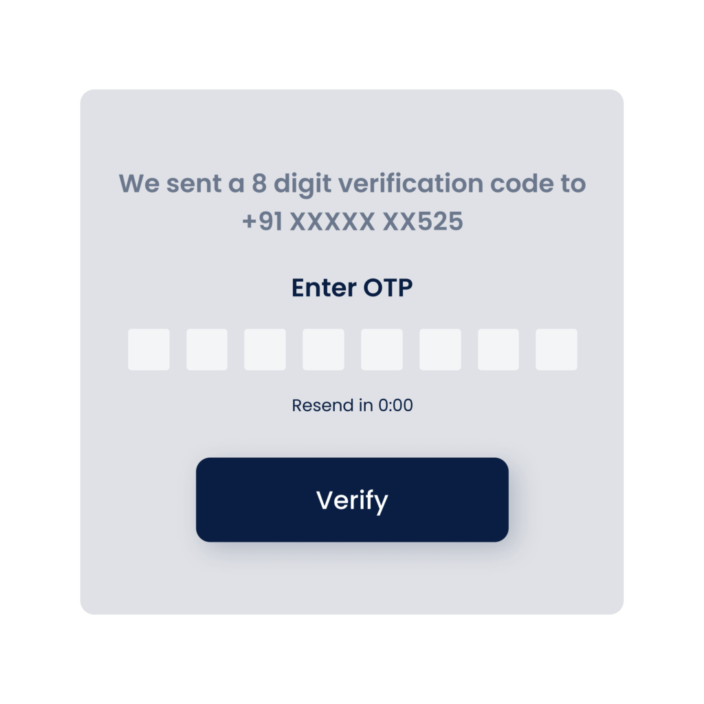
The OTP element has the feature to automatically paste the OTP and then display it to the user after the user receives the OTP on his/her mobile number. If the user enters the OTP in the OTP element, the OTP box also populates earlier used OTPs. The OTP element does not allow the user to enter alphabets and special characters.
Usage
| When to use |
| A business that deals with sensitive customer information can make use of our OTP services. Some examples of the sectors that use OTP services are banking, healthcare, e-commerce, insurance, transport, etc. |
OTP Configuration
On the “OTP” element, you can perform the following types of configuration:
- UI Configuration
- Event Configuration
UI Configuration
For the “OTP” element, you can configure the following UI properties:
| Tab | Property Name | Description | Mandatory | New Default Value | Visibility Rules |
| Basic | Reference Name | Specifies a unique name of the element. At the application level, an element is identified and managed by the reference name. | Yes | OTP_1 | |
| Basic | Caption | Specifies the title of the element. | No | OTP | |
| Basic | OTP Length | In this box, enter the maximum number of characters (For example: – 6) that the user can enter in the OTP element. | Yes | 5 | |
| Basic | Default Value | This property allows you to define the default value of an element. To define the default value: –> Click in this box, and it displays the list of the pre-define functions, attributes, and element IDs. –> In the list, select an attribute from which the application will fetch the default value and then display it in the element. | No | {{fx}} | |
| Basic | Mask | This property allows you to mask OTP. | No | marked | |
| Basic | Visible | Allows you to define the default visibility of the UI element. | No | marked | |
| Basic | Business Rule | Click this list and then select a pre-defined business rule that will determine the element’s visibility. If the user’s action satisfies the condition in the business rule, the application will display or hide the element. To define the business rule, access the Business Rule Manager module. | No | ||
| Basic | Enable | Allows the user to enable/disable an element. You can decide whether the element needs to be clickable and usable. | No | marked | |
| Basic | Business Rule | Click this list and then select a business rule to make the element active or inactive. If the user’s action satisfies the condition in the business rule, the application will make the element active or inactive in the application. To define the business rule, access the Business Rule Manager module. | No | ||
| Basic | Mandatory | Allows you to configure the element as a mandatory element. | No | unmarked | |
| Basic | Message on Failure | This property becomes visible when you select Yes under Mandatory. In the Message on Failure box, enter the error message that the application will display if the user does not perform the function on the element. | No | Required | when mandatory = checked |
| Basic | Enable Active Fill | It activates the function that you can use to fill the active color in the OTP element. | No | Selected | |
| Basic | Debounce Time | Debounce Time is applicable only for OnCharRemove event. It optimizes performance by delaying event execution until the user stops interacting for the specified duration, helping to avoid redundant triggers during rapid typing or frequent input updates.When enabled, define its Time Delay Input property, which defaults to 200ms. It only accepts values between 200 and 5000 ms, in steps of 50. | No | Tick the checkbox to enable it. | |
| UI Properties | Styles | Allows you to select a specific style for the element from the list of pre-defined styles. The vDesigner module offers pre-defined styles that you can apply to the element. | No | Default | |
| UI Properties- Background | Color | Click the leftmost box and then define the color of the element?s background. | No | Theme Variable (Neutral) | |
| UI Properties- Background | Opacity | Opacity is the degree to which content behind an element is hidden, and is the opposite of transparency. While configuring the color, you can also configure the opacity in the percentage unit. | No | 100% | |
| UI Properties- Alignment & Spacing | Margin | Allows you to desirably define margin around each side of the element. It provides four different boxes to define the margin outside the right, left, top, and bottom border of the element. | No | Theme Variable (Margin) | |
| UI Properties- Alignment & Spacing | Element’s Alignment | This property contains three tabs. You can use these tabs as follows: 1. Left:- By default, this tab is selected. It aligns the element to the left of the page. 2. Center:- If you select this tab, it aligns the element at the center of the page. 3. Right:- If you select this tab, it aligns the element to the right of the page. | No | Left | |
| UI Properties- Caption | Font | Select the font type (For example: – Arial) of the element?s caption. | No | Theme Variable (Font Family) | |
| UI Properties- Caption | Size | Enter the font size of the caption. | No | 12 | |
| UI Properties- Caption | Color | Select the color of the font of the caption. | No | Theme Variable (Caption) | |
| UI Properties- Caption | Bold | Enter the thickness of the character of the element?s caption in the range of values from 1 to 9. | No | 4 | |
| UI Properties- Caption | Style | Select the style of font (For example:- Italic) of the caption | No | Normal | |
| UI Properties- Input | Font | Select the font of the value that you enter in the element. | No | Theme Variable (Font Family) | |
| UI Properties- Input | Size | Enter the size of the font of the input text. | No | 14 | |
| UI Properties- Input | Color | Click the Color box and then select the color of the font of the input value. | No | Theme Variable (Answer Text) | |
| UI Properties- Input | Bold | Enter the size of the ?Bold? emphasis if you want to display the input text in Bold style. | No | 4 | |
| UI Properties- Input | Style | Click this list and then select any of the following styles to display the input text: –> Normal –> Italic | No | Normal | |
| UI Properties- Shape & Decoration | Type | Under the Shape and Decoration section, this property has the two following options: Autofill:- If you select this option, the element will occupy the available space of the parent layout. Manual:- If you select this option, you can define a specific size of the element. | |||
| UI Properties- Shape & Decoration | Width Value | Enter the width of the element in the pixel unit or percentage unit. | No | 100% | |
| UI Properties- Shape & Decoration | Height Value | Enter the height of the element in the pixel unit. | No | Set as ___ & Disable | |
| UI Properties- Shape & Decoration | X | Allows you to move the element along the X-axis; when the value increases, the element moves from left to right. | No | Show & Disable | |
| UI Properties- Shape & Decoration | Y | Allows you to move the element along the Y-axis; when the value increases, the element moves from top to bottom. | No | Show & Disable | |
| UI Properties- Shape & Decoration | Inprogress Border Color | This property allows you to define the element’s border color that the element displays when the user enters the OTP in the element. | No | #C6C6C6 | |
| UI Properties- Shape & Decoration | Select Border Color | This property allows you to define the element’s border color that the element displays when the user selects the element but does not enter a value in it. | No | #0F61FE | |
| UI Properties- Shape & Decoration | Unselect Border Color | This property allows you to define the element’s border color that the element displays when the user does not select the element to enter a value. | No | #C6C6C6 | |
| UI Properties- Shape & Decoration | Opacity | Opacity is the degree to which content behind an element is hidden, and is the opposite of transparency. While configuring the color, you can also configure the opacity in the percentage unit. | No | 100% | |
| UI Properties- Shape & Decoration | Unselect Color | Click the Color box and then define the color that the OTP element displays when the user does not select it to enter the value of the OTP. | No | ||
| UI Properties- Shape & Decoration | Opacity | Opacity is the degree to which content behind an element is hidden, and is the opposite of transparency. While configuring the color, you can also configure the opacity in the percentage unit. | No | 100% | |
| UI Properties-Tooltip | Show Tooltip | Click this check box to make a tooltip available with the element. | No | Clear Check box | |
| UI Properties-Tooltip | Message | This property allows you to configure the message for a tooltip. To configure the message: Click in this box, and a smart selector expands. In the smart selector, you can select the following: 1. Static Function:- By using the static function, you can manually define the message inside the static function. 2. Element:- If you select the element, the application will fetch the message that is linked to the selected element. 3. Entity:- If you select an entity, the app will fetch the message from the entity. | Yes | {{fx}} | When the Show Tooltip check box is selected |
| UI Properties-Tooltip | Color | This property allows you to define the color of the tooltip’s message. To define the message’s color: 1. Click the left Color box, a color canvas opens. 2. On the color canvas, move the circle on the upper bar to select the color of the tooltip’s text. 3. Move the circle on the lower bar to define the transparency of the selected color. | No | #6F6F6F | When the Show Tooltip check box is selected |
| Data | Entity Path | This property allows you to map an attribute to the element. You define the JSON based attributes in the entity in the Data Modeler module. To define the entity path: –> Click in the Entity Path box, and a list expands. –> The list displays several attributes from the entity. –> In the list, select an attribute to map it to the element. After the user performs the function on the element, the application can perform the following functions: a. Fetches data from the attribute and then displays it in the element. b. Stores data in the attribute. | No | EntityName. | |
| Data | Keyboard Type | Click this list and then select any of the following values: –> Text: – Selecting this value enables the application to open text-based keyboard. –> Number: – Selecting this value enables the application to open number-based keyboard. | No | Number | |
| Data | Submission Type | This property allows you to define the cursor position after the end-user enters the one time password in the OTP box. | No | Next Focus |
Event Configuration
On the “OTP” element, you can configure the following event:
- onCompletion
- onCharRemove
- onTextChanged