
Accordion
This post is referring to Vahana 2 (beta version). To check the document for production, please go to vDesigner-v1.0
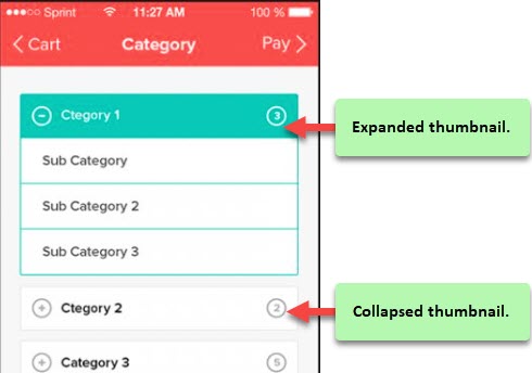
The “Accordion” element is a content area that can be expanded or collapsed. It contains a vertically placed list of items. In the list, the “Accordion” element can have labels or thumbnails. Each item in the list can be expanded or collapsed to display the content associated with that item.
Usage
| When to use |
| –> An accordion can be used to group or hide the complex regions to keep the page clean. –> An accordion is a special kind of collapsible/expandable element, which allows only one panel to be expanded at a time. |
Accordion Configuration
The “Accordion” element has the following property:
- UI Configuration
UI Configuration
For the “Accordion” element and its header section, you can configure the following properties:
| Tab | Property Name | Description | Mandatory | New Default Value | Visibility Rules |
| Basic | Reference Name | Specifies a unique name of the element. At the application level, an element is identified and managed by the reference name. | Yes | Column_xxxxx | |
| Basic | Elevation | Allows you to configure the elevation of the background. The elevation is measured as the relative distance between two surfaces along the Z-axis. | No | ||
| Basic | Visible | Click this check box to make the element visible to the end-user. | No | Clear | |
| Basic | Business Rule | Click this list and then select a pre-defined business rule that will determine the element’s visibility. If the user’s action satisfies the condition in the business rule, the application will display or hide the element. To define the business rule, access the Business Rule Manager module. | No | ||
| Basic | Enable | Click this check box to make the element active in the application. The end-user can perform the function on the active element. | No | Clear | |
| Basic | Business Rule | Click this list and then select a business rule to make the element active or inactive. If the user’s action satisfies the condition in the business rule, the application will make the element active or inactive in the application. To define the business rule, access the Business Rule Manager module. | |||
| UI Properties-Background | Color | This property allows you to define the background color of the Accordion element. To define the background color: 1. Click in the left Color box (  ), and a color canvas opens. ), and a color canvas opens.2. On the canvas, on the horizontal bar, move the circle to select the color. 3. In the upper section, move the circle to select the tone of the color. | |||
| UI properties | Styles | Allows you to select a specific style for the element from the list of pre-defined styles. The vDesigner module offers pre-defined styles that you can apply to the element. | |||
| UI Properties-Alignment & Spacing | Margin | Allows you to define a margin around each side of the element. It provides four different boxes to define the margin outside the right, left, top, and bottom borders of the element. | No | Theme Variable (Margin) | |
| UI Properties-Alignment & Spacing | Element’s Alignment | This property contains three tabs. You can use these tabs as follows: 1. Left:- By default, this tab is selected. It aligns the element to the left of the page. 2. Center:- If you select this tab, it aligns the element at the center of the page. 3. Right:- If you select this tab, it aligns the element to the right of the page. | No | Left | |
| UI Properties-Shape & Decoration | Type | Under the Shape and Decoration section, this property has the two following options: Autofill:- If you select this option, the element will occupy the available space of the parent layout. Manual:- If you select this option, you can define a specific size of the element. | Yes | Autofill | |
| UI Properties-Shape & Decoration | Width Value | Enter the width of the element in the pixel unit or percentage unit. | No | ||
| UI Properties-Shape & Decoration | Height Value | Enter the height of the element in the pixel unit. | No | ||
| UI Properties-Shape & Decoration | X | Allows you to move the element along the X-axis; when the value increases, the element moves from left to right. | No | Current X coordinate of the element | |
| UI Properties-Shape & Decoration | Y | Allows you to move the element along the Y-axis; when the value increases, the element moves from top to bottom. | No | Current Y coordinate of the element | |
| UI Properties-Shape & Decoration | Border Color | Allows you define the color of the element’s border. To define the color: –> In the Border Color box, click the left color box (  ), and a color canvas open. ), and a color canvas open.–> On the canvas, on the horizontal bar, move the circle to select the color. –> In the upper section, move the circle to select the tone of the color. | No | #FFFFFF | |
| UI Properties-Shape & Decoration | Border Radius | Allows you to define the radius of the element’s corners. Defining the radius of the corner makes the corner of the element round. | No | ||
| UI Properties-Shape & Decoration | Border Weight | Allows you to define the thickness of the accordion’s border. | |||
| UI Properties-Shadow | Color | Allows you to define the color of the bottom sheet’s shadow. | No | #FFFFFF | |
| UI Properties-Shadow | X | Allows you to move the element along the X-axis. When the value increases, the element moves towards the right edge of the canvas. | No | 0 | |
| UI Properties-Shadow | Y | Allows you to move the element along the Y-axis. When the value increases, the element moves towards the bottom edge of the canvas. | No | 0 | |
| UI Properties-Shadow | Spread | This property allows you to define the expansion of the shadow from the size of the box. In the Spread box, enter a numeric value to define the expansion of the shadow. | No | 0 | |
| UI Properties-Shadow | Blur | Allows you to impart the blurred effect to the shadow. When you increase the value of the “Blur” property, it will increase the blur effect. | No | 0 |
Was this article helpful?
YesNo