
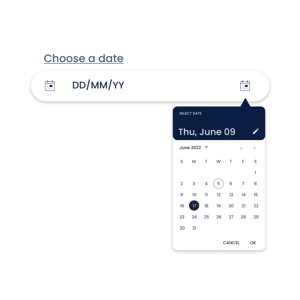
Date Picker
This post is referring to Vahana 2 (beta version). To check the document for production, please go to vDesigner-v1.0
Definition
The “Date Picker” element is a graphical user interface that allows the user to pick the date from the calendar box.
For example: – A user selects the date to view the details of the transactions that s/he performed on that specific date.
Usage
When to use
| When to use |
| Use date picker in the searching criteria where the user needs to search the data report on the specific date. |
Date Picker Configuration
The “Date Picker” element consists of the following properties:
- UI Configuration
- Event Configuration
UI Configuration
For the “Date Picker” element, the UI configuration includes the following:
| Tab | Property Name | Description | Mandatory | New Default Value | Visibility Rules |
| Basic | Reference Name | Specifies a unique name of the element. At the application level, an element is identified and managed by the reference name. | Yes | Date Picker 1 | |
| Basic | Caption | Allows you to define the title of the element. | No | Choose a Date | |
| Basic | Widget Theme | Allows you to configure a theme for your calendar. You can select any of the following themes: –> Android Theme:- It displays the calendar based on the android theme. –> iOS Theme:- It displays the calendar based on the apple phone based theme. –> Default:- It displays the calendar based on the default theme widget. | No | Default | |
| Basic | Start Date | Allows you to configure the start date and time that the calendar will display to the user. | No | 6/21/2021 | |
| Basic | End Date | Allows you to configure the end date and time that the calendar will display to the user. | No | 4/21/2025 | |
| Basic | Default Value | This property allows you to define the default value of an element. To define the default value: –> Click in this box, and it displays the list of the pre-define functions, attributes, and element IDs. –> In the list, select an attribute from which the application will fetch the default value and then display it in the element. | No | {{fx}} | |
| Basic | Wrap | Allows you to wrap the element around the content | No | Set as Unmarked& Hide | |
| Basic | Visible | Allows you to define the default visibility of the UI element. | No | marked | |
| Basic | Business Rule | Click this list and then select a pre-defined business rule that will determine the element’s visibility. If the user’s action satisfies the condition in the business rule, the application will display or hide the element. To define the business rule, access the Business Rule Manager module. | No | ||
| Basic | Enable | Allows the user to enable/disable an element. You can decide whether the element needs to be clickable and usable. | No | marked | |
| Basic | Business Rule | Click this list and then select a business rule to make the element active or inactive. If the user’s action satisfies the condition in the business rule, the application will make the element active or inactive in the application. To define the business rule, access the Business Rule Manager module. | No | ||
| Basic | Mandatory | Allows the user to set an UI element to a non-skippable field. | No | unmarked | |
| Basic | Message on Failure | This property becomes visible when you select Yes under Mandatory. In the Message on Failure box, enter the error message that the application will display if the user does not perform the function on the element. | No | Required | when mandatory = checked |
| UI Properties | Styles | Allows you to select a specific style for the element from the list of pre-defined styles. The vDesigner module offers pre-defined styles that you can apply to the element. | No | Default | |
| UI Properties- Background | Color | Click in the Color box and then select the background color of the element. | No | Theme Variable (Neutral) | |
| UI Properties- Background | Opacity | Opacity is the degree to which content behind an element is hidden, and is the opposite of transparency. | No | 100% | |
| UI Properties- Alignment & Spacing | Margin | Allows you to desirably define margin around each side of the element. It provides four different boxes to define the margin outside the right, left, top, and bottom border of the element. | No | Theme Variable (Margin) | |
| UI Properties- Alignment & Spacing | Element’s Alignment | This property contains three tabs. You can use these tabs as follows: 1. Left:- By default, this tab is selected. It aligns the element to the left of the page. 2. Center:- If you select this tab, it aligns the element at the center of the page. 3. Right:- If you select this tab, it aligns the element to the right of the page. | No | Left | |
| UI Properties- Caption | Font | Select the Font of the caption | No | Theme Variable (Font Family) | |
| UI Properties- Caption | Size | Select the Font size of the caption | No | 12 | |
| UI Properties- Caption | Color | Select the color of the caption | No | Theme Variable (Caption) | |
| UI Properties- Caption | Bold | Select the Bold size of the caption | No | 4 | |
| UI Properties- Icon | Suffix Source | Allows you to configure an icon that you want to use with the element. After you configure the icon, the app will display the icon to the right of the element. You can use the following options to configure the icon: –> None –> URL –> Asset Library | No | None | |
| UI Properties- Icon | Suffix URL | In this box, enter the URL of the icon. The application fetches the icon from the URL-based location and then displays it to the right of the element. | Yes | When Suffix = URL | |
| UI Properties- Icon | Select Suffix Icon | Allows you to fetch the image of icon from the Assets Manager module. In this box: –> Click the asset library icon (  ), and the Select Asset dialog box opens. ), and the Select Asset dialog box opens.–> In the Select Asset dialog box, select an icon, and then click Select, and you successfully configure the image of the icon. | Yes | If Suffix Source = Assets | |
| UI Properties- Icon | Suffix Size | In this box, enter the numeric value (for example:-14) to define the size of the icon. | No | 16 | When Suffix != None |
| UI Properties- Icon | Suffix Color | Click the Color box and then select the color to define the color of the icon. Note: – The “Color” property can only be configured for “Material” icons. If you have defined the URL to load the image, the “Color” property cannot be applied to the URL-based images. | No | #161616 | When Suffix != None |
| UI Properties- Hint | Text | Enter the description of the hint text that the application displays as a brief help about the element. | No | DD/MM/YYYY | |
| UI Properties- Hint | Size | Enter the size of the font of the hint text. | No | 14 | |
| UI Properties- Hint | Color | Click in the Color box and then define the font color of the hint text. | No | #6F6F6F | |
| UI Properties- Input | Font | Select the font of the input text. For the “Date Picker” element, the input text is the date and time that the box displays after you select them. | No | Theme Variable (Font Family) | |
| UI Properties- Input | Size | Enter the size of the font of the input text. | No | 14 | |
| UI Properties- Input | Color | Click in the Color box and then select the font color of the input text. | No | Theme Variable (Answer Text) | |
| UI Properties- Input | Bold | Enter the size of the “Bold” emphasis if you want to display the hint text in Bold style. | No | 4 | |
| UI Properties- Shape & Decoration | Type | Under the Shape and Decoration section, this property has the two following options: Autofill:- If you select this option, the element will occupy the available space of the parent layout. Manual:- If you select this option, you can define a specific size of the element. | |||
| UI Properties- Shape & Decoration | Width Value | Enter the width of the element in the pixel unit. | No | 100% | |
| UI Properties- Shape & Decoration | Height Value | Enter the height of the element in the percentage unit or pixel unit. | No | Set as ___ & Disable | |
| UI Properties- Shape & Decoration | X | Allows you to move the element along the X-axis; when the value increases, the element moves from left to right. | No | Show & Disable | |
| UI Properties- Shape & Decoration | Y | Allows you to move the element along the Y-axis; when the value increases, the element moves from top to bottom. | No | Show & Disable | |
| UI Properties- Shape & Decoration | Border Radius | It allows you to define the element’s corners’ radius. Defining the radius of the corner makes the element’s corner round. | No | Theme Variable (Border Radius) | |
| UI Properties- Shape & Decoration | Border Color | Allows you define the color of the element’s border. To define the color: –> In the Border Color box, click the left color box (  ), a color canvas open. ), a color canvas open.–> On the canvas, on the horizontal bar, move the circle to select the color. –> In the upper section, move the circle to select the tone of the color. | No | #C6C6C6 | |
| UI Properties-Tooltip | Show Tooltip | Click this check box to make a tooltip available with the element. | No | Clear Check box | |
| UI Properties-Tooltip | Message | This property allows you to configure the message for a tooltip. To configure the message: Click in this box, and a smart selector expands. In the smart selector, you can select the following: 1. Static Function:- By using the static function, you can manually define the message inside the static function. 2. Element:- If you select the element, the application will fetch the message that is linked to the selected element. 3. Entity:- If you select an entity, the app will fetch the message from the entity. | Yes | {{ fx }} | When the Show Tooltip check box is selected |
| UI Properties-Tooltip | Color | This property allows you to define the color of the tooltip’s message. To define the message’s color: 1. Click the left Color box, a color canvas opens. 2. On the color canvas, move the circle on the upper bar to select the color of the tooltip’s text. 3. Move the circle on the lower bar to define the transparency of the selected color. | No | #6F6F6F | When the Show Tooltip check box is selected |
| Data | Entity Path | This property allows you to map an attribute to the element. You define the JSON based attributes in the entity in the Data Modeler module. To define the entity path: –> Click in the Entity Path box, and a list expands. –> The list displays several attributes from the entity. –> In the list, select an attribute to map it to the element. After the user performs the function on the element, the application can perform the following functions: a. Fetches data from the attribute and then displays it in the element. b. Stores data in the attribute. | Yes | EntityName. | |
| Data | Read Format | Click this list to select a date format. The application will display the date in the selected format (For example: – dd/MM/yyyy). | No | dd/MM/yyyy |
Event Configuration
On the “Date Picker” element, you can configure the following events:
- onSelect
- beforeSelect
Was this article helpful?
YesNo