
Button
This post is referring to Vahana 2 (beta version). To check the document for production, please go to vDesigner-v1.0
Definition
Buttons are the clickable elements. When you click a button, it triggers an action. The button communicates “Calls to Action” to the users and allows them to interact with the pages in several ways. The label of a button defines the action that the user performs on the button.
Usage
| When to use | When not to use |
| Use buttons to communicate actions to the users and to allow users to interact with the page. Each page should have one primary button, and any remaining calls to action should be represented as lower emphasis buttons. | Do not use buttons as navigational elements. Instead, use links when the desired action has to take the user to a new page. |
Button Configuration
On the button element, you can perform the following types of configuration:
- UI Configuration
- Data Configuration
- Event Configuration
UI Configuration
| Tab | Property Name | Description | Mandatory | New Default Value | Visibility Rules |
| Basic | Reference name | Specifies a unique name of the element. At the application level, an element is identified and managed by the reference name. | Yes | Button_1 | |
| Basic | Caption | Specifies the title of the element. | No | Primary Button | |
| Basic | Underline | In this property: –> Click Yes to impart the underline effect to the button. –> Click No to not impart the underline effect to the button. | – | unmarked | |
| Basic | Wrap | This property allows you to wrap the element’s dimensions by reducing the space between the element and the content inside the element. | No | unmarked | |
| Basic | Visible | Allows you to define the default visibility of the UI element. | No | marked | |
| Basic | Business Rule | Click this list and then select a pre-defined business rule that will determine the element’s visibility. If the user’s action satisfies the condition in the business rule, the application will display or hide the element. To define the business rule, access the Business Rule Manager module. | No | ||
| Basic | Enable | Allows the user to enable/disable an element. You can decide whether the element needs to be clickable and usable. | No | marked | |
| Basic | Business Rule | Click this list and then select a business rule to make the element active or inactive. If the user’s action satisfies the condition in the business rule, the application will make the element active or inactive in the application. To define the business rule, access the Business Rule Manager module. | No | ||
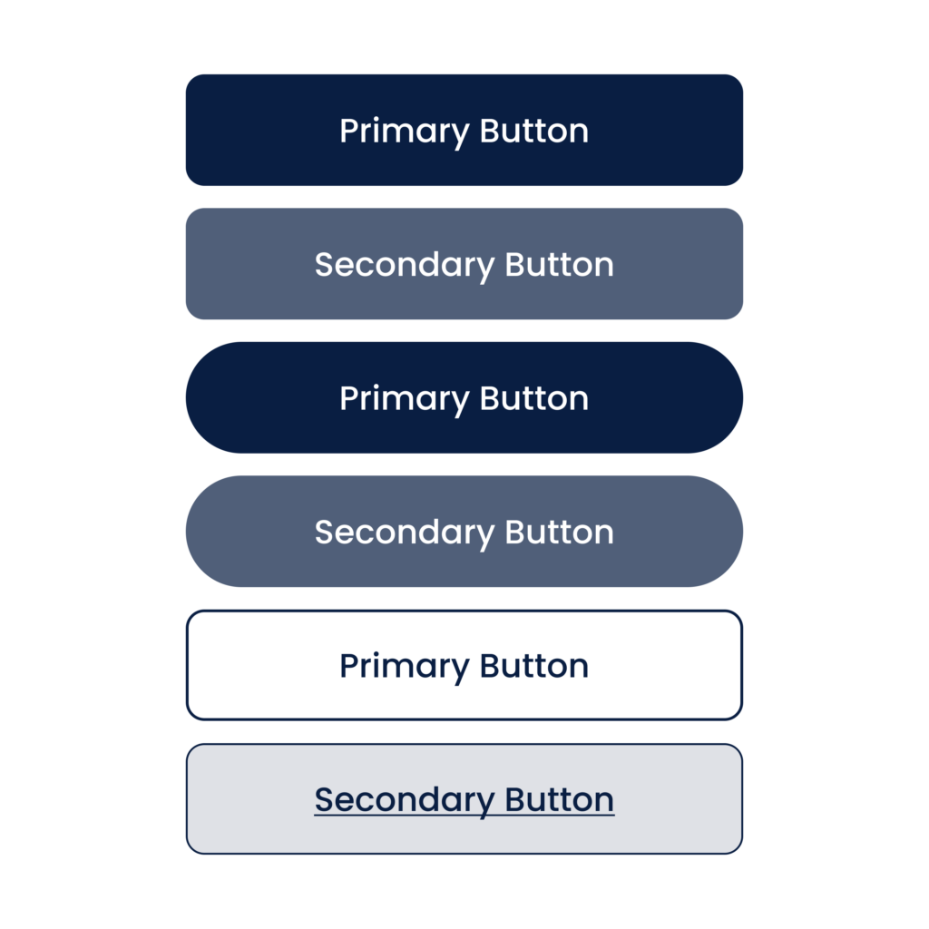
| UI Properties | Styles | Allows you to select a specific style for the element from the list of pre-defined styles. The vDesigner module offers pre-defined styles that you can apply to the element. These pre-defined styles are: –> Primary –> Success –> Info –> Danger –> Secondary –> Warning | No | Primary | |
| UI Properties- Background | Color | Click the Color box and then select the background color of the button. | No | Theme Variable (Primary) | |
| UI Properties- Background | Opacity | The opacity-level describes the transparency-level. | Yes | 100% | |
| UI Properties- Background | Select Color | Click the Color box and then select the background color that the button displays when the user puts the mouse pointer on the button to perform the function. | No | Theme Variable (Primary) | |
| UI Properties- Background | Opacity | The opacity-level describes the transparency-level. | Yes | 100% | |
| UI Properties- Alignment & Spacing | Margin | Allows you to desirably define margin around each side of the element. It provides four different boxes to define the margin outside the right, left, top, and bottom border of the element. | No | Theme Variable (Margin) | |
| UI Properties- Alignment & Spacing | Element’s Alignment | This property contains three tabs. You can use these tabs as follows: 1. Left:- By default, this tab is selected. It aligns the element to the left of the page. 2. Center:- If you select this tab, it aligns the element at the center of the page. 3. Right:- If you select this tab, it aligns the element to the right of the page. | No | Left | |
| UI Properties- Caption | Font | Select the font type (For example: – Arial) of the element’s caption. | No | Theme Variable (Font Family) | |
| UI Properties-Caption | Size | Enter the font size of the caption. | No | 14 | |
| UI Properties- Caption | Color | Select the color of the font of the caption. | No | Theme Variable (Neutral Color) | |
| UI Properties- Caption | Bold | Enter the thickness of the character of the element’s caption in the range of values from 1 to 9. | No | 9 | |
| UI Properties – Icon | Source | Allows you to configure an icon that you want to use with the element. After you configure the icon, the app will display the icon with the element. You can use the following options to configure the icon: –> None –> URL –> Asset Library | No | None | |
| UI Properties- Icon | Enter URL | This box appears only after you select URL in the Source list. In the Enter URL box, enter the URL of the icon. The application fetches the image of the icon from the URL-based location. | No | When source = URL | |
| UI Properties- Icon | Select Asset | Allows you to fetch the image of icon from the Assets Manager module. In this box: –> Click the asset library icon (  ), and the Select Asset dialog box opens. ), and the Select Asset dialog box opens.–> In the Select Asset dialog box, select an icon, and then click Select, and you successfully configure the image of the icon. | Yes | When source = Assets Manager | |
| UI Properties- Icon | Size | In this box, enter the numeric value (for example:-14) to define the size of the icon. | No | 16 | When source = URL |
| UI Properties- Icon | Color | Click the Color box and then select the color to define the color of the icon. Note: – The Color property can only be configured for “Material” icons. If you have defined the URL to load the image, the Color property cannot be applied to the URL-based images. | No | Theme Variable (Neutral) | |
| UI Properties- Icon | Alignment | You can use this property to align the icon by using the following options: –> Left –> Right –> Top –> Bottom | No | Left | When source = URL |
| UI Properties- Icon | Padding | This property allows you to define padding around each side of the element. The padding defines the space between the element’s content and each side of the element. It provides four different boxes to define the padding around the right, left, top, and bottom side of the element. | No | Set at [0,0,0,0] and Hide | |
| UI Properties – Shape & Decoration | Type | Under the Shape and Decoration section, this property provides the following options: Autofill:- If you select this option, the element will occupy the available space of the parent layout. Manual:- If you select this option, you can define a specific size of the element. | Yes | Autofill | |
| UI Properties- Shape & Decoration | Width Value | Enter the width of the element in the pixel unit. | No | 100% | If “Type” = Manual |
| UI Properties- Shape & Decoration | Height Value | Enter the height of the element in the percentage unit or pixel unit. | No | Set as ___ and Disable | |
| UI Properties- Shape & Decoration | X | Allows you to move the element along the X-axis; when the value increases, the element moves from left to right. | No | Show and Disable | |
| UI Properties- Shape & Decoration | Y | Allows you to move the element along the Y-axis; when the value increases, the element moves from top to bottom. | No | Show and Disable | |
| UI Properties- Shape & Decoration | Border Radius | Allows you to define the radius of any of the corners of the element. Defining the radius of the corner makes the corner of the element round. | No | Theme Variable (Border Radius) | |
| Data | Entity Path | This property allows you to map an attribute to the element. You define the JSON based attributes in the entity in the Data Modeler module. To define the entity path: –> Click in the Entity Path box, and a list expands. –> The list displays several attributes from the entity. –> In the list, select an attribute to map it to the element. After the user performs the function on the element, the application can perform the following functions: a. Fetches data from the attribute and then displays it in the element. b. Stores data in the attribute. | No | – |
Event Configuration
On the “Button” element, you can configure the following events:
- onClick
- onLongPress
Was this article helpful?
YesNo