
Bottom Sheet Overlay
The bottom sheets are primarily used in the mobile apps. In an app, the bottom sheet is a surface that contains the supplementary content. This content is anchored to the bottom edge of the mobile phone device.
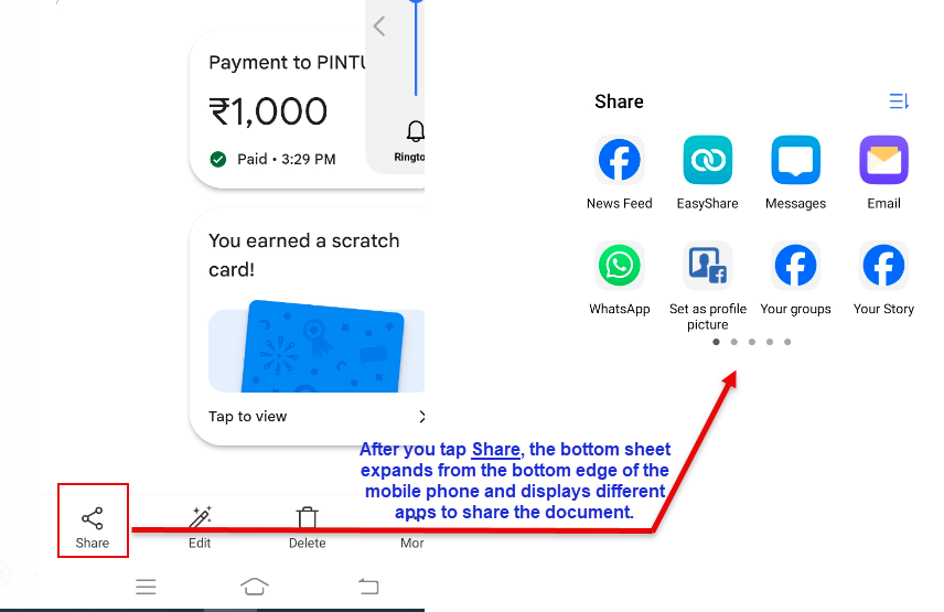
The bottom sheet displays the content after a user performs the related function. For instance:- When you want to share a document with another user, you tap Share on your mobile phone device. After you tap Share, the bottom sheet expands and then displays different instant messaging services and apps to share the document.
The user can expand or reduce the size of the bottom sheet by dragging it with a hand gesture.
You can use three types of bottom sheets in the application as follows:
| Bottom Sheet Type | Description | Screen Experience |
| Standard Bottom Sheet | It displays the content that complements the screen’s primary content. The advantage of using the standard bottom sheet is that the bottom sheet’s content remains visible while the user accesses the primary content. |  |
| Modal Bottom Sheet | It serves as an alternative to inline menus or a dialog box to contain and display large amount of content, such as longer description, iconography, and other additional content. |  |
| Expandable Botton Sheet | It provides small and collapsible surface that the user can expand to access key features. The expandable bottom sheet offers the combined advantages of standard and modal bottom sheets. It provides the persistent access of the standard sheet, in addition to the space and focus of the modal sheet. |  |
In the vDesigner application, you can access the Bottom Sheet Overlay as follows:
Accessing Bottom Sheet Overlay Component
To access the bottom sheet overlay component:
- On the vDesigner home page, see the upper tool bar.
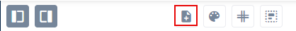
- On the tool bar, click the Create Page icon (
 ), and a new page is added to the application.
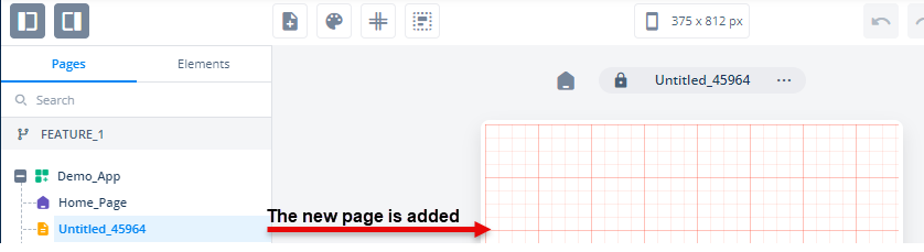
- After you add a new page, see its Page Properties panel.
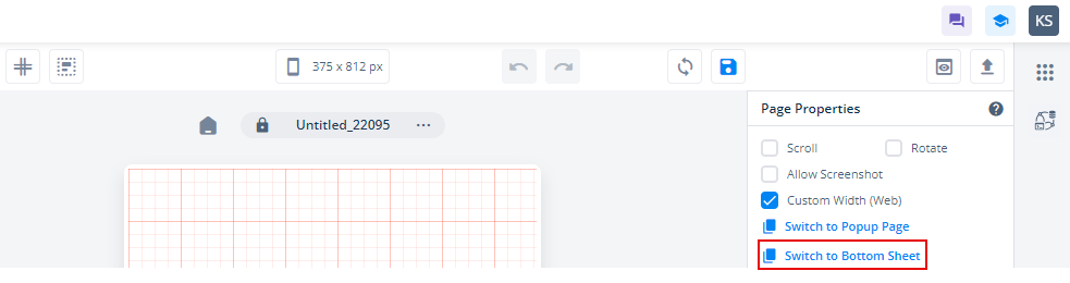
- In the Page Properties panel, click Switch to Bottom Sheet, and the Switch to Bottom Sheet dialog box opens.
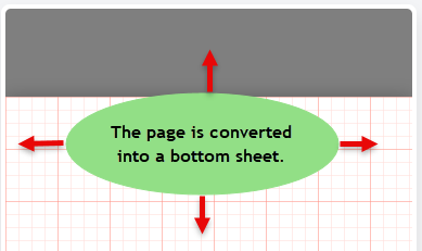
- On the Switch to Bottom Sheet dialog box, click Switch to convert the page into a bottom sheet.
For the bottom sheet, you can configure different properties in the following categories:
- UI Configuration
These properties are described as follows:
UI Configuration
| Tab | Property Name | Description | Mandatory | New Default Values | Visibility Rules |
| Basic | Scroll | After you click this check box, the scroll bar becomes available with the bottom sheet. | No | Clear Check box | |
| Basic | Rotate | When you click this check box, the screen or related page will have the feature to automatically switch to landscape mode after the user turns his or her device sideways. | No | Clear Check box | |
| Basic | Allow Screenshot | When you click this check box, the application will allow the user to take the screen capture of bottom sheet. | No | Clear Check box | |
| Basic | Dismissible | After you click this check box, the user can close the bottom sheet by tapping the outside of the bottom sheet. | No | Selected Check box | |
| UI Properties-Style | Styles | Allows you to select a specific style for the bottom sheet from the list of pre-defined styles. The vDesigner module offers pre-defined styles that you can apply to the element. | No | Default | |
| UI Properties-Background | Page Background | Allows you to define the bottom sheet’s background by providing the following options: 1. Color 2. Image 3. Gradient | No | Color | |
| UI Properties-Background | Color | Click the left box to define the background color of the bottom sheet. | No | #FFFFFF | When Page Background = Color |
| UI Properties-Background | Image | Allows you to configure an image as the background of the bottom sheet. | No | ||
| UI Properties-Background | Image Source | This box comes into view after you select Image in the Page Background list. To configure an image as the bottom sheet’s background, you can use one of the following options: –> URL –> Asset Library | Yes | When Page Background = Image | |
| UI Properties-Background | Image URL | This box comes into view after you select URL in the Image Source list. In the Image URL box, enter the URL of an image. The application fetches the image from the URL-based location and then displays it as the bottom sheet’s background. | Yes | When Image Source = URL | |
| UI Properties-Background | Select Asset | This box becomes visible after you select Assets Library in the Image Source list. This property allows you to configure an image as the element’s background from the Assets Manager module. To configure the image: –> Click the asset library icon (  ), and the Select Asset dialog box opens. ), and the Select Asset dialog box opens.–> In the Select Asset dialog box, select an image and then click Select, and you successfully configure the image as the element’s background. | Yes | When Image Source = Asset Library | |
| UI Properties-Background | Fit Type | Provides the following options to resize the image in the container: 1. Cover:- The image keeps its aspect ratio and fills the available dimensions. The image is clipped to fit in the container. 2. Fill:- With this option, the image is resized to fill the given dimensions. If required, the image is stretched or reduced to fit in the container. 3. Contain:- The image keeps its aspect ratio but is resized to fit in the container. | No | ||
| UI Properties-Background | Initial Height | Allows you to define the default height of the bottom sheet in percentages or pixels after it expands to display the content as a result of the user’s action. | Yes | 50% | |
| UI Properties-Background | Min Height | Allows you to define the minimum height of the bottom sheet in percentages or pixels. This property allows the user to minimize the bottom sheet until the permissible minimum height. | Yes | 25% | |
| UI Properties-Background | Max Height | Allows you to define the maximum height of the bottom sheet in percentages. This property allows the user to maximize the bottom sheet until the permissible maximum height. | Yes | 100% | |
| UI Properties-Alignment and Spacing | Padding | This property allows you to define padding around each side of the bottom sheet. It provides four different boxes to define the padding around the right, left, top, and bottom side of the sheet. The padding specifies the space in pixels around each side of the bottom sheet inside the page border. | No | 0 | |
| UI Properties-Alignment and Spacing | Backdrop | This property allows you to configure the backdrop filter of the page behind the bottom sheet. | No | 50% | |
| UI Properties-Alignment and Spacing | Container Internal Alignment | Allows you to define the alignment of different elements that you drag to a page. You can define the alignment of elements across horizontal and vertical axes of the page. Click the first list to select the alignment across the horizontal axis as follows: 1. Left 2. Center 3. Right Click the second list to select the alignment across the vertical axis as follows: 1. Top 2. Middle 3. Bottom 4. Space Around 5. Space Between 6. Space Evenly | No | Left, Top | |
| UI Properties-Shadow | Color | Allows you to define the color of the bottom sheet’s shadow. | No | #FFFFFF | |
| UI Properties-Shadow | X | Allows you to move the element along the X-axis. When the value increases, the element moves towards the right edge of the canvas. | No | 0 | |
| UI Properties-Shadow | Y | Allows you to move the element along the Y-axis. When the value increases, the element moves towards the bottom edge of the canvas. | No | 0 | |
| UI Properties-Shadow | Spread | This property allows you to define the expansion of the shadow from the size of the box. In the Spread box, enter a numeric value to define the expansion of the shadow. | No | 0 | |
| UI Properties-Shadow | Blur | Allows you to impart the blurred effect to the shadow. When you increase the value of the “Blur” property, it will increase the blur effect. | No | 0 |