
Configuring a Page
After you successfully create a page by using the configurator. You can configure several properties of the page. These properties are as follows:
- Basic
- Advanced
- Style
- Events
- Data
Apart from configuring these properties, you can add new elements to the page. You can configure these properties as follows:
To configure page-related properties:
- On the vFlow 2.0 module’s dashboard, see the left navigation panel.
- In the left navigation panel, see the Configurator icon (
 ).
). - Click the Configurator icon (), and the All Pages page opens.
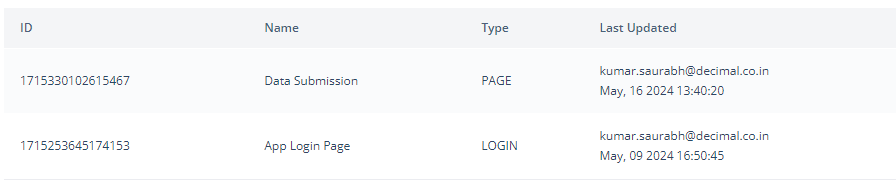
- On the All Pages page, under the Name column, find the page (for example, Data Submission page) to configure its properties.
- After you find the page (for example, Data Submission page), move to the right in the same row, and then place the mouse pointer left to the three-dot icon (
 ), and an Edit icon (
 ) comes into view.
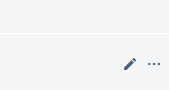
- Click the Edit () icon, and the <<Page Name>> page opens.

- On the <<Page Name>> page, under Config, you can configure different properties as follows:
Basic
| Property Name | Description |
| Page Type | This box, by default, displays the type of page. You define the page type (for example, page, subpage, popup) when you create a page. |
| Page Category | By default, this list displays: Private. It means when you add a page, it is added to the application as a private page. You can configure a page with the following scopes: 1. Private:- You can access a private page after successful authentication. 2. Public:- You can access a public page without authentication. Commonly, most of software applications are designed and developed with the login page, considering data criticality and privacy. Thus, having public page in an application rarely occurs, but you can configure a public page based on application-related requirements. |
| Page Name | This field by default displays the name (for example, Data Submission) of the page that you defined when you created the page. The vFlow module internally uses the name of a page as a name identifier to manage different pages at the application level. |
| Description | This is the optional field. You can write a brief reason to create the current page. |
| Page URL | In this field, enter the page’s URL (for example:- /www.xyz.com). When you enter the page’s URL, prefix it with the forward slash character (“/“). The page URL specifies the page’s path. When you access a page in the application, the browser’s address bar displays the page’s URL. |
| Breadcrumb | In this box, enter a random alphanumeric value that helps the end-user view and track the site map or navigation map. The navigation map tells the user about the location or path of the current page. Thus, the user can determine where he or she is in the current application while accessing different pages in the application. 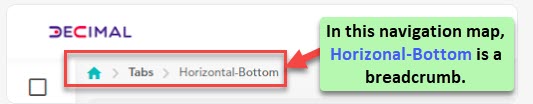 |
| Save | After you define the page’s basic properties, click Save to apply the customized basic properties. |
Properties
| Property Name | Description |
| Enable | By default, this check box is selected. It means that when you create a page, it is created as an active page. The user can perform the function on the active page. If you click to clear the Enable check box, the page becomes inactive. The user cannot perform the function on the inactive page. |
| Disable Browser Button | When you click to select this check box, the back and forward buttons of the browser become unavailable. |
| Webview Whitelist URL | In this box, you can enter one or more URLs that you want to whitelist. To enter more than one URL, you can separate two URL strings by a comma. Whitelisting a URL means that you can access the URL from within your application. |
| Background Image URL | In this box, enter an image’s URL if you want to display an image in the background of the page. After the application loads the page on the device, it displays the image in the background of the page. |
| Page Header | This list displays the earlier-created headers. If you have not created a header, it displays the None value, which means you have not created a header. To configure a header for the current page, you need to create a header and then select it from this list. To create a header: a. Click the Page Header list. b. In the Page Header list, click Create Header, and a Create System Component dialog box opens. c. In the Create System Component dialog box, in the Reference Name box, enter the header’s name (for example, datasbm_header). d. After you enter the header’s name, click Create to create a new header. |
| Page Footer | This list displays the earlier-created footers. If you have not created a footer, it displays the None value, which means you have not created a footer. To configure a footer for the current page, you need to create a footer and select it from this list. To create a footer: a. Click the Page Footer list. b. In the Page Footer list, click Create Footer, and a Create System Component dialog box opens. c. In the Create System Component dialog box, in the Reference Name box, enter the footer’s name (for example, datasbm_footer). d. After you enter the footer’s name, click Create to create a new footer. |
| Save | After you define the page’s advanced properties, click Save to apply the customized advanced properties. |
Layout
To learn about layout, visit the post: Configuring a Layout.
Style
| Property Type | Font |
| Property Name | Description |
| Background Color | This property allows you to define the background color of the page. To configure the background color: a. Under Background Color, click the left box, and a color canvas opens. b. On the canvas, on the horizontal bar, move the circle to select the color. c. On the canvas, move the circle to select the tone of the color. |
| Family | Click this list, and then select the font’s family (for example, Serif). A font’s family defines the typeface of fonts. It contains a group of multiple fonts with a similar typeface. |
| Size | In this box, enter the font’s size (for example, 8) in pixel. |
| Color | This property allows you to define the color of the text’s font. To define the font’s color: a. Under Color, click the left box, and a color canvas opens. b. On the canvas, on the horizontal bar, move the circle to select the color. c. On the canvas, move the circle to select the tone of the color. |
| Alphabet Case | Click this list to select one of the following values: a. None:- Select this option to display the text on the page in default case. b. UPPERCASE:- Select this option to display the text in uppercase characters. c. lowercase:- Select this option to display the text in lowercase characters. |
| Text Alignment | You can use this property to alignment the page’s text by using the following options: a. Left b. Center c. Right |
| Property Type | Dimension |
| Property Name | Description |
| Height | In this box, enter the default height of the page after the application loads it on the device’s screen. |
| Maximum Height | In this box, enter the maximum permissible height of the page. The user cannot stretch the page vertically beyond its maximum height. |
| Width | In this box, enter the default width of the page after the application loads it on the device’s screen. |
| Maximum Width | In this box, enter the maximum permissible width of the page. The user cannot stretch the page horizontally beyond its maximum width. |
| Property Type | Spacing |
| Property Name | Description |
| Margin | This property allows you to define the external space around the page’s border. You can define the space in pixels. |
| Padding | This property allows you to define the space between the page’s border and the content on the page. |
| Border Radius | You can use this property to define the radius of the page’s border’s corner. You can define the radius of all corners. Defining the radius makes the page’s corner round. |
| Property Type | Custom CSS Class Name |
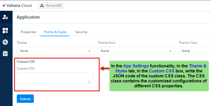
| Class Name | In this box, enter the name of pre-defined CSS class that provides the customized look and feel to the page’s content. Note:- To know more how to define CSS class, see the post: App Settings. In the App Settings post, see the Custom CSS property. |
| Save | After you define the page’s style-related properties, click Save to apply these properties. |
Animation
| Property Name | Description |
| Type | Click this list to impart one of the following animation effects to the page when it is loaded. a. Bounce b. Flash c. Pulse d. Rubber Band e. Handshake |
| Save | After you configure the page’s animation property, click Save to apply it to the page. |
Events
The vFlow 2.0 module provides different events for the page, components, and elements. On the page, you can configure the onLoad event. Similarly, you can configure the onClick event on the button. Based on the component or element type, the vFlow module provides different events or a group of events that you can configure to implement the required functionality.
On the page, you can configure the event as follows:
| Event Type | onLoad |
| Property Name | Description |
| Select Task Group | You can use this property to create a task group. To create a task group: 1. Click the Select Task Group list, and then click Create Task Group, and a Create Task Group dialog box opens. 2. In the Create Task Group dialog box, in the Reference Name box, enter the name (for example, myfirst_tskgp) of the task group. 3. After you enter the task group’s name, click Create to successfully create a task group. |
| Save | After you create a task group, click Save to link the task group to the current page. |
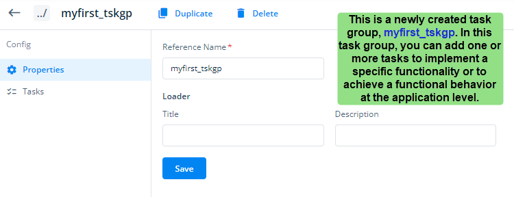
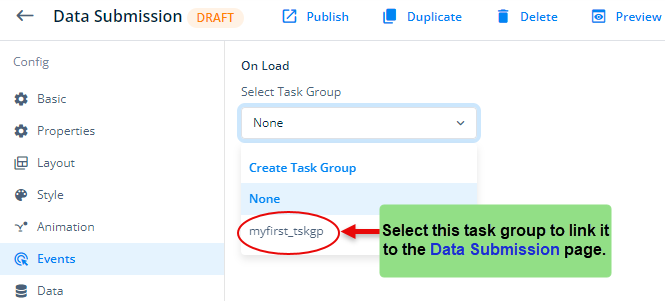
After you return to the Events section under Config, you can see the newly created task group in the Select Task Group list. To link the myfirst_tskgp task group to the current page, click the Select Task Group list, and then select myfirst_tskgp.
Apart from linking the myfirst_tskgp task group to the Data Submission page
Data
This functionality allows you to define the data source. The data source is an application-integrated data layer that stores the application-related data. To know more about the data source, see the category: Data.