
vFlow Elements (Common Properties)
Introduction
In the application, the element, which is also referred to as the user interface, is used to design a web page. In the screen, an element or a group of elements represents the functionality. In the vFlow module, the element is a lowest level entity. To design an application, the element is added to the vFlow component.
The vFlow module provides the following elements:
| Element Name | Description |
| Text | The “text” element is used to display a text item. The text item can be a information or ask the user to perform a specific function. In the application, you can use the “text” element to display the message to the user, a hyperlink, a hint that helps the user perform a specific function, etc. |
| Number | You can use the “Number” element to display a numeric value. You can display a positive value on the application page. |
| Marquee | You can use the “marquee” element to display the scrolling text or image. You configure the text or image to scroll horizontally or vertically on the application page. |
| Key Value | The “Key Value” element is used to display a key-value pair in the application. In the key-value pair, the “key” part represents a variable, and the “Value” part represents the variable’s value. |
| Image | The image element displays an image on the application. You can add the image to the “FV”, “card”, and “timeline” components. |
| Tags | The “tag” element is used to display the tag in the application. The tag can be any alphanumeric value, but it is treated as a string on the application level. |
| Button | The “button” element is a clickable element. The “button” element is used to implement a functionality. The user clicks the button to perform a specific function. The text or label of the button briefly displays the function that the user needs to perform by clicking the button. By clicking the button, the user can: –> View a specific set of data –> Submit the data to the server –> Navigate to another page, etc. |
| Maticon | The “Mat-Icon” element allows you to add vector based icons in the application. The “Mat-Icon” element includes icon fonts and SVG icons, except bitmap based formats, such as PNG, JPEG, GIF, etc. |
| Hyperlink | This element is dedicatedly used to display the hyperlink on the application page. You can display a text as a hyperlink. When the user clicks the hyperlink, an event is triggered, and the application performs a specific function. |
| Horizontal Rule | The “Horizontal Rule” is a horizontal line that you can use to create two or more sections on the web page. To define a top navigation pane or footer section, you can use the “Horizontal Rule” element. |
| Check Box | You can use the “Check Box” element to display the multi-choice options. You can include this element when you want the user to select multiple options or items, such as selection of hobbies, selection of skills etc. Note:- You are recommended to use the “Check box” element if you plan to display a few items (For example:- 4 to 5 items) that the user needs to select. For a huge list of items, such as displaying cities, counties, or states, you are recommended to use a dropdown list. |
| Radio Button | The “Radio Button” element is used as a group of mutually exclusive options. It means that the “Radio Button” element contains multiple options, but the user can select only one option at a time. You can use the radio button if you want to display the types of gender, modes of transaction, etc. |
| Toggle Button | The “Toggle Button” element represents two different states. When you want the user to switch between two states, you can use the toggle button. In the “Toggle Button”, these two states are mutually exclusive, and the user can select only one state at a time. |
| Input Text | You can use the “Input Text” element in the application when you want to capture the user-input, such as entering personal information, and other details. |
| Text Area | The “Text Area” element is a multi-line input field where the user can enter the text in multiple lines. You can use this element when you want to capture the user’s written feed back. |
| Type and Search | This element is a text field where the user can enter a query and then search for an answer. This element is similar to the “Text Field” element in terms of functionality. |
| Image Slider | The “Image Slider” element is also referred to as Image Carousels or Slide-Show. The “Image Slider” element is an animated design element that displays images and videos as an automatic or manual slide show. You can use this element to make the application more attractive by displaying images and videos. |
| Camera | You can use this element to integrate a camera into the application. By using the integrated camera service, the end-user can capture the photos. |
| Video | You can use this element to integrate a video recorder into the application. By using the video recorder, the end-user can record a video up to 15 minutes in length. |
| Single Image Uploader | The “Single Image Uploader” element allows the user to request, collect, and manage a single image that a user uploads. |
| Multi Media Uploader | The “Multi Media Uploader” element allows the user to request, collect, and manage the multimedia files that several participants upload to the application. |
| Media Enlisting | You can use this element to integrate a playable media file into the application page. The end user can play media file without using Flash or any other plug-in. |
| Image Viewer | You can use this element to integrate an “Image Viewer” service into the application. By using the image viewer service, the end user can view images in a variety of formats. |
| Date | This element allows you to integrate a digital calendar into the application. The “Date” element provides the following data in the digital calendar: –> Day of the month (1st to 31st) –> Months (January to December) –> List of years in the YYYY format Apart from these data, the calendar can display additional data, such as the day of the week. |
| Group Element | The “Group Element” groups two or more elements. In the “Group Element” properties’ section, you need to access the “Element Mapping” property. In the “Element Mapping” property, you need to enter the sequence number (For example:- 1, 2, 3, 4) of different elements. The sequence numbers are separated by comma. You are recommended to use the group element when you want to manage and control a group of elements in a section or panel. The “Group Element” manages a group of multiple elements inside a virtual container. |
| Biometric | You can use this element to integrate a biometric authentication service into the application. By using the biometric service, an application user can carry a measurement and statistical analysis by capturing people’s physical and behavioral characteristics. |
| You can use this element to integrate an email client service into the application. The user can use the email service to send the email to different recipients. | |
| Multiselect | This element can also be referred to as the “Multiselect Dropdown”. It allows the end user to select one or more items (options) from the list of multiple items. |
| Progress Bar | The “Progress Bar” element represents the progress of an activity (for example:- Installation Process) through an incremental linear or circular visual presentation. |
| Slider | The “Slider” element allows the user to view and select a value from a range of values along a track bar. Based on the configuration of the slider, the track bar may or may not display the range or set of values. |
| Rich Text | The “Rich Text” element is used to display the content in the rich text format. The rich text format provides a few style and decoration features, such as bold, italic, bullets, text alignment, etc. |
| Password | The “Password” element is used to display a password box or password input field in the application. When the user enters the value in the password box, it displays the value in the encrypted format. While configuring the “Password” element’s properties, you can also apply regex based conditions. |
| OTP | The “OTP” element is used to enter the unique identification number in the application. You can use the “OTP” element in the registration module, login process, or transaction authentication. |
| Timer | You can add the “Timer” element to the application when you want to display the countdown time to the user. You can use the “Timer” element to display the time to resend the OTP, session time, etc. |
| Masking | You can add the “Masking” element to the application to mask a specific value. You can mask the value in the following ways: 1. You can capture the user-input in the masked format. 2. You can define a text value in the tempObject. It will display the masked value on the application page. |
| Accordion | The “Accordion†element is a content area that you can expand or collapse. It contains a vertically aligned list of items. In the list, the “Accordion†element can have labels or thumbnails. In the list, when you click an item, it expands and then displays the content, or it collapses and then hides the content. |
| Favourite | The “Favorite Element” is used to mark a card in the FV component as “Favorite.” You can use this element to distinguish between important and unimportant cards. |
| JSON Input | You can add this element to the application when you want the user to enter the JSON code for the functional purposes. |
| Document Enlisting | You can add this element to the application when you want to display a list of the documents that the application user has uploaded to the application from the local drive. You can choose a pre-defined template to display the list of documents. The vFlow module provides multiple templates to display the list of the uploaded documents on the application. |
| Media Enlisting | You can add this element to the application when you want to display a list of different media that the application user has uploaded to the application from the local drive. |
Element Properties
The vFlow module contains the element-related properties in the following sections:
- Basic
- Properties
- UI Properties
- Additional Properties
In these four properties-related sections, the Basic, UI Properties, and Additional Properties segments include the common properties. The “Properties” section contains the specific properties that are related to a specific element or a few element types.
Which property or how many properties one is going to configure, it depends on the functional requirement of the application. To make the configuration lucid, let’s start with the common properties.
Common Properties
Common Properties (Basic)
| Propery Type | Description |
| Sequence | In this field, enter a numeric value (for example:- 2). This numeric value specifies the sequence number of the element on the page. The application will display the element to the user based on its sequence number. While adding an element: –> If the device width, including laptop, mobile, and tab, is 100 percent, the application will display the element from the top at the specified sequence number. –> If the device width, including laptop, mobile, and tab, is less than 100 percent, the application will display the element from the right at the specified sequence number. |
| Type | This field displays a hardcoded non-editable value. This value specifies the element’s type (for example:- Text, Input Field, etc.). |
| Element Name | In this field, enter the element’s name (for example:- Search). |
| Element Description | In this field, enter a brief description of the element. The element’s name that you enter in the Element Name field is displayed as the label name of the element on the page. |
Common Properties (UI Properties)
| Property Type | Description |
| Laptop/Desktop width | This property displays the “100 %” as a default value. You can change this default value to any other value less than the 100%. You can configure this property as follows: 1. If the Laptop/Desktop width property has the “100%” value, the application page will display the elements from top to bottom. 2. If the Laptop/Desktop width property has the value less than the 100% (for example:- 70%), the application page will display the elements from left to right. |
| Tab width | This property displays the “100 %” as a default value. You can change this default value to any other value less than the 100%. You can configure this property as follows: 1. If the Tab width property has the “100%” value, the application page will display the elements from top to bottom. 2. If the Tab width property has the value less than the 100% (for example:- 70%), the application page will display the elements from left to right. |
| Mobile width | This property displays the “100 %” as a default value. You can change this default value to any other value less than the 100%. You can configure this property as follows: 1. If the Mobile width property has the “100%” value, the application page will display the elements from top to bottom. 2. If the Mobile width property has the value less than the 100% (for example:- 70%), the application page will display the elements from left to right. |
UI Properties (Data Style)
| Property Type | Description |
| Font, Background, Height, and Width | This group of properties allows you to configure the following: –> Width, height, maximum permissible height and width, background, and other properties of the element that displays the data –> Data’s font type, size, text’s alignment (left, center, and right), etc. The application will display the data to the end-user based on the data’s configured properties. You can define the properties’ values in the following units: 1. Pixel 2. VH (Viewport Height) 3. Percentage |
| Margin | This property allows you to define the whitespace in the pixel, VH, or percentage units around each side of the element. You can define the space around the following borders of the element: –> Top –> Left –> Bottom –> Right 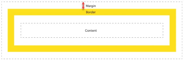 |
| Padding | This property allows you to define the inner space in the pixel, VH, or percentage units around each side of the element. You can define the inner space around the following borders of the element: –> Top –> Left –> Bottom –> Right Note:- For the element’s value, the inner space is measured by the distance between the value inside the element and the element’s border. 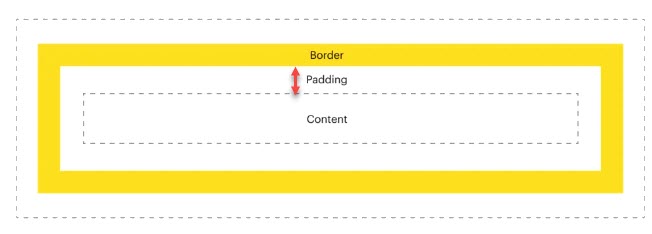 |
| Border Radius | When you configure this property, it makes the corners of the element round. To make the corner round, you need to define the corner’s radius. You can enter the radius’s value in pixel, VH, or percentage units to make the following corners round: –> Top Left –> Top Right –> Bottom Left –> Bottom Right |
| Border | When you click the Border area, it expands and then displays the following fields: –> Border Top –> Border Right –> Border Left –> Border Bottom In these fields, you can enter the value in pxel, VH, or percentage to define the width of the top, right, left, and bottom borders. Also, you can define the border’s color. |
UI Properties (Label Style)
| Property Type | Description |
| Font, Background, Height, and Width | This group of properties allows you to configure the following: –> Width, height, maximum permissible height and width, background, and other properties of the container that displays the label. –> Label’s font type, size, text’s alignment (left, center, and right), etc. The application will display the label to the end-user based on the label’s configured properties. You can define the properties’ values in the following units: 1. Pixel 2. VH (Viewport Height) 3. Percentage |
| Margin | This property allows you to define the whitespace in the pixel, VH, or percentage units around each side of the label’s container. You can define the space around the following borders of the container: –> Top –> Left –> Bottom –> Right |
| Padding | This property allows you to define the inner space in the pixel, VH, or percentage units around each side of the label’s container. You can define the inner space around the following borders of the container: –> Top –> Left –> Bottom –> Right Note:- For the label, the inner space is measured by the distance between the label inside the container and the container’s border. |
| Border Radius | When you configure this property, it makes the corners of the label’s container round. To make the corner round, you need to define the corner’s radius. You can enter the radius’s value in pixel, VH, or percentage units to make the following corners round: –> Top Left –> Top Right –> Bottom Left –> Bottom Right |
UI Properties (Animation Style)
| Property Name | Description |
| Type | Click this list and then select the animation’s type. |
| Delay | Click this list and then select the time after which the application will play the animation. For instance:- In the Delay list, if you select 2 sec, the application will play the animation after 2 seconds. |
| Speed | Click this list to select the speed of the animation. |
| Repeat | Click this list and then select a number (For example:- 2). The application will play the animation for the selected number of times. |
| Add CSS Class | In this field, enter the class’s name (for example:- test-popup) that contains the CSS properties. When you configure the application’s settings by using the App Config utility before you publish it, you can define the CSS class. To define the CSS class: 1. On the vFlow module’s dashboard, see the upper top panel. 2. In the upper top panel, click App Config, and the App Config page opens. 3. On the App Config page, see the CSS Custom Classes area. 4. In the CSS Custom Classes area, click in the CSS Classes box and then define the CSS properties. 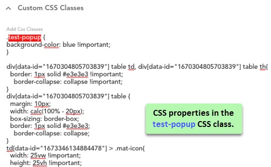 |
Events
| Property Name | Description |
| Events | This field displays the list of events that you configure on the component. To learn more about how to configure an event, visit the post: vFlow Advance. |
Additional Properties
This property is broadly described in the vFlow Advance post.