
Popup Page
This post is referring to Vahana 2 (beta version). To check the document for production, please go to vDesigner-v1.0
When you add a page to the application, you can design a page as a page or a popup page. You can add a popup page to get the user input, generate leads, provide information to the user, etc.
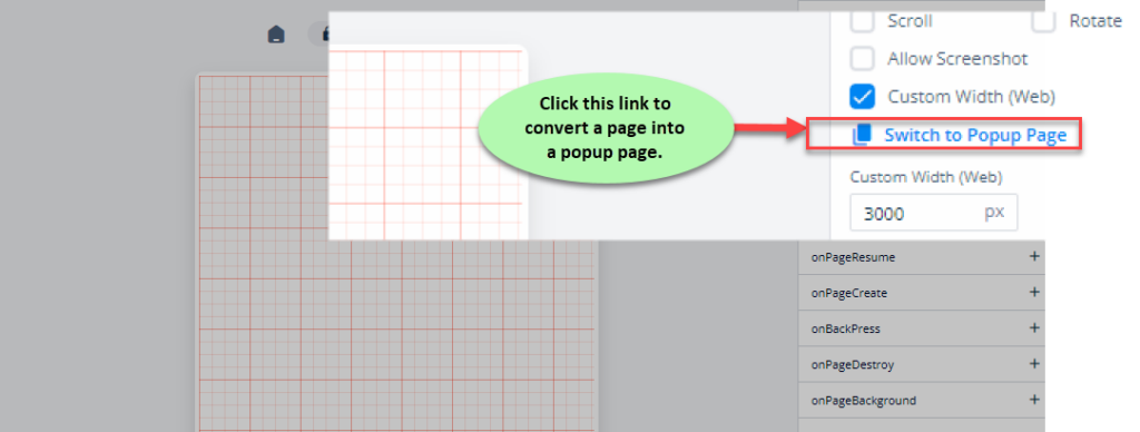
After you add a page to the application, the Page Properties panel to the right of the vDesigner canvas displays the Switch to Popup Page link.
To switch to a popup page:
- In the Page Properties panel, click the Switch to Popup Page link, and the Switch to Popup Page dialog box opens.
- In the Switch to Popup Page dialog box, click Switch, and the page is converted into a popup page.
Note:- You cannot turn a popup page into a page after the page is converted into a popup page.
For a popup page, you can configure different properties in the following categories:
- UI Configuration
- Data Configuration
- Security Configuration
- Event Configuration
These properties are described as follows:
UI Configuration
| Tab | Property Name | Description | Mandatory | New Default Values | Visibility Rules |
| Basic | Reference Name | This box displays the default reference name of the newly added page. Also, you can change the default reference name. At the application level, the reference name is used to manage components and elements. | Yes | PageXXXX | |
| Basic | Scroll | When you click this check box, the page displays the scroll bar. The user can move the scroll bar to see the content of the page. | No | Clear Check box | |
| Basic | Rotate | When you click this check box, the screen or related page will have the feature to automatically switch to landscape mode after the user turns his or her device sideways. | No | Clear Check box | |
| Basic | Allow Screenshot | When you click this check box, the application allows you to take a screen capture of the related page. | No | Clear Check box | |
| UI Properties-Style | Styles | Allows you to select a specific style for the page from the list of pre-defined styles. The vDesigner module offers pre-defined styles that you can apply to the element. | No | Default | |
| UI Properties-Background | Page Background | Allows you to define the page’s background by providing the following options: 1. Color 2. Image 3. Gradient | Yes | Color | |
| UI Properties-Background | Color | Click the left box to define the background color of the page. | Yes | #FFFFFF | When Page Background = Color |
| UI Properties-Background | Image | Allows you to configure an image as the background of the bottom sheet. | No | ||
| UI Properties-Background | Image Source | This box comes into view after you select Image in the Page Background list. To configure an image as the element’s background, you can use one of the following options: –> None –> URL –> Asset Library | Yes | When Page Background = Image | |
| UI Properties-Background | Image URL | This box comes into view after you select URL in the Image Source list. In the Image URL box, enter the URL of an image. The application fetches the image from the URL-based location and then displays it as the page’s background. | Yes | When Image Source = URL | |
| UI Properties-Background | Fit Type | Provides the following options to resize the image in the container: 1. Cover:- The image keeps its aspect ratio and fills the available dimensions. The image is clipped to fit in the container. 2. Fill:- With this option, the image is resized to fill the given dimensions. If required, the image is stretched or reduced to fit in the container. 3. Contain:- The image keeps its aspect ratio but is resized to fit in the container. | No | Cover | When Page Background = Image |
| UI Properties-Background | Axis | Allows you to configure the orientation of the gradient color as follows: 1. Vertical 2. Horizontal In a color scheme, a color gradient specifies a range of position-dependent colors. These colors are used to fill a region. | Yes | Vertical | When Page Background = Gradient |
| UI Properties-Background | Color1 | Allows you to define the first color in the color gradient scheme. Click the left box to select the first color. | Yes | #FFFFFF | When Page Background = Gradient |
| UI Properties-Background | Color2 | Allows you to define the second color in the color gradient scheme. Click the left box to select the second color. | Yes | #FFFFFF | When Page Background = Gradient |
| UI Properties-Background | Position | Allows you to define the position of the popup page by providing the following options: 1. Center 2. Top 3. Bottom | No | Center | |
| UI Properties-Alignment and Spacing | Padding | This property allows you to define padding around each side of the page. It provides four different boxes to define the padding around the right, left, top, and bottom side of the page. The padding specifies the space in pixels around each side of the page inside the page border. | No | 0 | |
| UI Properties-Alignment and Spacing | Margin | Allows you to define margin around each side of the element. It provides four different boxes to define the margin outside the right, left, top, and bottom border of the element. At the page level, the “Margin” property specifies the space between the page’s content and the page’s border. | No | 0 | |
| UI Properties-Alignment and Spacing | Border Radius | Allows you to define the radius of one or more corners of the element. Defining the radius of the corner makes the corner of the element round. | No | 0 | |
| UI Properties-Alignment and Spacing | Elevation | Allows you to configure the elevation of the page’s background. The elevation is measured as the relative distance between two surfaces along the Z-axis. | No | 0 | |
| UI Properties-Alignment and Spacing | Scrim Color | Allows you to configure the scrim color. The scrim color specifies the color of the visible part of the current page after the popup page opens and overlaps the current page. | No | #000000 | |
| UI Properties-Alignment and Spacing | Container Internal Alignment | Allows you to define the alignment of different elements that you drag to a page. You can define the alignment of elements across horizontal and vertical axes of the page. Click the first list to select the alignment across the horizontal axis as follows: 1. Left 2. Center 3. Right Click the second list to select the alignment across the vertical axis as follows: 1. Top 2. Middle 3. Bottom 4. Space Around 5. Space Between 6. Space Evenly |
Data Configuration
| Tab | Property Name | Description | Mandatory | New Default Values | Visibility Rules |
| Data Configuration-Input | Entity Path | This property allows you to map an entity to a page. To map an entity: 1. Click in the Entity Path box, and a smart selector expands. 2. The smart selector displays the list of different entities, functions, and elements. 3. In the list, select an entity for the following purposes: a. To fetch the data from the entity and then display it on the page. b. To get the data from page and then store it in the entity. | No | {{ fx }} |
Security Configuration
| Tab | Property Name | Description | Mandatory | New Default Values | Visibility Rules |
| Security Configuration-Basic | Security Level | This property allows you implement the page-level security by providing the following options: 1. User Session:- If you select this option, the application lets the user access the current pop-up page after successful login-based authentication. When you select this option, you also need to perform the following functions: a. Click the three-dot icon right to the page’s title (for example:- Untitled_86044) and then select Set as Login to turn the popup page as a login page b. Configure the “Authentication” API on an element in the popup page. 2. Device Lock:- If you select this option, the user will need to use the device unlock password (for example:- number, biometric to access the page. |
Event Configuration
On the “Popup Page” component, you can configure the following events:
- onPageResume
- onPageCreate
- onBackPress
- onPageDestory
- onPageBackground
Was this article helpful?
YesNo