
vDesigner Dashboard (UI block’s placement and auto-creation feature)
The vDesigner module is based on the concepts of Flutter. Designing UI on canvas is broadly managed by the two following aspects:
- Placement of elements on canvas–
- Auto Placement
- Manual Placement of elements:- This function enables the user to determine the position and placement of the UI after the user drags it to the canvas.
- Dimensions of elements & layouts:- After the user drags an element to the canvas, the element appears with the default dimensions. Thus, the user can change the dimensions of the element based on the requirement.
Auto placement
- First element drag:- After you drag the first element to the canvas, you can see positioning guides (
 ) on the top left based on the default alignment of the page.
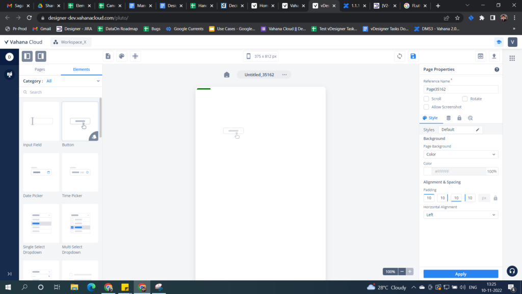
After you drop the element on the canvas, the element is placed at the top left of the page.
- Auto Creation of Layout
- Row: Column & Stack are auto-created
- Column: Row & Stack are auto-created
- Stack: None
- Add ons
- Users can make these add ons available or unavailable by using a CTA on the toolbar.
- Users can observe these virtual layouts by changing any of the UI properties.
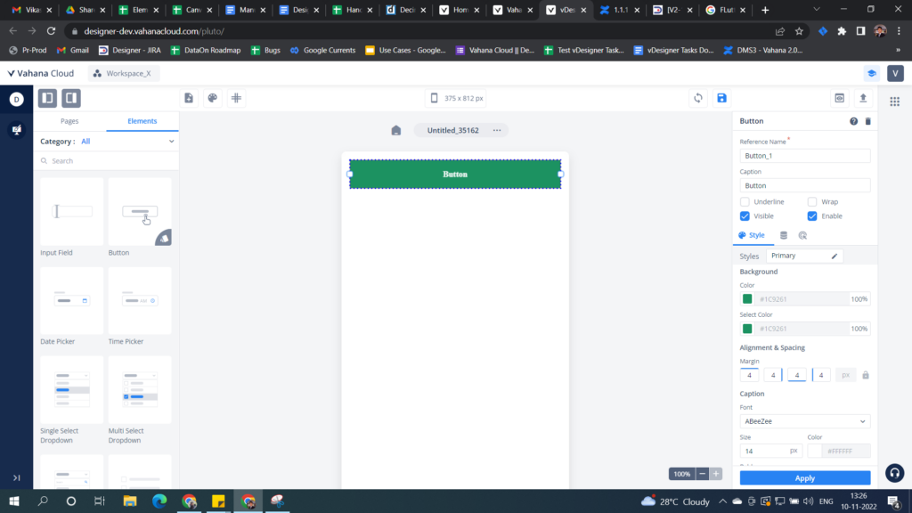
- Next element drag:- Now if the user drags another element, there are 4 possibilities:
- The element is placed to the left of the first element
- The element is placed to right of the first element
- The element is placed to top of the first element, and
- The element is placed to the bottom of the element.
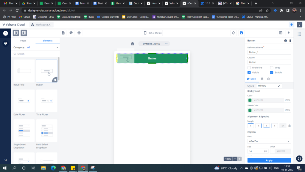
Accordingly, the user can see the guides (green for all possibilities, yellow for the final drop position) based on the mouse pointer position when the second element is dragged to the canvas (Refer to the below image).
Let us take a look at a use case to understand how the auto-creation of the row, column, and stack works on the vDesigner canvas and in the preview mode.
Auto-creation of Row
- Underlying Parent
- Page, Column, Header, Footer, Card, List
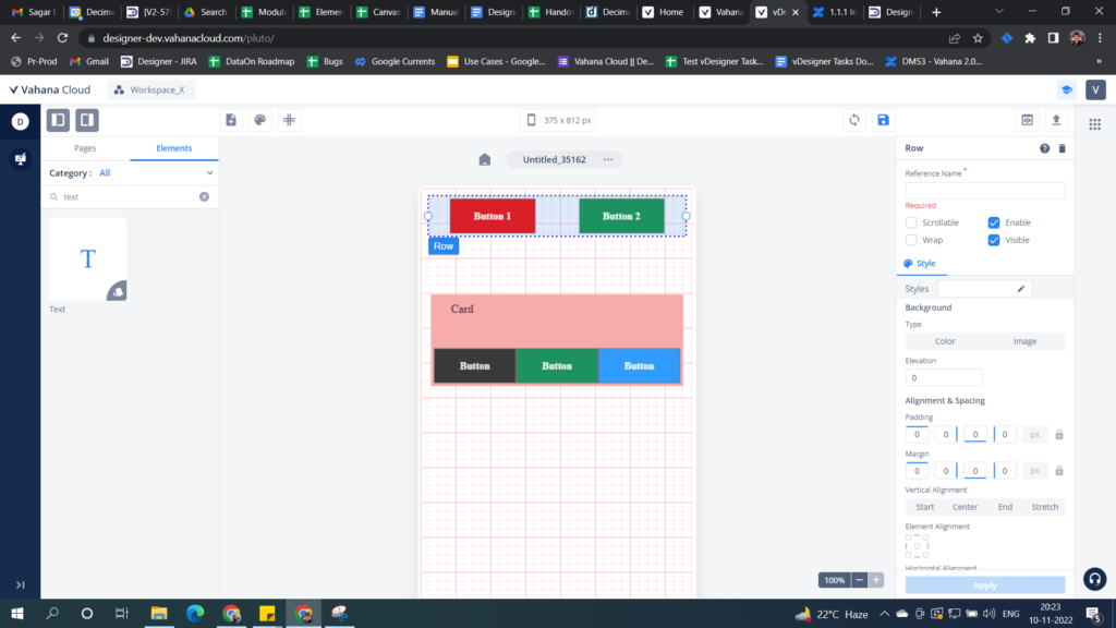
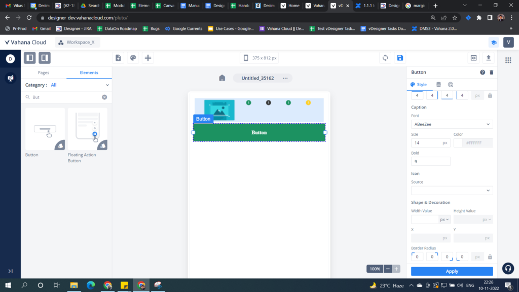
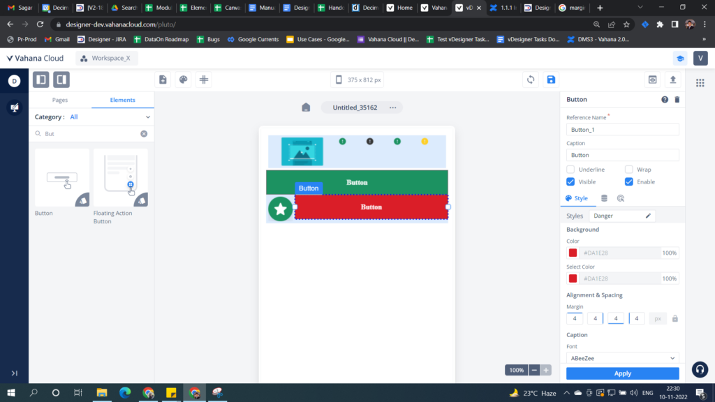
- Scenario 1: Two adjacent buttons on the page.
- Scenario 2: Two adjacent buttons on the card.
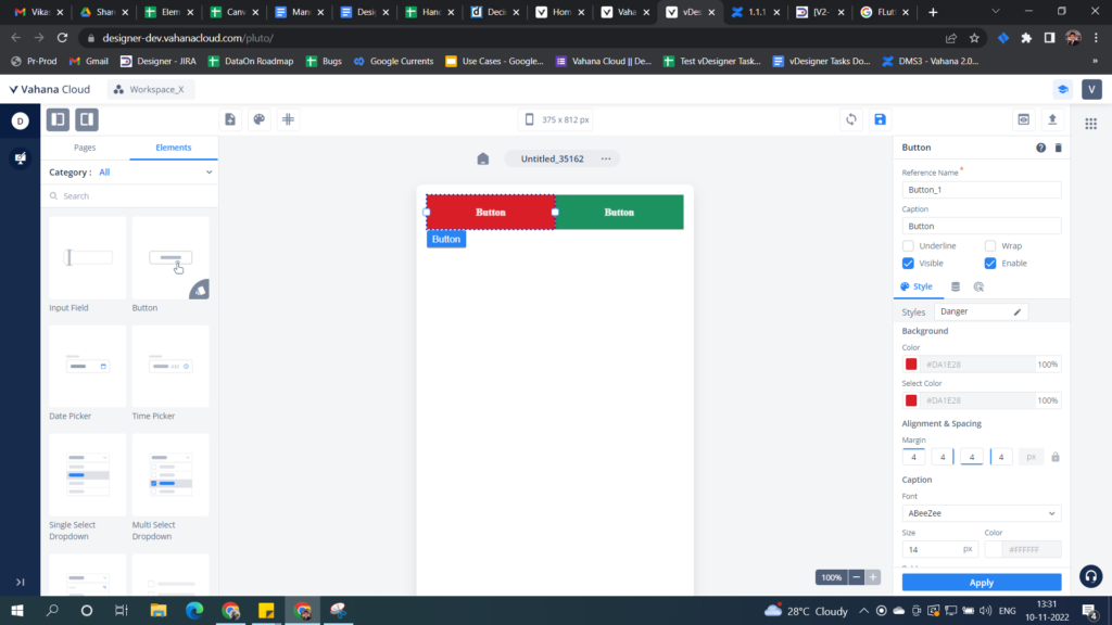
So you can clearly see that the red button is placed next to the green button as the yellow guide assists to place the element (the final drop position). Since we already know that the canvas of vDesigner 2.0 is based on “Flutter” (An open source SDK), the horizontal, vertical, and overlay placement of UI elements needs row, column, and stack respectively.
But you don`t need to worry! vDesigner auto-creates them for you so that you enjoy a FIGMA-like experience.
Design on Canvas
Any element or layout-type element can be placed on the page or inside a layout-type element (Header, Footer, Card, Row, Column, List, Stack). All of these layout elements and pages can be classified into the following fundamental layout types and their auto-creation rules:
- Row: Column & Stack are auto-created
- Column: Row & Stack are auto-created
- Stack: None
If the system generates a layout, it’s called a virtual layout. Virtual layouts are only visible on canvas but not in the preview or build. The following are the possible layouts that are auto-created:
- Horizontal Layout (Row):- It is automatically created when a user places one element horizontally next to an existing element if the underlying parent is Page, Column, Header, Footer, Card, or List.
- Vertical Layout (Column):- It is automatically created when a user places one element vertically under or over the existing element if the underlying parent is Row.
- Overlay Layout:- It is automatically created when a user places and holds one element on top of an existing element.
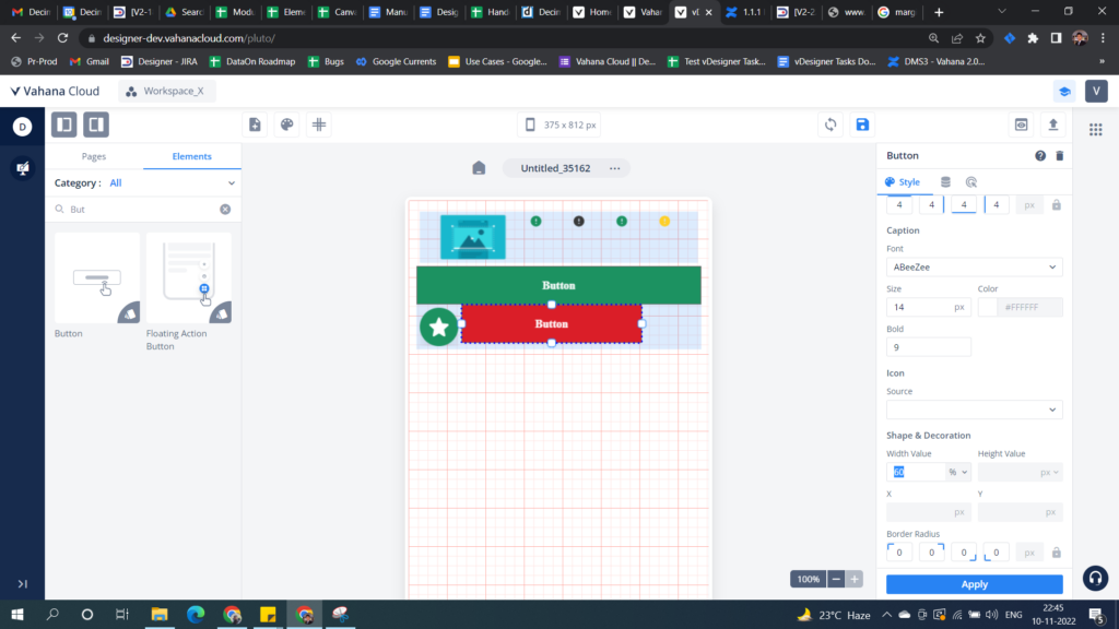
See the following screen capture where:
- Two buttons are placed horizontally next to each other with the help of guides
- Place a card element and then place three buttons inside the card (See the row is automatically created in the below image.)
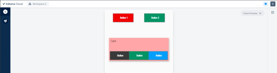
Design preview
See, in the following screen capture, the virtual row is not visible in the preview mode.
Auto-creation of Column
- Underlying Parent: Row
- Scenario: Two adjacent buttons in a row
Design on Canvas
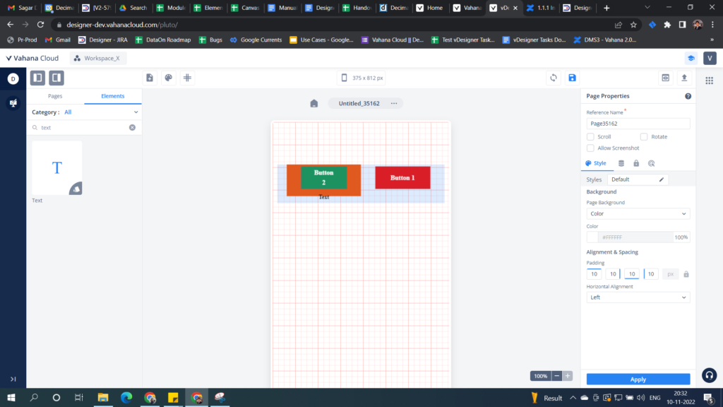
- Place two buttons horizontally next to each other with the help of guides (It is a case of automatically created row).
- Thus, place another text element under the first button as shown in the below image. (It is a case of automatically created column).
- Impart a color to the row by using the property panel (Virtual Layout Realization)
Design Preview
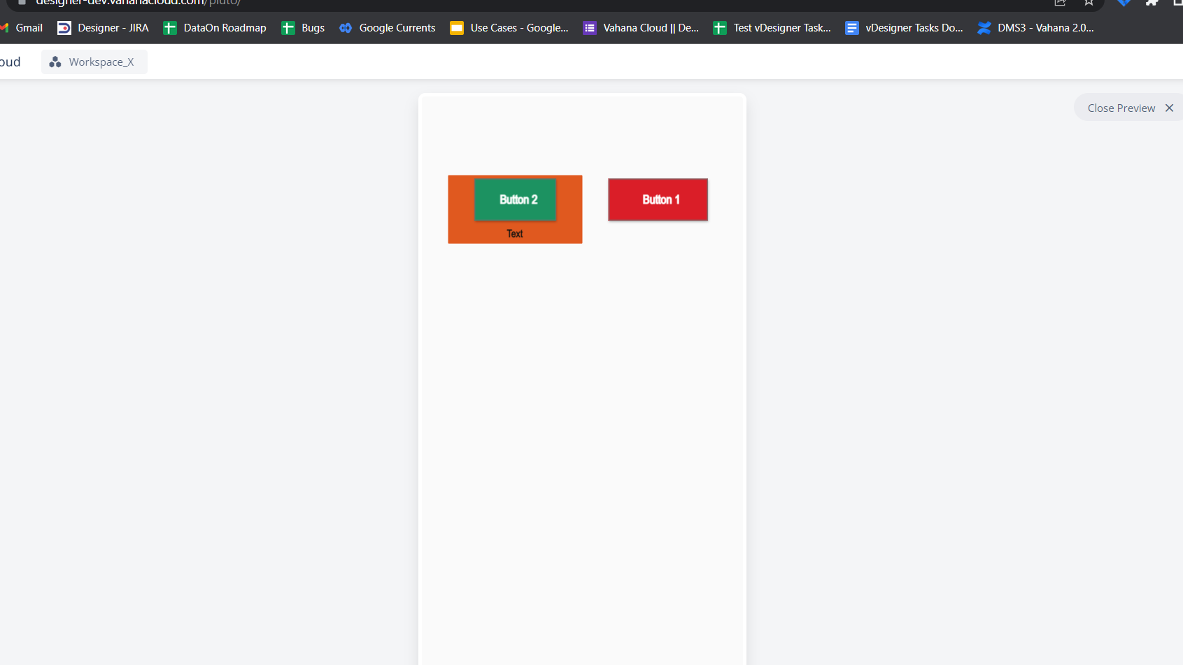
- You can observe that the realized column is visible, but the virtual row is not visible.
- The column is formed as these two buttons are placed in a virtual row.
Manual placement of elements on the canvas
- Alignment
- Padding – Inner spacing within the element. This is only applicable for page and layout elements.
- Margin – Outer spacing between the current element and adjacent elements/layout/page.
Alignment
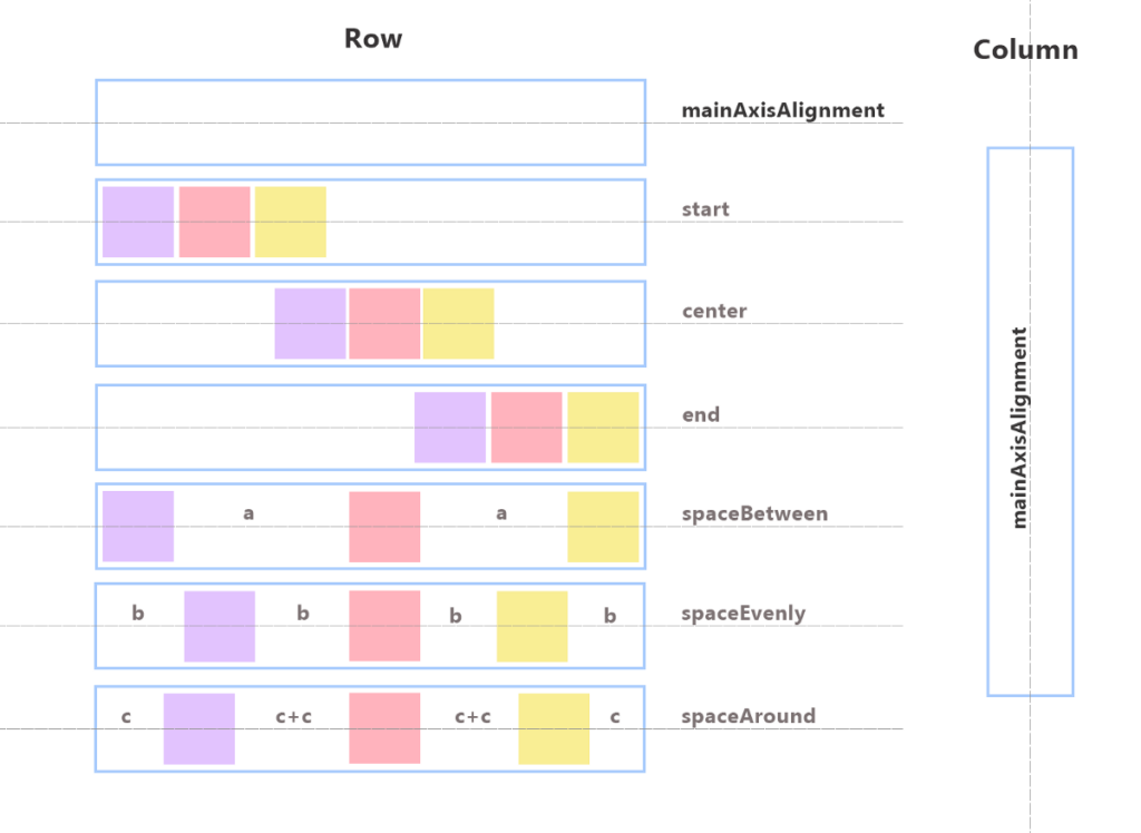
vDesigner provides the alignment at the three following levels:
- Page:- When an element is dragged to the page, the element by default takes the top-left alignment.
- Groups Layout:- Users can define the alignment at the real and virtual layout levels (this also includes groups) for all child elements and for itself with respect to its immediate parent. vDesigner offers two type of the layout: Row and Column. A user can either create a layout or the system generates them. If a user creates them, it’s called a real layout. If the system generates, it’s called a virtual layout. If the user selects and then creates a group around a set of elements on the canvas, a virtual layout is created.
- Element:- A user can define the alignment of an element with respect to the alignment of its parent UI block, such as a layout, group, or page.
You can define the alignment of the element on the Property panel. Also, you can click right-click to define the element by using a context menu.
| Direction/UI/Entity Level | Page | Row | Column/Card | Element (If parent = row) | Element (If parent = row) |
| Vertical | –>Top –>Bottom –> Center (Default) | –>Top –>Bottom –>Center (Default) –>Space Evenly –>Space Around –>Space Between | –>Top –>Bottom –>Center | N/A | |
| Horizontal | –>Left (Default) –>Right –>Center | –>Left (Default) –>Right –>Center –>Space Evenly –>Space Around –>Space Between | –>Left (Default) –>Right –>Center | N/A | –>Left –>Right –>Center |
Note:-
- Based on the hierarchy, the alignment of the child element overrides the alignment of the parent element.
- If one element is removed from a row or column, the rest of the elements should be positioned by following the alignment of the parent element.
To define the alignment of the element:
- Drag the Row layout to the canvas.
- Place the four icons inside the row.
- You can apply the alignment in the two following ways:
Case1:- By using the context menu
- Right-click the Row layout, a context menu opens.
- On the context menu, select the alignment.
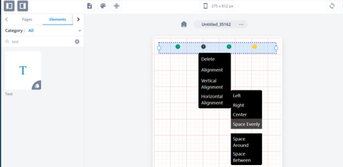
Case2:- By using the property panel
- Click the Row layout, the property panel opens.
- On the property panel, find the Horizontal Alignment list.
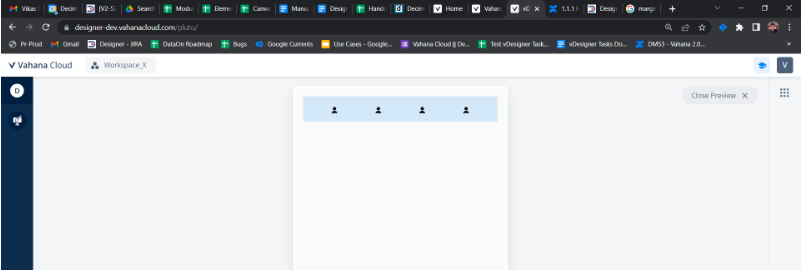
- Click the Horizontal Alignment list and then click Space Evenly (See the following screen capture).
Padding and Margin
- Padding specifies the internal spacing between layout’s edges and its child element. Padding is applicable to all the layouts. Padding is available for all four sides of the element (Left, Right, Top, and Bottom).
- Margin defines the external spacing between a UI element and the edge of its adjacent element/layout/page. Margin is available for all fours sides (Left, Right, Top, and Bottom).
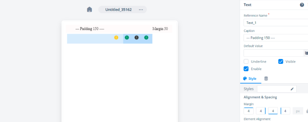
To define the padding and margin:
- Drag the Row layout to the canvas.
- Place the four icons inside the row.
- Click the Row layout, the property panel opens.
- On the property panel, find the Alignment and Spacing area.
- Under Alignment and Spacing, find Padding.
- Under Padding, enter 150 in the fourth box to define the left padding.
- Under Margin, enter 50 in the second box to define the right margin.
Dimensions of UI Elements
Before exploring this use case, let us discuss the four concepts as follows:
- Page Size – 375 * 800 px (height changes if the page is set to scrollable)
- Element category
- Default drop dimension behavior
The vDesigner module classifies the elements into two following categories:
- Fill X – Horizontal – The user has control over width only while height is locked. All elements and layouts are covered in the scope except Icon, Image, Fab & Text.
- Fill XY – Both Directions – The user has control over both height & width. The elements that fall under the scope are- Icon, Image, Fab and Text.
Default drop dimension behavior of elements
- Auto-Fill – Element automatically takes the space available in the permissible direction.
When the elements are dragged to the canvas, all elements and layouts, except Icon, Image, Fab and Text element, behave like this. When the element with auto-fill property dragged to the canvas again, the elements will retain their auto-fill nature.
Steps:–
- Drag a FAB button to the canvas.
- Drag the Button element next to the Fab button, the Button element (Fill X) takes the available width on the page
- On the property panel of the button, the dimension type is “Auto-fill” (Default value).
- Manual:- Element width can be switched to “Manual” mode. This is applicable to all elements. You can change the dimension (For example:- Width) of the element in the pixel (px) unit or percentage (%) unit.
Steps:-
- On the property panel of the button, switch the dimension type from “Auto-fill” (default) to “Manual“.
- Enter the width as 60% to see the change on the canvas and in the preview mode.
Note:-
- Wrap – Size is defined by the content inside the element. Only the “Text” element is of wrap type.
- Min dimensions – For all elements, there is a min width & height assigned. Elements can`t be resized beyond min dimension or fitted in a space where min dimension > available space.