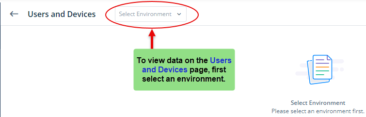
Users and Devices
Under the Analytics section, you can view graphical representations of the different platforms, devices, and operating systems that call a service.
Also, it displays the data related to the following:
- Number of successful and unsuccessful attempts when a service is called
- Number of users who consumed the service during a specific time period, and geographical location from where the user consumed the service.
NOTE:– When you access the Users and Devices page, it does not display the data until you select an environment. After you select the environment, it displays pie charts related to different platforms, devices, and operating systems. The users accessed the application on these devices and platforms to call a service.
Now, let’s go through them as follows:
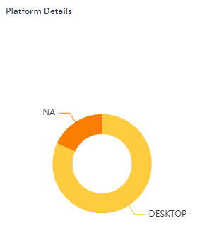
Platform Details
This panel displays data related to the platform on which the service was called. A platform can be a laptop computer, mobile phone device, and others. When you put the mouse pointer on a specific section of the pie chart, you will see the following data:
- Total Number of users
- Percentage of users
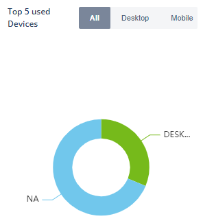
Top Five Used Devices
This section provides information on the top five devices that were used to consume the service, including their usage frequency and device names, such as the iPhone, Samsung, OnePlus, and others.
To differentiate between the devices, you can select the desktop or mobile devices and then get the more precise data. When you put the mouse pointer over a particular section of the pie chart, you will see the following data:
- Total number of events
- Percentage of events

Top Five Used OS
This graph represents the five operating systems that were most used to call a service, for example, Windows, iOS, Android, etc. You can click the related tabs to see the data as follows:
| Tab | Description |
| All | After you click this tab, the Users and Devices page displays the data related to all devices, including desktop, mobile, etc. |
| Desktop | After you click this tab, the Users and Devices page displays the data related to all devices, including desktop and laptop computers. |
| Mobile | After you click this tab, the Users and Devices page displays the data related to all types of mobile devices, including Android, IOS, etc. |
When you put the mouse pointer on a specific section of the pie chart, you will see the following data:
- Total Number of events
- Percentage of events
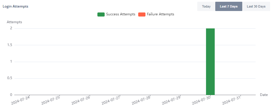
Login Attempts Panel
This bar graph displays the number of successful and failed attempts when a user accesses the service. You can view data for the last 7 days (this option by default is selected), last 30 days, or today.
When you put the mouse pointer on a specific bar, you will see the total number of successful and failed attempts.
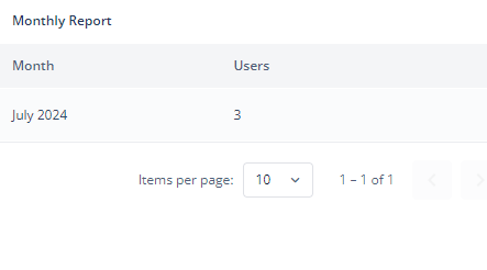
Monthly Report
This section displays the total number of users who attempted to call the service.
NOTE:– When you click the Download button in the Monthly Report section of Users and Devices page, the data download notification is displayed as a pop-up message such as:
“Your monthly report has been generated Successfully. Please contact the administrator to download the report from this path :/home/decimal/Desktop/Excel Reports/AU_XXXX_REVAMP-XX0XX86XX1-XYXYXY-X0X6XX3XX9-September 2020-01-06-NNNN 01:04:13.xlsx”
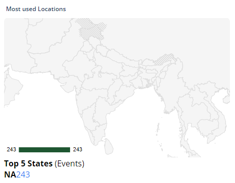
Most Used Locations
This map-like graphical representation displays the top five states where the user accessed the service most frequently.