Log Analytics
Introduction
Log Analytics provides data in graphical or tabular formats, aiding high-level configuration and troubleshooting within the application for issues such as bugs, slowness, or system failures.
By analyzing Services Average Time, Traffic (Success), Failures, Service Usage Counts, etcetera. in this set of data, you can identify the service that is underperforming or encountering issues. Also, you can click the Refresh icon to refresh the table of data logs.
It includes four sub-sections:
- Highlights
- Most Used Services
- Most Time Consuming Services
- Services Usage
How to access the Log Analytics section?
- On the Users and Devices page, see the left navigation panel.
- In the left navigation panel, click the Log Analytics icon (
 ) to display the Log Analytics section.
 - In the Log Analytics section, the Highlights tab is selected by default.
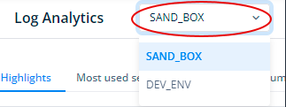
Note:- You can also change the environment by clicking the SAND_BOX list. If you select another environment, the Log Analytics page displays logs related to services that were configured under the selected environment.
The following heading broadly describes different sub-sections of the Log Analytics sub-module.
Log Analytics sub-sections and their components
Highlights
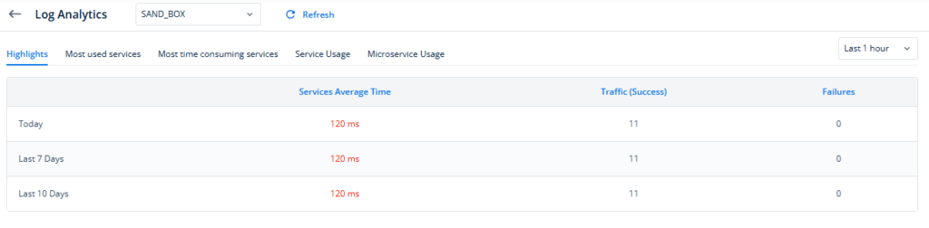
In the Highlights sub-section, you can view a comparison of the cumulative success rate, failure rate, and average execution time for all services. This data is presented in a table format and can be viewed for today, yesterday, last 7 days, and the last 10 days on an hourly basis.
The Hightlights tab displays the following data fields:
| Data Field | Description |
| Services Average Time | Provides the average time taken by all services in the application. |
| It is measured in Milliseconds. | |
| If the value of the Service Average Time increases, it means a few services are slow or experiencing failures. | |
| Traffic (Success) | This field displays the total number of successful attempts to access the service. |
| Failures | Shows the number of unsuccessful attempts to access the service. |
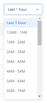
Note:- You can also select different time ranges when a service experienced downtime for a specific time period.
Most used services
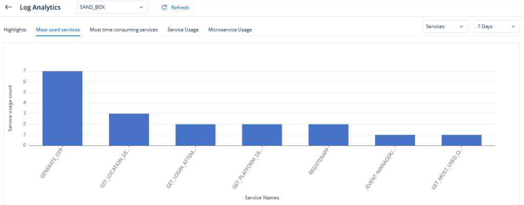
This bar graph provides data on the usage count for the top ten most used services for the application. It also allows you to determine the total number of times an application has accessed the service.
The Most used services tab displays the following components:
- The vertical axis (y-axis) represents the count of service usage, while the horizontal axis (x-axis) displays the names of services. Under each bar, you can see the name of the service.
- To get the exact usage number, put your mouse pointer on each bar. The number displayed next to the Direct text specifies the count of the service usage.
- When you click a bar, a detailed data comes into view (The metrics are explained at the end of this article)
- You can click the Services list to view the details of the most used services under the following categories:
- Services:- Under this category, you can view the details of all types of services, including microservices, custom Java-based services, public vConnect APIs, and third-party connectors.
- Connectors:- Under this category, you can view the details of all third party connectors, such as Google Map API, PAN Authentication API, and others. These connectors consume third-party APIs.
- Micro-services:- Under this category, you can view the details of all micro-services and custom Java-based services.
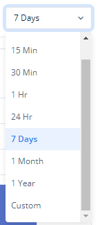
- By default, this graph displays results for the last 7 days. You can also define the time range to view data for a number of minutes, days, months, or even years. You can select a value for the time range in the 7 Days list or change it by scrolling down the list to the end.
Most time consuming services
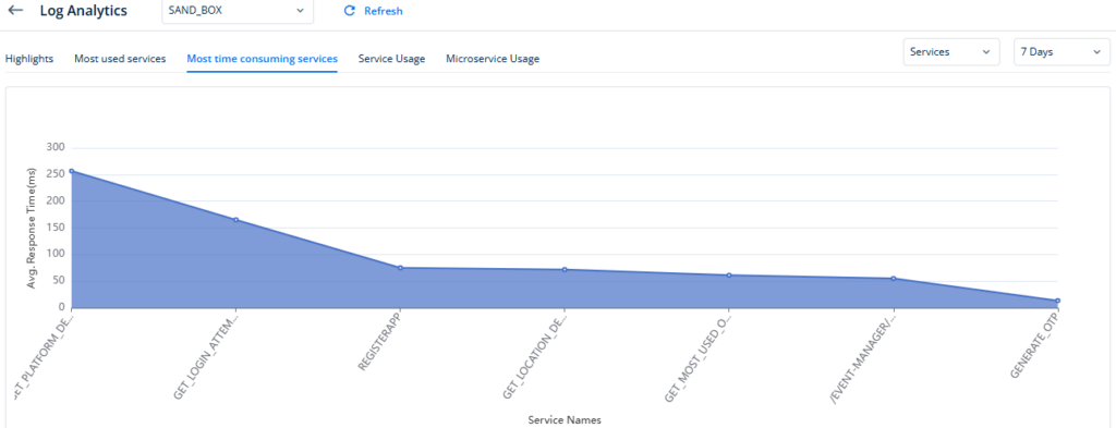
As the name suggests, this line graph displays the average response time for the top ten most time-consuming services. The Log Analytics page displays these service in descending order in terms of time consumption.
This helps you find the service that is not working as expected. Thus, you can find the bug in the service and fix it.
The Most time consuming services tab displays the following data values:
- The vertical axis (y-axis) represents the Average Response Time, while the horizontal axis (x-axis) displays the names of services.
- Average Response Time is the average time taken by a service to return the response.
- To get the exact Average Response Time, put your mouse pointer on each dot. The number displayed next to “Direct” specifies the time in milliseconds.
- When you click a dot, a detailed set of data comes into view (The metrics of the detailed set of data are explained at the end of this article)
- You can click the Services list to view the details of the most used services under the following categories:
- Services:- Under this category, you can view the details of all types of services, including microservices, custom Java-based services, public vConnect APIs, and third-party connectors.
- Connectors:- Under this category, you can view the details of all third party connectors, such as Google Map API, PAN Authentication API, and others. These connectors consume third-party APIs.
- Micro-services:- Under this category, you can view the details of all micro-services and custom Java-based services.
- By default, this graph displays results for the last 7 days. However, you can change the time range to view data for any number of minutes, days, months, or even years. You can select a time range by scrolling down the 7 Days list.
Service usage
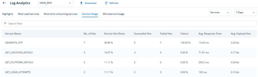
In this tab, you can view both detailed and high-level data for each service implemented in the application. You can examine metrics such as the number of hits, success rate, failure count, failure percentage, average response time, and average payload size.
This feature allows you to review data for a maximum of five hundred services within the application. It allows you to target specific services for troubleshooting or enhancements from L1 to L3 levels. You can use the Search filter on the top of the Service Usage table and use it to find a specific service.
You can click the Download link to download data metrics related to the services’ usage. The Service Usage tab displays the performance data metrics based on the selected data in the related filters. When you click the Download link, it downloads the same set of data in Excel format that it shows under the Service Usage tab.
When you click a record of the service, a set of detailed data comes into view. (You can see metrics of this data at the end of this post.)
The Service usage tab displays the following data values:
| Column | Description |
| Number of Hits | Indicates the total number of times the service was called. |
| Service Hits Share | This column displays the percentage share of hits to a specific service out of the total number of hits that were made to all services. |
| Success | Shows the number of successful attempts to access the service |
| Failure | Displays the number of unsuccessful attempts that the application makes to access the service. |
| Failure (%) | Represents the percentage of failures relative to the total number of access attempts. |
| Avg. Response Time | Mean time taken by a service to return the response. |
| Avg. Payload Size (kb) | The payload specifies size of the response data that the API returns to the client application. The size of payload depends on the data payload of the API request. Note:- On the vConnect platform, most of the APIs are configured and exposed with the POST method. |
By clicking the Services list, you can view services’ details under the following categories:
- Services:- Under this category, you can view the details of all types of services, including microservices, custom Java-based services, public vConnect APIs, and third-party connectors.
- Connectors:- Under this category, you can view details of all third party connectors, such as Google Map API, PAN Authentication API, and others. These connectors consume third-party APIs.
- Micro-services:- Under this category, you can view the details of all micro-services and custom Java-based services.
Note:- By default, this graph displays data for the last 7 days. You can change the time range to the other value (for example, 24 Hr) by scrolling the list to view data. You can also define a custom time range by clicking the Custom option in the list. After you select Custom in the list, you can select the date and time in the From and To boxes to define a custom time range.
When you click the graphs
To gain more detailed insights for a better understanding of bugs, the last three sub-sections—Most Used Services, Most Time-Consuming Services, and Service Usage—offer a key feature that is outlined as below:
- For Most Used Services: Click one of the bars in the graph.
- For Most Time-Consuming Services: Click one of the “dots” in the graph.
- For Service Usage: Click a service-related record in the list of different records.
After you click in the graphs under the For Most Used Services, For Most Time-Consuming Services, and For Service Usage tabs, the Log Analytics page displays the following data:
- Data Traffic
- Average Response Time
- Payload Size
Metrics Detailed:
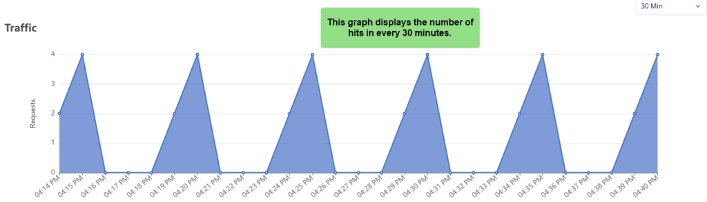
1. | Traffic | Specifies the total number of time the application calls a service. |
| The vertical axis (y-axis) represents the number of requests, while the horizontal axis (x-axis) displays the time interval. | ||
2. | Avg. Response Payload Size | Displays the size of the response data that the API returns to the application or end-user. |
| The vertical axis (y-axis) represents Average Response Payload Size in KBs, while the horizontal axis (x-axis) displays the time interval. | ||
3. | Avg. Response Time | Shows the average time that a service takes to return data to the application. |
| The vertical axis (y-axis) represents Average Response Time in Milliseconds, while the horizontal axis (x-axis) displays the time interval. |
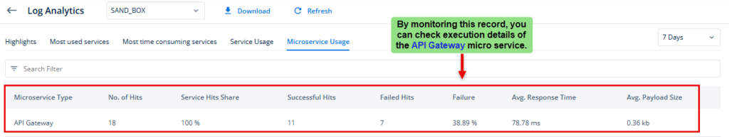
Microservice Usage
Under this tab, you can view metrics related to the execution of microservices, including API gateways and Java-based custom microservices. The metrics include the number of hits, success rate, failure count, failure percentage, average response time, and average payload size. If you view and observe this data set, it helps you monitor microservices’ performance during the specific timeframe.
This feature allows you to monitor the data of a maximum of five hundred microservices at a time. You can fix the problem related to microservices execution from level1 to level3 under the defined problem escalation matrix.
To observe the performance of a specific microservice, see the Search box and then enter the microservice’s name in it to display the record related to that microservice.
You can click the Download link to download data metrics related to the micro services’ usage. The Microservice Usage tab displays the performance data metrics based on the selected data in the related filters. When you click the Download link, it downloads the same set of data in Excel format that it shows under the Microservice Usage tab.
Under the Microservices Usage tab, the data table displays the following data values:
| Column | Description |
| Microservice Type | It displays the name of the microservice (for example, API gateway) Note:- For a single microservice, the Log Analytics module displays a single record that contains the aggregated data (for example, No of Hits) for that microservice. |
| No of Hits | It displays the total number of hits that the client environment made to invoke the microservice. |
| Service Hits Share | This column displays the percentage share of hits to a specific microservice out of the total number of hits that were made to all micro-services. |
| Success Hits | It displays the total number of attempts (for example, 6) that the client environment made to successfully invoke the microservice. |
| Failure Hits | It displays the total number of failed attempts that the client environment made to invoke the microservice. |
| Failure | This column displays the failed attempts to invoke the service in percentage units (for example, 45%). |
| Avg. Response Time | This column displays the average time that the microservice takes to send the response to the client. |
| Avg. Payload Size | The payload specifies size of the response data that the microservice returns to the client application. The size of payload depends on the data payload of the API request. |
Note:- By default, this graph displays data for the last 7 days. You can change the time range to the other value (for example, 24 Hr) by scrolling the list to view data. You can also define a custom time range by clicking the Custom option in the list. After you select Custom in the list, you can select the date and time in the From and To boxes to define a custom time range.
Under Microservices Usage tab, when you click a specific record, the <<microservice name>> page opens. This page displays graphs related to the following data variables:
1. | Traffic | Specifies the total number of time the application calls a service. |
| The vertical axis (y-axis) represents the number of requests, while the horizontal axis (x-axis) displays the time interval based on the time frame (for example, 30 Min) selected in the 7 Days list. | ||
2. | Avg. Response Payload Size | Displays the size of the response data that the API returns to the application or end-user. |
| The vertical axis (y-axis) represents Average Response Payload Size in KBs, while the horizontal axis (x-axis) displays the time interval based on the time frame (for example, 24 Hr) selected in the 7 Days list. | ||
3. | Avg. Response Time | Shows the average time that a service takes to return data to the application. |
| The vertical axis (y-axis) represents Average Response Time in Milliseconds, while the horizontal axis (x-axis) displays the time interval based on the time frame (for example, 1 Hr) selected in the 7 Days list. |