
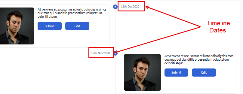
Timeline Date
The Timeline Date element is used under the Timeline component to display chronological events with associated dates. It helps structure time-based data clearly and interactively, making it easier to track progress, historical records, or scheduled events.
Common Use Cases:
- Event Tracking: Displays a sequence of events along a timeline.
- Project Milestones: Highlights key dates in a project lifecycle.
- Activity History: Logs historical actions or updates in a structured format.
Configuration
The element’s configuration in vFlow 2.0 allows you to customize its behavior, appearance, and interaction across various devices. Through simple settings, you can control everything from its visibility and functionality to how it adapts to different screen sizes, making it flexible and user-friendly for developers and end-users. Let’s have a look at each of its configurations:
Basic
| Basic Configuration | Description |
| Type | The Type indicates the type of element you are configuring. In this case, it defaults to “Timeline Icon” and cannot be changed here. This selection is made initially when you first create the element. |
| Reference Name | The Reference Name is a unique identifier assigned to the element for internal use. This name is visible only to vFlow users, and is not displayed to end-users. The Reference Name is intended for your convenience, helping you easily identify and manage the element throughout. |
| Label | The Label is the name or text displayed on the element, making it easily recognizable to end-users. |
| Description | The Description field is intended for use by application designers or administrators (vFlow users) to provide additional context or details about the element. This description is not visible to end-users and is used solely for internal reference to assist with element management. |
Properties
| Properties | Description |
| Mandatory | To make this mandatory, select this checkbox. |
| Default Value | This property allows you to display a predefined static value as the default text within the element. This can be useful for providing instructions to users. |
| Start Date & Time | It defines the format of the beginning date and time for the timeline event. |
| End Date & Time | It defines the format of the end date and time for the timeline event. |
Style
The Style option allows you to personalize the appearance of the element. This includes adjusting various visual aspects to ensure it complements your application’s overall design. Here’s a breakdown of different settings that you can make adjustments to:
- Laptop/Desktop width: The button automatically expands to take up 100% of the available width on desktop and laptop screens, ensuring it spans the entire container. However, this width can be adjusted according to the specific design or layout requirements.
- Tab width: On tablet devices, the button will also span 100% of the container’s width. This ensures that it adapts well to medium-sized screens, making it easier for users to interact with on touch devices. You can adjust this width as needed based on design preferences.
- Mobile width: For mobile devices, the button remains at 100% width to ensure full visibility and easy tap interaction, even on smaller screens. Like the other devices, this width can be adjusted as per requirement.
Data Style
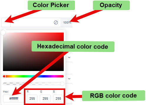
- Background Color: To choose the background color for the element, you can use a color picker or enter a hexadecimal or RGB color code. The default opacity is set to 100%.
Font
- Family: You can select the font family for text in the element. If no specific font is chosen, “None” will use the default font.
- Size: You can specify the font size in pixels (px).
- Color: You can set the font color using the color picker or a hexadecimal or RGB color code. The default opacity is 100%.
- Alphabet Case: You can choose the text case (e.g., uppercase, lowercase) or select “None” to keep the original case.
- Text Alignment: You can set the text alignment (e.g., left, center, right) or select “None” for default alignment.
Dimension
- Height: You can define the height of the element in pixels (px) or percentage (%).
- Maximum Height: You can set the maximum height to prevent the element from exceeding this limit.
- Width: You can specify the width of the element in pixels (px) or percentage (%).
- Maximum Width: You can define the maximum width to prevent the element from expanding beyond this size.
Spacing
- Margin: To adjust the space around the element, enter values for top, right, bottom, and left margins in pixels (px). Default is 0px for all sides.
- Padding: To set the internal space within the element, enter values for top, right, bottom, and left padding in pixels (px). The default is 0px for all sides.
- Border Radius: To define the curvature of the corners of the element, enter values for top-left, top-right, bottom-right, and bottom-left in pixels (px). The default is 0px for all corners.
- Custom CSS Class Name
- Users can enter custom CSS class names in the provided input field to apply additional styles.
- Multiple Classes Names can be provided If needed. They can be applied by separating them with commas, as indicated by the example (
classA, classB).
Note: Similarly, you can provide the label and data styling on the same style option.
Data
If you want to fetch and show some data in this element, select one of the data types that fits best for the business requirements:
Note: To learn more about Data, click here or check the post under configurator.