Subcomponent
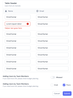
The Subcomponent element allows one component to be embedded within another while retaining its original properties. This enables reuse of components across different sections of the application.
For example, suppose a Table component needs to be displayed within a List component. In that case, a Subcomponent element can be created under the List component, and the Table component can be mapped to it. This element ensures that the Table component retains its properties that were defined during its creation while being embedded within the List component.
This subcomponent element support is available under List (Template 4) and Fieldset.
For example:

Common Use Cases:
- Component Embedding: Inserts a component (e.g., Table) inside another (e.g., List).
- Modular UI Design: Reuses components across multiple sections.
- Dynamic Content Mapping: Displays nested components while maintaining their configuration.
Configuration
The element’s configuration in vFlow 2.0 allows you to customize its behavior, appearance, and interaction across various devices. Through simple settings, you can control everything from its visibility and functionality to how it adapts to different screen sizes, making it flexible and user-friendly for developers and end-users. Let’s have a look at each of its configurations:
Basic
| Basic Configuration | Description |
| Type | The Type indicates the type of element you are configuring. In this case, it defaults to “Subcomponent” and cannot be changed here. This selection is made initially when you first create the element. |
| Reference Name | The Reference Name is a unique identifier assigned to the element for internal use. This name is visible only to vFlow users, and is not displayed to end-users. The Reference Name is intended for your convenience, helping you easily identify and manage the element throughout. |
| Label | The Label is the name or text displayed on the element, making it easily recognizable to end-users. |
| Description | The Description field is intended for use by application designers or administrators (vFlow users) to provide additional context or details about the element. This description is not visible to end-users and is used solely for internal reference to assist with element management. |
Properties
| Property | Description |
| Visible | To make this invisible, unselect this checkbox. |
| Enable | To disable the element, click to clear this checkbox. |
| Supported Component List | Find the component by its Reference Name in the dropdown list of components eligible for embedding. |
Note that all the components can not be embedded, so this dropdown list has only embeddable components.
Following is the list of the subcomponents supported under the list and fieldset component:
| Component | Supported Subcomponent |
| List | 1. List 2. Table 3. Accordion 4. Chart |
| Fieldset | 1. List 2. Table |
Style
The Style option allows you to personalize the appearance of the element. This includes adjusting various visual aspects to ensure it complements your application’s overall design.
Note: If you style the embedded sub-component here, it will overwrite the styling defined in the parent configuration of the component.
Here’s a breakdown of different settings that you can make adjustments to:
- Laptop/Desktop width: The button automatically expands to take up 100% of the available width on desktop and laptop screens, ensuring it spans the entire container. However, this width can be adjusted according to the specific design or layout requirements.
- Tab width: On tablet devices, the button will also span 100% of the container’s width. This ensures that it adapts well to medium-sized screens, making it easier for users to interact with on touch devices. You can adjust this width as needed based on design preferences.
- Mobile width: For mobile devices, the button remains at 100% width to ensure full visibility and easy tap interaction, even on smaller screens. Like the other devices, this width can be adjusted as per requirement.
- Custom CSS Class Name
- Users can enter custom CSS class names in the provided input field to apply additional styles.
- Multiple Classes Names can be provided If needed. They can be applied by separating them with commas, as indicated by the example (
classA, classB).
How to Implement Subcomponent
Though the subcomponent element can be implemented under the List and Fieldset components in different scenarios, let’s understand its implementation with an example scenario.
Example Scenario: There is a form in the list format that will fetch the data with validation and store it in the static JSON path defined under Form Component.
Step 1. Define Data under Form Component
- Under the Form Component, go to the Data Section.
- Select Data Type as Static. Under the JSON input field, define:
{
"246271826182": {
"id": "value",
"name": "value",
"email": "value",
"listdata": [
{
"name": "Heading 1",
"docName": "Profile Check",
"imageid": "https://example.com/icon.jpg",
"companyName": "Company Ltd"
}
],
"tabledata": [
{
"id": 1,
"name": "User1",
"email": "user1@gmail.com"
},
{
"id": 2,
"name": "User2",
"email": "user2@gmail.com"
}
]
}
}
Step 2. Create and Configure list
- Create a List.
- In the Data section, select Path data type and define path (For example,
getVal("listdata"))
Step 2. Create Fieldset
- Create a Fieldset Component.
- In the element section, create a subcomponent.
- Under the subcomponent properties section, map the List in the Supported Component List.
- Then map the fieldset under the layout of the Form Component.
Important Rules & Behaviors
- Server-side pagination won’t work in subcomponents.
- Only ‘Path’ data types are supported for subcomponents, not other data sources.
- Recursive Mappings Unsupported: You can’t map a component (such as a List) into itself, either directly or through indirect nesting, to avoid crashes or unpredictable behavior due to infinite loop formation.
Runtime Scenario
- You must fill required fields in both Fieldset and its subcomponents to proceed. The footer button will stay disabled if required fields aren’t filled — this label will now say “Check mandatory fields with validations.”
