
Styles
You can use the Styles submodule to reconfigure the properties of the default style or create a new custom style. When you create a new style, you also configure properties under it. The Styles submodule contains a default style named Default. Apart from the Default style, you can create multiple custom styles based on the application design-related requirements.
In the Styles submodule, you can treat a style as a virtual container that includes several UI (user interface)-style-related properties. It allows you to configure the properties related to the following:
- Layout components, such as page, popup, header, footer, and others
- Elements, such as input field, button, dropdown, and others
For layout components, you can configure the following properties:
- Background (Type, Color)
- Border
- Shadow, and others
For elements, you can configure the following properties:
- Background (Color)
- Label
- Placeholder
- Input
- Border
- Caption, and others
These listed properties are top-level properties. They also contain second-level properties that you configure under a style. When you apply a theme to the application, the second-level properties change the design aspect and overall look and feel of the application.
You can access the Styles submodule as follows:
Accessing Styles Submodule
To access the Styles submodule, see the list of different themes on the Themes page. In the list, click the name of a theme to display the Colors page. On the Colors page, see the left navigation panel. In the left panel, click the Styles menu ( ) to display the Styles page.
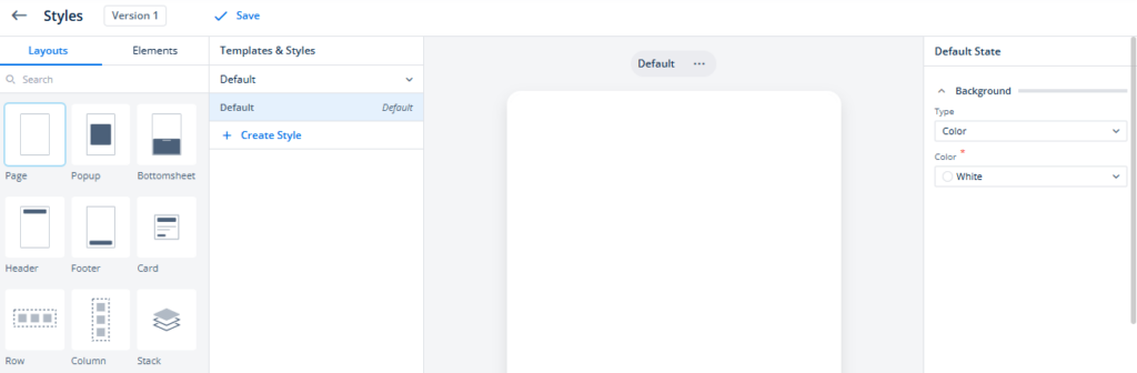
The Styles page contains a canvas that automatically displays the selected layout or element. On the Styles page, in the Layouts tab, if you select a layout, the middle canvas displays the selected layout. After you select a layout, you can change layout-related properties in the Default State panel.
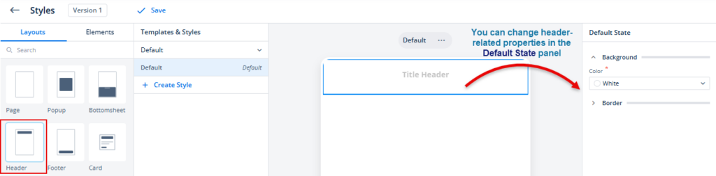
When you click the Elements tab and then select an element (for example, Dropdown), the middle canvas displays the selected element in single status or with multiple states.
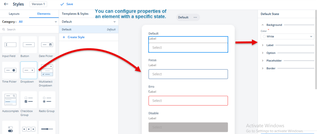
The Styles submodule displays several elements with different states, such as Default, Focus, Err (when the element shows the error), and Disable. You can reconfigure the properties of the element with a specific state.
For instance:- You can define the look and feel of the dropdown element with the disabled state. Later, the application displays the dropdown element in disabled (inactive) mode based on the configuration that you define for the disabled (inactive) dropdown element.
Creating a New Style
You can create a new custom style if you choose not to use the default style. Under the new custom style, you can configure the properties related to the page and other layouts and different elements. After you create a custom style, it becomes available in the vDesigner module. Thus, you can apply the custom style to different pages and elements.
To create a new custom style:
- On the Styles page, see the Templates & Styles panel.
- In the Templates & Styles panel, click Create Style to display the Create Style dialog box.
- In the Create Style dialog box, in the Name box, enter the style’s name (for example, Style3_for_newapp).
- After you enter the new style’s name, click Create to display the message “<<style name>> created,” and create a new style.
- After you create a new style, the Templates & Styles panel starts displaying the name of the new style.
Note:- After you create a new custom style, you mandatorily need to configure the property of the page layout under the newly created custom style. If you do not configure the property of the page layout, the Theme module will fail to create the custom style.
- Click the Layouts tab, and then select Page.
- See the Deafult State panel, and then select the values in the Type list and Color list to define the background color of the page.
- After you define the background color of the page, click Apply in the Default State panel.
- After you click Apply, the Styles page displays a message, “Style updated,” and a Save link comes into view.
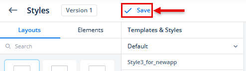
- Click Save to update and use a new custom style for the application.
Making a Custom Style the Default Style
If you created multiple custom styles, you can make one of them the default style. When you do not have a custom style under the Styles submodule or you did not create any custom style earlier, a style named Default serves as a default style.
In the Styles submodule, the Default style is a predefined (system-defined) style. After you create one or more custom styles, you can make one of the custom styles the default style as follows:
- On the Styles page, see the Templates & Styles panel.
- In the Templates & Styles panel, find a custom style (for example, style1_for_newapp) that you want to make the default style.
- After you find the style, put the mouse pointer on the name of the style to display Set as default.
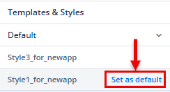
- Click Set as default to make the style the default style.