
PV
The Pair Values (PV) component in your application is designed to display values from one array based on the values of another array. This functionality makes it useful for scenarios where you want to establish a connection or pairing between two sets of data and present them side by side for better insight or analysis.
Key Features
- Array Pairing: The component pairs data from two different arrays, allowing for the display of values from one array based on the values of another. This ensures that corresponding data points are shown together, facilitating a clearer comparison or relationship.
- Flexible Data Handling: The PV component can handle dynamic arrays, adapting to changes in data in real-time. This feature makes it suitable for applications that require frequent updates or dynamic data interactions.
- Mapping Capabilities: It helps map one set of data to another, enabling quick visualization of the relationships between two distinct data sets.
- Efficient Data Display: This component is ideal for scenarios like displaying key-value pairs, where the values of one field or array are determined by the values of another field or array, offering an organized and clear format.
Common Used Cases
- Product Comparison: Displaying product features and corresponding prices from two different arrays allows for easy comparison of attributes.
- Data Correlation: Visualizing the relationship between two arrays of data in analytical applications, such as matching sales figures with time periods or products.
- Key-Value Pairing: In cases where key-value structures need to be displayed, such as showing a list of categories alongside corresponding descriptions or metadata.
In essence, the Pair Values component (PV) enables the dynamic pairing and display of related data, providing flexibility and clarity when dealing with two interconnected data arrays.
Creating PV
- Under Inventory (
 ), click “Component“, which is on the second left panel.
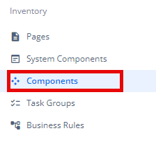
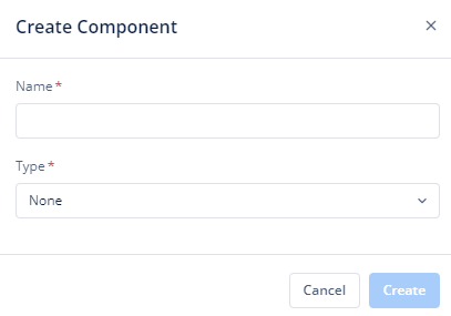
- Click Create placed on the second horizonal panel from the top, and a dialog box “Create Component” pops up.

- Select Type as “PV“, Name it in the text box and click “Create“.
- When you click Create (
 ), Basic option of Config menu for the PV opens.
 - Now you will see the following menu options:
- Basic
- Properties
- Style
- Layout
- Events
- Data
Note: You can create this component in the layout option of the configurator section as well. After this, you can follow the process given below.
Basic
| Basic Properties | Description |
| Type | The Component Type indicates the type of component you are adding. In this case, it defaults to “PV” and cannot be changed here. This selection is made initially when you create the component. |
| Reference Name | The Reference Name is a unique identifier assigned to the component for internal use. This name is visible only to vFlow users, and is not displayed to end-users. The Reference Name is intended for your convenience, helping you easily identify and manage the component throughout. |
| Description | The Description field is intended for use by application designers or administrators (vFlow users) to provide additional context or details about the component. This description is not visible to end-users and is used solely for internal reference to assist with component management. |
Properties
| Properties | Description |
| Tab Key Navigation | |
| Expand Only One Fieldset | |
| Header | It is displayed on the top of the component. To know more about header, click here or see the Header section under the System Components. |
| Footer | It is displayed on the bottom of the component. To know more about the footer, click here or see the Footer section under the System Components. |
Style
The Style option allows you to personalize the appearance of the PV. This includes adjusting various visual aspects to ensure it complements your application’s branding and overall design. Here’s a breakdown of different settings that you can make adjustments to:
Template
There is only one template available for the PV UI design need:
- Template 01
For the template, you can customize the following settings:
- Large Screen Width: The PV width is adjustable by entering a percentage value in the text box. For example, if the width is set to 100%, the PV will take the full width of the screen.
- Transparent: When you click to select this checkbox, the PV will have a transparent background, allowing it to blend into the background of the page or layout.
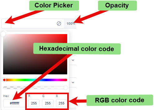
- Background Color: To choose the background color for the template, you can use a color picker or enter a hexadecimal or RGB color code. The default opacity is set to 100%.
- Font:
- Family: You can select the font family for text in the component. If no specific font is chosen, “None” will use the default font.
- Size: You can specify the font size in pixels (px).
- Color: You can set the font color using the color picker or a hexadecimal or RGB color code. The default opacity is 100%
- Alphabet Case: You can choose the text case (e.g., uppercase, lowercase) or select “None” to keep the original case.
- Text Alignment: You can set the text alignment (e.g., left, center, right) or select “None” for default alignment.
- Dimension:
- Height: You can define the height of the template in pixels (px) or percentage (%).
- Maximum Height: You can set the maximum height to prevent the template from exceeding this limit.
- Width: You can specify the width of the template in pixels (px) or percentage (%).
- Maximum Width: You can define the maximum width to prevent the template from expanding beyond this size.
- Spacing:
- Margin: To adjust the space around the template, enter values for top, right, bottom, and left margins in pixels (px). Default is 0px for all sides.
- Padding: To set the internal space within the template, enter values for top, right, bottom, and left padding in pixels (px). Default is 0px for all sides.
- Border Radius: To define the curvature of the corners of the template, enter values for top-left, top-right, bottom-right, and bottom-left in pixels (px). Default is 0px for all corners.
- Custom CSS Class Name
- Users can enter custom CSS class names in the provided input field to apply additional styles.
- Multiple Classes Names can be provided, If needed. They can be applied by separating them with commas, as indicated by the example (
classA, classB).
These settings allow you to tailor the template and, consequently, the PV to your specific design preferences and requirements.
Layout
You can learn more about configuring the layout in the Configurator section. However, it’s important to note a key difference when working with the PV component:
- This differs from the process in the Configurator, where you have the ability to create new components directly while configuring the PV’s layout.
- When creating a PV component from the Inventory menu option in vFlow, you cannot create a new component directly from the PV’s layout option. Rather you have to make a new component separately and then map it to the PV.
Note: In the PV layout, you can map only the Accordion component.
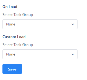
Events
The Events option of the PV component, as shown in the image, allows you to assign task groups that will execute when specific actions occur within the component. These tasks can be created separately in the configurator or inventory and can be grouped to perform various actions when certain events are triggered.
Here’s a breakdown of the Events section:
- On Load:
- This option lets you assign a task group that executes automatically when the component is loaded.
- You can select an existing task group from the dropdown list labeled Select Task Group or go back to the inventory or configurator to make a task or task group if needed.
- This could be useful for initializing data or triggering other actions as soon as the PV component is displayed.
- Custom Load:
- The Custom Load event enables you to trigger a specific task group during a customized loading scenario.
- Similar to the previous options, you can choose the task group to be executed from the Select Task Group dropdown list or go back to the inventory or configurator to make a task or task group if needed.
After assigning the appropriate task groups to these events, click the button to apply your configuration to the component.
In summary, the Events section provides flexibility in automating actions within your PV by linking predefined tasks to occur during the component’s loading process. This customization ensures a more dynamic and interactive user experience, tailored to your application’s specific needs.
Data
If you want to fetch and show some data in the PV, select one of the data types that fits best for the business requirements:
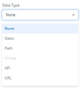
Note: To know more about Data, click here or check the post under configurator.
Reference
The Reference option becomes available when you open a Component, Task Group, or Business Rule from the page-level inventory that opens in the configurator, and the global inventory.
Since the global inventory contains all the Components, Task Groups, and Business Rules created in Vahana vFlow 2.0, it can be challenging to determine where these entities are mapped within the application. The Reference option provides a structured overview of all locations or items where a selected entity is mapped, offering a clear dependency view.
Example Mapping:
- Form > Row 1 > Column 1
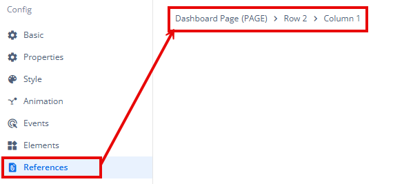
This feature helps in efficiently tracking and managing dependencies across different sections of the application.