Properties
In the left panel, under Config, you can find the ‘Properties‘ section. In the Properties section, you configure the advanced properties of a page. These properties are explained for different templates are given below:
For Normal Template
| Property Name | Description |
| Enable | By default, this check box is selected. It means that when you create a page, it is created as an active page. The user can perform the function on the active page. If you click to untick the Enable check box, the page becomes inactive. The user cannot perform the function on the inactive page. |
| Disable Browser Button | When you tick this check box, the back and forward buttons of the browser become unavailable. |
| Webview Whitelist URL | In this box, you can enter one or more URLs that you want to whitelist. To enter more than one URL, you can separate two URL strings by a comma. Whitelisting a URL means that you can access the URL from within your application. |
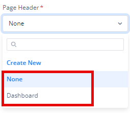
| Page Header | A Page Header is the section at the top of an application’s screen or page that typically includes key navigational and informational elements. Its design and content can vary depending on the type of application and its purpose. This list displays the earlier-created headers. If you have not created a header, it displays the None value, which means you have not created a header. To configure a header for the current page, you need to create a header and then select it from this list. To create a header: a. Click the Page Header list. b. In the Page Header list, click Create Header, and a Create System Component dialog box opens. c. In the Create System Component dialog box, in the Reference Name box, enter the header’s name (for example, datasbm_header). d. After you enter the header’s name, click Create to create a new header. Note: Page Header will not appear merely by creating it but by mapping it to the page in the Properties section of the Configurator and saving it.  |
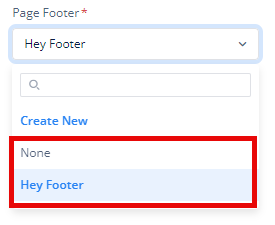
| Page Footer | A Page Footer is the section located at the bottom of a screen or page. It typically contains supplementary information and links that support the primary content and user experience. This list displays the earlier-created footers. If you have not created a footer, it displays the None value, which means you have not created a footer. To configure a footer for the current page, you need to create a footer and select it from this list. To create a footer: a. Click the Page Footer list. b. In the Page Footer list, click Create Footer, and a Create System Component dialog box opens. c. In the Create System Component dialog box, in the Reference Name box, enter the footer’s name (for example, datasbm_footer). d. After you enter the footer’s name, click Create to create a new footer. Note: Same mapping and saving as stated in the Page Header is required required for the Page Footer to appear.  |
| Save | After you define the page’s advanced properties, click |
For Login Template
| Property Name | Description |
| Page Logo URL | In this box, you can enter the URL of the image of logo. |
| Login Method | To define the Login flow, you can choose between “Login With Password” (default) and “Login With Username” |
| Username Properties | Under Username Properties, You must define the Label, which gives a name to the text box in which the user will enter the username, for example, Email Address, Customer ID, etcetera. |
| Password Properties | Under Password Properties, You must define the Label, which gives a name to the text box in which the user will enter the password, for example, Password, Passcode, etcetera. Note: This section appears only if you selected “Login with Password” method. |
| Action Button | Under Action Button, You must define the Label, which gives a name to the button by clicking which user can enter the application. |
Slider
A slider, often referred to as carousel, is a user interface component that allows users to view a series of images or videos in a sequential manner. It typically includes navigation controls, such as arrows or dots, to cycle through the images or videos. Sliders can be used for displaying multiple images or videos within a confined space, enhancing visual engagement and usability on websites or applications.
| Property Name | Description |
| Navigation Type | To enable navigation arrows for changing slides, select this checkbox. |
| Indicators | To display indicators showing your current slide among all slides on the page, select this checkbox. |
| Auto Transition | To set the duration for which a slide is displayed before automatically transitioning to the next, select this checkbox. You can enter time duration in seconds. |
| Pause on Hover | To make the slide pause when the cursor is put on it, select this checkbox. |
For each slide, you can specify the following attributes:
- Type: You can choose between Image and Video depending on the content you wish to display on the slide.
- URL: You can enter the URL of the image or video that you want to display on the slide.
- Label: You can provide a text label or name for the slide.
Also, you can add a new slide by click on the Add Slide icon (![]() ) and define the its type, URL, and Label.
) and define the its type, URL, and Label.
Background
To provide any background image to the page, you can add the URL of the JPEG/ JPG image in the box.

After defining the advanced properties, Click ![]() to apply them.
to apply them.
For OTP Template
| Properties | Description |
| Page Logo URL | In this box, you can enter the URL of the image of logo. |
| For Login | If you want to use OTP for Login, click to select this checkbox. |
| Hide OTP Timer | If you want to hide the OTP Timer, click to select this checkbox. |
| Load With Login Template | If you want to use the Login Template interface like slider, background image, etcetera, click to select this checkbox. |
| Display Message | If you want to display some message, you can enter that in the box. |
| OTP field Label | You can display label text or name using it, for example, ‘OTP’ or ‘Enter Your OTP’. |
| OTP Digit Length | In this box, you can define the length of OTP that you want to send to the user’s device. |
Note: Click here to see Slider and Background as they are same as described above.
After defining the advanced properties, Click ![]() to apply them.
to apply them.
For New Password
| Properties | Description |
| Page Logo URL | In this box, you can enter the URL of the image of logo. |
| Password field Label | You can provide label text or name in the field, for example ‘Enter New Password’. |
Note: Click here to see Slider and Background as they are same as described above.
Forgot Password
| Properties | Description |
| Page Logo URL | In this box, you can enter the URL of the image of logo. |
| Password field Label | You can provide label text or name in the field. |
