
General Settings
On the vFlow module’s home page, “General Setting” is the first top-level menu option in the left navigation panel. It allows you to configure basic properties at the application level. It primarily contains two sections, as follows:
- Properties
- Theme
Under these sections, different configurable properties are briefly described as follows:
Properties
| Property Name | Description |
| Application Name | This box, by default, displays the name of the application in non-editable mode. This is the same application that you created on the Vahana portal’s home page. |
| Application Description | This box also displays a constant non-editable text value, Default microapp for vflow. |
| Home Page | Click this list and then select a page. In the application, the selected page is treated as the application’s home page. |
| Login Page | Click this list and then select a page. In the application, the selected page is treated as the application’s home page. |
| Application Header | Click this list and then select the entity/object that stores the application header. |
| Breadcrumb | Click this list to select the entity that stores the value of a Breadcrumb. You can also manually enter the value of the Breadcrumb. The breadcrumb is a random alphanumeric value that helps the end-user view and track the site map or navigation map. The navigation map tells the user about the location or path of the current page. Thus, the user can determine where he or she is in the current application while accessing different pages in the application. 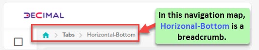 |
| Push Notification | This property allows you to configure the push notification at the application level. You can choose one of the following options: 1. Firebase:- Choose this option to send the alerts to the application device through Firebase SDK 2. Java:- Choose this option to send the alerts to the application device through Java |
| System Message Position | This property allows you to define the horizontal and vertical alignment of system-level messages as follows: 1. Vertical Alignment:- It provides three options to define the vertical alignment of the message: a. None b. Top c. Bottom 2. Horizontal Alignment:- It provides three options to define the horizontal alignment of the message: a. Left b. Center c. Right |
| Application Loader | This property allows you to configure the following: a. Image URL:- In this box, enter a URL from where the image of the loading screen fetched. b. Default Title In this box, enter the application’s title. This title appears under the icon of the application on the device’s screen. c. Default Description In this box, enter a brief description of the application loader that comes into view under the application title. |
Theme
| Property Name | Description |
| Theme | Click this list and then select one of the following available themes: 1. None (No theme is applied) 2. Dark 3. Light |
| Theme Font | Click this list and then select one of the following available fonts for the theme’s text: 1. None (If this option is selected, the application displays the theme-related text in the default font) 2. Lato 3. Sans Pro 4. Roboto |
| Theme Color | Click this list to select one of the available theme colors, such as red, blue, green, etcetera. |
| Custom CSS | In this box, you can define the code of different CSS properties in JSON format. These CSS properties provide a different look and feel to the application.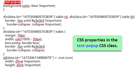 |
After you configure properties under the Properties and Theme sections, click Commit to apply these properties to the application.
Was this article helpful?
YesNo