
Full Calendar
The Full Calendar component is an advanced calendar feature that allows users to view and manage events in different timeframes, such as month, week, or day views. This component provides detailed scheduling functionality, making it ideal for applications that require comprehensive event tracking and management.
Key Features:
- Month, Week, and Day Views:
Users can switch between viewing events for an entire month, a specific week, or a detailed day view. The day and week views allow users to track events on an hourly basis. - Event Management:
Users can add, edit, and delete events within the Full Calendar. This includes setting start and end times, event descriptions, and other relevant details. - Drag and Drop:
Events can be easily rescheduled by dragging and dropping them to different time slots in the day or week view. - Customizable Layout:
The Full Calendar’s layout can be tailored to fit your application’s design, including the ability to change the color scheme, font styles, and display options. - Event Notifications:
Alerts or notifications can be set to remind users of upcoming events, ensuring they stay on top of their schedule. - Recurring Events:
The component supports setting up recurring events, allowing users to schedule repeated tasks or appointments without manual re-entry.
Common Use Cases:
- Appointment Scheduling:
Suitable for managing meetings, appointments, or events that span over specific time slots in a day or week. - Project Management:
Track project deadlines, meetings, or deliverables with detailed day-by-day or week-by-week event tracking. - Resource Booking:
Manage the booking of resources such as meeting rooms or equipment by visualizing their availability on the calendar.
Difference from Basic Calendar:
While the basic Calendar component provides a straightforward view of dates, the Full Calendar offers advanced functionality, such as switching between time frames (month, week, day) and detailed tracking of events on an hourly basis.
Creating Full Calendar
Basic
| Basic Properties | Description |
| Type | The Component Type indicates the type of component you are adding. In this case, it defaults to “Full Calendar” and cannot be changed here. This selection is made initially when you create the component. |
| Reference Name | The Reference Name is a unique identifier assigned to the component for internal use. This name is visible only to vFlow users, and is not displayed to end-users. The Reference Name is intended for your convenience, helping you easily identify and manage the component throughout. |
| Description | The Description field is intended for use by application designers or administrators (vFlow users) to provide additional context or details about the component. This description is not visible to end-users and is used solely for internal reference to assist with component management. |
Properties
| Properties | Description |
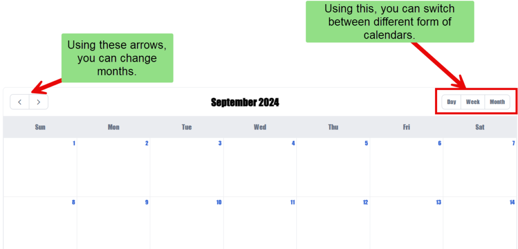
| Navigation Buttons | These buttons allow users to navigate through the next or previous month, week, or day, providing an easy way to explore different time periods within the calendar. |
| Calendar View Buttons | Enabling this option displays a toolbar at the top of the calendar, allowing users to switch between different calendar views such as monthly, weekly, or daily, for easier navigation and viewing options. |
| Indicator | |
| Initial View | Out of Month, Week, and Day Views, you can choose the view that will be displayed at first as default. For example: An application that primarily tracks daily tasks, the “Day” view can be set as the default. |
| Start Day | You can decide whether to set Sunday or Monday as the starting day of the week. You can select between the values 0 or 1, where 0 indicates Sunday and 1 indicates Monday. In regions where Monday is considered the first day of the week, this property can be set to ensure consistency with local conventions. |
| Start Date Type / End Date Type | You can choose between a static or dynamic start date and end date type: Static: Manually specify the start and end dates directly. Dynamic: Provide a path to fetch the start and end dates dynamically based on external data or logic. Use Case: For instance, if an account holder opened a savings account on 1st January 2024, the Full Calendar can be configured to restrict date selection prior to the account opening date. This ensures the user can only select valid dates for their overall account statement. |
| Start Date/End Date | Either add the path to get the dates or simply select the dates Add the Path: Provide a specific path to fetch the start and end dates dynamically based on external data. Select the Dates: Manually choose the start and end dates using the calendar option displayed in the configuration. The choice between these options depends on the selected Date Type (static or dynamic). |
| Header | It is displayed on the top of the component. To know more about header, click here or see the Header section under the System Components. |
| Footer | It is displayed on the bottom of the component. To know more about footer, click here or see the Footer section under the System Components. |
Style
The Style option allows you to personalize the appearance of the Full Calendar. This includes adjusting various visual aspects to ensure it complements your application’s branding and overall design. Here’s a breakdown of different settings that you can make adjustments to:
- Large Screen Width: The component width is adjustable by entering a percentage value in the text box. For example, if the width is set to 100%, the Full Calendar will take the full width of the screen.
- Transparent: When you click to select this checkbox, the component will have a transparent background, allowing it to blend into the background of the page or layout.
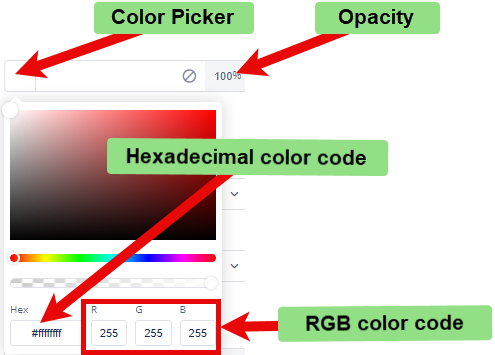
- Background Color: To choose the background color for the full calendar, you can use a color picker or enter a hexadecimal or RGB color code. The default opacity is set to 100%.
- Event Color: When creating an event for a specific time or date, you can highlight the timeslot by applying a background color. This helps visually distinguish the event on the Full calendar.
- Event Text Color: To further emphasize the event, you can customize the text color within the timeslot. This ensures the event stands out and improves visibility for users.
- Font:
- Color: You can set the font color using the color picker or a hexadecimal or RGB color code. The default opacity is 100%.
- Dimension:
- Height: You can define the height of the Full calendar in pixels (px) or percentage (%).
- Maximum Height: You can set the maximum height to prevent the Full calendar from exceeding this limit.
- Width: You can specify the width of the Full calendar in pixels (px) or percentage (%).
- Maximum Width: You can define the maximum width to prevent the Full calendar from expanding beyond this size.
- Spacing:
- Margin: To adjust the space around the Full calendar, enter values for top, right, bottom, and left margins in pixels (px). Default is 0px for all sides.
- Padding: To set the internal space within the Full calendar, enter values for top, right, bottom, and left padding in pixels (px). Default is 0px for all sides.
- Border Radius: To define the curvature of the corners of the Full Calendar, enter values for top-left, top-right, bottom-right, and bottom-left in pixels (px). The default is 0px for all corners.
These settings allow you to tailor the Full calendar to your specific design preferences and requirements.
Animation
This option allows you to apply several animations to enhance the Full calendar’s loading appeal. The following are the available animations:
- Bounce
- Flash
- Pulse
- Rubber Band
- Handshake
Their Configuration:
- Click the Type list, and then select an animation to apply an effect when the Full calendar loads.
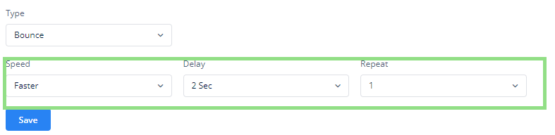
- After you select one of the animations (for example, Bounce), you will see the following configuration options:
- Speed: In this field, you can select one of the following options to adjust the speed of the animation:
- Faster
- Fast
- Slower
- Slow
- Delay: Click this list to select a value (for example, 3 seconds). This value specifies a time period. The application will load the animation after this time period (for example, 3 seconds).
- Repeat: In this list, select a value (for example, 2). This value specifies the total number of times the application will play the animation.
- Speed: In this field, you can select one of the following options to adjust the speed of the animation:
- After you configure the Full calendar’s animation properties, click
 to apply them to the Full calendar.
Events
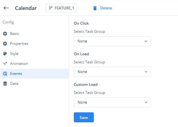
The Events option of the Full calendar component, as shown in the image, allows you to assign task groups that will execute when specific actions occur within the Full calendar component. These tasks can be created separately in the configurator or inventory and can be grouped to perform various actions when certain events are triggered.
Here’s a breakdown of the Events section:
- On Click:
- This option allows you to assign a task group to be executed when the user clicks on the Full Calendar component, for example clicking on one of the dates could show a set of date-specific events.
- You can select an existing task group from the dropdown list labeled Select Task Group or go back to the inventory or configurator to make a task or task group if needed.
- On Load:
- This option lets you assign a task group that will execute automatically when the Full Calendar component is loaded.
- This could be useful for initializing data or triggering other actions as soon as the Full Calendar is displayed.
- Custom Load:
- The Custom Load event enables you to trigger a specific task group during a customized loading scenario.
- Similar to the previous options, you can choose the task group to be executed from the Select Task Group dropdown list or go back to the inventory or configurator to make a task or task group if needed.
After assigning the appropriate task groups to these events, click the button to apply your configuration to the Full Calendar component.
In summary, the Events section provides flexibility in automating actions within your Full Calendar component by linking predefined tasks to occur on user interaction (e.g., clicking a date) or during the Full Calendar’s loading process. This customization ensures a more dynamic and interactive user experience, tailored to your application’s specific needs.
Data
If you want to fetch and show some data in the full calendar, select one of the data types that fits best for the business requirements:
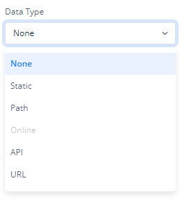
Note: To know more about Data, click here or check the post under configurator.
Reference
The Reference option becomes available when you open a Component, Task Group, or Business Rule from the page-level inventory that opens in the configurator, and the global inventory.
Since the global inventory contains all the Components, Task Groups, and Business Rules created in Vahana vFlow 2.0, it can be challenging to determine where these entities are mapped within the application. The Reference option provides a structured overview of all locations or items where a selected entity is mapped, offering a clear dependency view.
Example Mapping:
- Form > Row 1 > Column 1
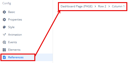
This feature helps in efficiently tracking and managing dependencies across different sections of the application.