
Application Header
Introduction to Application Header
The Application Header is a System Component that remains consistent across the entire application, regardless of the page. Positioned at the top of every screen, it serves as the primary identifier for the application, ensuring a unified and recognizable presence throughout.

Users have the ability to customize the Application Header by adding various elements, adjusting its style, and configuring both basic and advanced properties. However, it’s important to note that the Application Header can only be created and managed within the System Components section of the Inventory. This centralized management ensures that any changes to the Application Header are applied consistently across the entire application.
Creating an Application Header
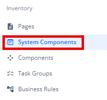
- Under Inventory (
 ), click “System Component“, which is on the second left panel.
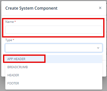
- Click Create placed on the second horizonal panel from the top, a dialog box “Create System Component” pops up.

- In the dialog box, type the Name of the system component. and Select “APP HEADER“.
- When you click Create (
 ), Basic option of Config menu for the Application Header opens.
 - Now, you will see four options under the config menu:
- Basic
- Properties
- Style
- Elements
Let’s discuss each of them descriptively:
Basic
| Basic Properties | Description |
| System Component Type | The System Component Type indicates the type of system component you are adding. In this case, it defaults to “APP HEADER” and cannot be changed here. This selection is made initially in the “Create System Component” dialog box when you first set up the component. |
| Reference Name | The Reference Name is a unique identifier assigned to the system component for internal use. This name is visible only to vFlow users, and is not displayed to end-users. The Reference Name is intended for your convenience, helping you easily identify and manage the system component throughout. |
| Description | The Description field is intended for use by application designers or administrators (vFlow users) to provide additional context or details about the system component. This description is not visible to end-users and is used solely for internal reference to assist with component management. |
| Display on Page Type | In this section, you can specify where you want your header to appear: on the Public page, the Private page, or both. This setting allows you to control the visibility of the header based on the type of page within the application. |
Properties
| Properties | Description |
| Display User Section | This option lets you add a user section at the top within the application header, which can display elements such as the user’s name, the current date, and other relevant information. To enable this feature, click the checkbox. |
| Fixed Header | To keep the application header fixed at the top of the page while scrolling, click to select this checkbox. This ensures that the header remains visible at all times, providing consistent access to navigation and other elements. |
| Logo | To display a logo within the application header, click to select the “Logo” checkbox. This will include the logo in the header, enhancing brand visibility and recognition. |
Logo
When you select the Logo checkbox, you can configure the logo with the following options:
- Type: You can select the type of the logo that you want to display. You can choose between an IMAGE or a MATICON.
- If you select IMAGE:
- Logo Label: In this textbox, you can enter a name or text label to display alongside the logo.
- Logo Image URL: You can provide the URL of the image you want to use for the logo.
- If you select MATICON:
- Logo Label: In this textbox, you can enter a name or text label to display alongside the logo.
- Logo Material Icon: You can click pencil icon (
 ) to select a Material Icon from a range of available icons to use as your logo.
- If you select IMAGE:
This configuration allows you to tailor the appearance of the logo to fit your application’s branding and design needs.
User Section
| User Section Properties | Description |
| Primary Text Source | In this box, you can enter the path from which you want to get data of the fixed first name that you want to display, using “getVal(‘userObject.full_name’) ” |
| Secondary Text Source | In this box, you can enter the path from which you want to get data of the fixed second name that you want to display, using “getVal(‘userObject.full_name’)” |
| User Section Image – User Image | To display the user image in the application header, you can click to select the “User Image” checkbox and enter the URL in the Icon URL. |
| User Section Image – Name Initials | To display the initials of the name of the user, you can click to select the “Name Initials” checkbox and enter the Name Source Path. |
| Hamburger | The Hamburger refers to a collapsible menu icon. It is commonly used to provide a compact way to access navigation options or additional features within the application. The hamburger menu is a versatile feature that helps streamline the user interface by hiding navigation options until they are needed. To enable the hamburger menu and view all available options, click to select this option. |
Hamburger
When you click to select the Hamburger checkbox, you see following configurations:
Type: You can select the type of the Hamburger menu that you want to display. You can choose between an IMAGE or a MATICON.
- If you select IMAGE:
- Hamburger Label: In this textbox, you can enter a name or text label to display alongside.
- Hamburger Image URL: You can provide the URL of the image you want to use for the Hamburger menu.
- If you select MATICON:
- Hamburger Label: In this textbox, you can enter a name or text label to display alongside.
- Hamburger Material Icon: You can click pencil icon ( ) to select a Material Icon from a range of available.
Style
The Style option allows you to personalize the appearance of the Application Header. This includes adjusting various visual aspects to ensure it complements your application’s branding and overall design. Here’s a breakdown of different settings that you can make adjustments to:
Template
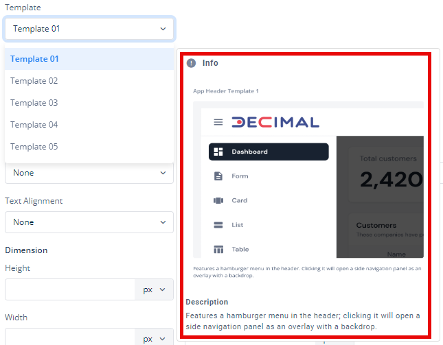
There are five templates available for various UI design needs:
- Template 01
- Template 02
- Template 03
- Template 04
- Template 05
You can view a small preview and succinct description of each template by putting your mouse arrow over each of them in the dropdown list. This feature allows you to quickly see how each template looks before making your selection, helping you choose the one that best fits your design needs.
For each template, you can customize the following settings:
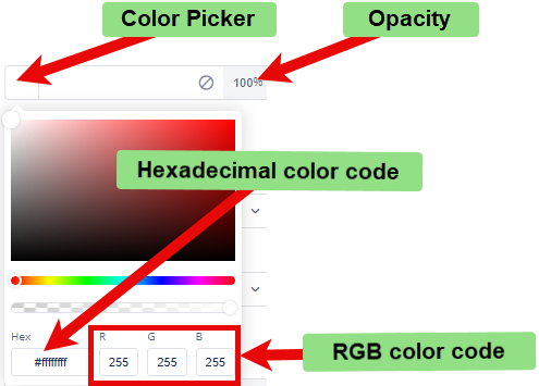
- Background Color: To choose the background color for the template, you can use a color picker or enter a hexadecimal or RGB color code. The default opacity is set to 100%.
- Background Image URL: You can input the URL of the background image you want to use for the template.
- Font:
- Family: You can select the font family for text in the template. If no specific font is chosen, “None” will use the default font.
- Size: You can specify the font size in pixels (px).
- Color: You can set the font color using the color picker or a hexadecimal or RGB color code. The default opacity is 100%.
- Alphabet Case: You can choose the text case (e.g., uppercase, lowercase) or select “None” to keep the original case.
- Text Alignment: You can set the text alignment (e.g., left, center, right) or select “None” for default alignment.
- Dimension:
- Height: You can define the height of the template in pixels (px).
- Maximum Height: You can set the maximum height to prevent the template from exceeding this limit.
- Width: You can specify the width of the template in pixels (px).
- Maximum Width: You can define the maximum width to prevent the template from expanding beyond this size.
- Spacing:
- Margin: To adjust the space around the template, enter values for top, right, bottom, and left margins in pixels (px). Default is 0px for all sides.
- Padding: To set the internal space within the template, enter values for top, right, bottom, and left padding in pixels (px). Default is 0px for all sides.
- Border Radius: To define the curvature of the corners of the template, enter values for top-left, top-right, bottom-right, and bottom-left in pixels (px). Default is 0px for all corners.
These settings allow you to tailor each template and, consequently, the application header to your specific design preferences and requirements.
Elements
You can add various elements to this system component such as Buttons, Mat-Icon, Hyperlinks, Input, Select, Multiselect, Date, and Global Search.
To read more about the elements, click here (Elements).