An Introduction to Smart Selector
In the vDesigner module, the smart selector is an input field-based utility that allows you to select the following in the input field element:
- Element
- Entity
- Attribute
- Function
- Enum (Enumeration) and others
In the smart selector, you select an element, entity, attribute, and others so that you can map the selected item to the other item or configure a property. In general, you can use a smart selector to configure a property, select an item (for example, an entity or element) to store and fetch data, compare two expressions in the business rule, and several other scenarios to develop a mobile app.
When you use the vDesigner module to develop a mobile app, you will use the smart selector in many places and on many occasions. You can use the smart selector as follows:
Identifying a Smart Selector
Before you use a smart selector, it is important to know how the smart selector looks like. In the vDesigner module, when you find an input field with the default value {{ fx }}, it means this input field is a smart selector.
Using Smart Selector
You can find the smart selector in the following places:
- In the property panel of an element
- In the property panel of a task
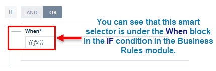
- In the Business Rules module to define an expression
- In the Custom Functions module, and others
Before you start using the smart selector, you must know different parts of the smart selector and their usages:
| Item | Description |
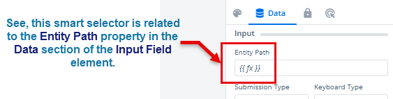
| {{ fx }} | This is the default value of the smart selector. When the vDesigner module displays a property panel or page, it displays the smart selector with the default {{ fx }} value. |
Exact Search Toggle Button ( ) ) | In the smart selector, this icon is called the Exact Search toggle button. The Exact Search toggle button searches for the exact value that you entered in the Search box. By default, the smart selector displays the Exact Search toggle button in the gray color. In the gray color, the Exact Search toggle button remains in an inactive state. It means that you cannot use the gray color Exact Search toggle button. To use the Exact Search toggle button, click it to turn its color blue. After the color of the toggle button turns blue, it means that it will search for the exact value that you entered in the Search box. |
Full View Icon ( ) ) | When you click a smart selector field for the first time, it expands in the compact view. On the expanded shape of the smart selector, you can see the Full View icon () to the right of the Search box. When you click the Full View icon ( ), it displays the smart selector as a separate dialog box. |
Set as Default switch ( ) ) | The Set as Default switch () turns the smart selector’s full view mode into a default mode. Click the switch button to turn it blue ( ) to make the full view mode of the smart selector the default mode. ) to make the full view mode of the smart selector the default mode.After you make the smart selector’s full view mode the default mode, the smart opens in the full view mode when you click it to use. |
Compact View Icon ( ) ) | This icon comes into view when you turn the smart selector into full view mode. You can see the compact view icon on the toolbar of the smart selector. Click the Compact View icon ( ) to switch the smart selector to the compact view. When you access a smart selector for the first time, the related page displays it in the compact view mode. |
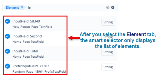
| Group of Tabs | In the smart selector, under Search box, see the group of tabs. This group of tabs contains the following tabs: 1. Attribute 2. BR (Business Rule) 3. Element 4. Entity 5. Enumeration 6. Function 7. System Data The advantage of the group of tabs in the smart selector is that it refines your search to a specific category. For instance:- Assume you want to display only a list of elements by excluding the rest of the items, such as business rules, functions, entities, attributes, and others. To display the list of elements, click the Element tab and then enter the name of the element in the Search box. After you enter the name of the element in the Search box, the smart selector will only display the list of existing elements. To understand this statement, click here. |