
Rich Text Editor
The Rich Text Editor Element provides an interactive, feature-rich text editor for end users within the application. It allows users to input and format text dynamically using options such as bold, italics, underline, lists, hyperlinks, and more, making it suitable for scenarios requiring structured and styled text input.
Unlike the Rich Text Element, which is designed for developers to configure predefined text formatting within vFlow, the Rich Text Editor Element offers a real-time editing experience directly to end users. This ensures flexibility in content creation, enabling users to format and structure their text as needed.
Common Use Case:
The Rich Text Editor Element is designed for end users, allowing them to input and format text dynamically. Common use cases include:
- User-Generated Content – Allowing users to create and format text in applications such as blogs, feedback forms, or emails.
- Rich Form Inputs – Enabling users to enter structured text with formatting options like headings, lists, and links.
- Collaborative Editing – Providing a text area where multiple users can format and refine content.
- Content Customization – Allowing end users to personalize text input with various formatting tools as per their needs.
Configuration
The element’s configuration in vFlow 2.0 allows you to customize its behavior, appearance, and interaction across various devices. Through simple settings, you can control everything from its visibility and functionality to how it adapts to different screen sizes, making it flexible and user-friendly for developers and end-users. Let’s have a look at each of its configurations:
Basic
| Basic Configuration | Description |
| Type | The Type indicates the type of element you are configuring. In this case, it defaults to “Rich Text Editor” and cannot be changed here. This selection is made initially when you first create the element. |
| Reference Name | The Reference Name is a unique identifier assigned to the element for internal use. This name is visible only to vFlow users, and is not displayed to end-users. The Reference Name is intended for your convenience, helping you easily identify and manage the element throughout. |
| Label | The Label is the name or text displayed on the element, making it easily recognizable to end-users. |
| Description | The Description field is intended for use by application designers or administrators (vFlow users) to provide additional context or details about the element. This description is not visible to end-users and is used solely for internal reference to assist with element management. |
Properties
| Properties | Description |
| Visible | To make this invisible, click to clear this checkbox. |
| Mandatory | If checked, this element becomes necessary to continue or for the workflow, enforcing user interaction before proceeding. |
| Default Value | This property allows you to display a predefined static value as the default text within the element. |
| Custom Label | |
| Leading Icon & Type | It’s an option to add an icon or image before the element to indicate its purpose. You can It’s an option to add an icon or image before the element to indicate its purpose. You can select among None, IMAGE, Asset Library, and MATICON. You can also choose its Background and Text Colors. |
| Trailing Icon & Type | You can add an icon or image after the element, enhancing the field’s visual guidance. You can select among None, IMAGE, Asset Library, and MATICON. You can also choose its Background and Text Colors. |
| Choosing from MATICON, IMAGE, and Asset Library | 1. If you choose Maticon as the leading and/or trailing icon, click Choose Icon and select the icon from the Material Icons dialog box. 2. If you choose IMAGE as the leading and/or trailing icon, enter the URL of the image in the URL input box. 3. If you choose Asset Library as leading and/or trailing icon: a) Click Choose Asset box. 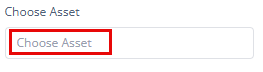 b) A Select Asset dialgbox opens. 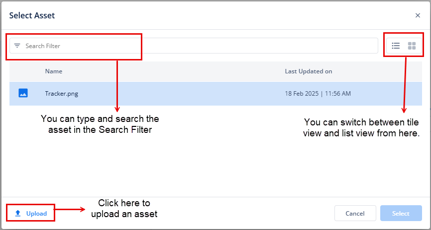 c) Either choose an asset that has already been uploaded from the library or upload an asset from your device. d) Then select the asset and then click Select (at the bottom right of the dialog box). e) When the asset is selected, its name will be displayed in the Choose Asset box, signifying that an asset is mapped. Note: To remove the chosen asset, set the Leading Icon or Trailing Icon type to None or select any other option from the dropdown list. For the comprehensive information on Asset Library/ Manager, click here. |
| Tooltip | After choosing the Leading or Trailing Icon, you can enter a text that is visible while hovering the mouse over the icon without cluttering the interface. |
| Count / Path of Count | Count: This property allows you to display a numerical indicator next to the icon. It is useful for showing notifications, such as the number of unread messages or alerts. Path of Count: You can specify a data path from which the count will be dynamically retrieved. This ensures that the displayed count reflects the current state of the data, making the interface more responsive and informative. You might set the Path of Count to something like getVal("user.unreadMessages"), which retrieves the current count of unread messages from the user object. |
| Parent | Checking Parent will make this element a parent element, meaning it will take up the entire screen assigned to it until an event is performed. Once an event occurs, the screen will split to display both the parent element and the result of the action, providing a dynamic interface that adjusts based on user interaction. |
| Rich Text Toolbar Preferences | The Rich Text Toolbar provides various formatting options for structured text input. Just select the checkbox of the properties that you want to display to the end-user of the application: Font & Style Bold, Italic, Underline, Strikethrough, Eraser, Font, Font Size, Paragraph, Line Height, Superscript, Subscript Lists Unordered List, Ordered List Media File, Image, Video Editing Tools Cut, Copy, Paste, Select All, Copy Format Alignment Indent, Outdent, Alignment View Find, Change Mode, Full-size, Preview Miscellaneous Class span, Horizontal Rule, Table, Link, Symbols, Brush |
Style
The Style option allows you to personalize the appearance of the element. This includes adjusting various visual aspects to ensure it complements your application’s overall design. Here’s a breakdown of different settings that you can make adjustments to:
- Laptop/Desktop width: The button automatically expands to take up 100% of the available width on desktop and laptop screens, ensuring it spans the entire container. However, this width can be adjusted according to the specific design or layout requirements.
- Tab width: On tablet devices, the button will also span 100% of the container’s width. This ensures that it adapts well to medium-sized screens, making it easier for users to interact with on touch devices. You can adjust this width as needed based on design preferences.
- Mobile width: For mobile devices, the button remains at 100% width to ensure full visibility and easy tap interaction, even on smaller screens. Like the other devices, this width can be adjusted as per requirement.
- Custom CSS Class Name
- Users can enter custom CSS class names in the provided input field to apply additional styles.
- Multiple Classes Names can be provided If needed. They can be applied by separating them with commas, as indicated by the example (
classA, classB).
Data Style
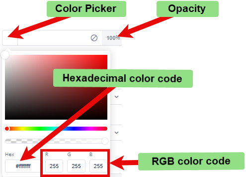
- Background Color: To choose the background color for the element, you can use a color picker or enter a hexadecimal or RGB color code. The default opacity is set to 100%.
Font
- Family: You can select the font family for text in the element. If no specific font is chosen, “None” will use the default font.
- Size: You can specify the font size in pixels (px).
- Color: You can set the font color using the color picker or a hexadecimal or RGB color code. The default opacity is 100%.
- Alphabet Case: You can choose the text case (e.g., uppercase, lowercase) or select “None” to keep the original case.
- Text Alignment: You can set the text alignment (e.g., left, center, right) or select “None” for default alignment.
Dimension
- Height: You can define the height of the element in pixels (px) or percentage (%).
- Maximum Height: You can set the maximum height to prevent the element from exceeding this limit.
- Width: You can specify the width of the element in pixels (px) or percentage (%).
- Maximum Width: You can define the maximum width to prevent the element from expanding beyond this size.
Spacing
- Margin: To adjust the space around the element, enter values for top, right, bottom, and left margins in pixels (px). Default is 0px for all sides.
- Padding: To set the internal space within the element, enter values for top, right, bottom, and left padding in pixels (px). The default is 0px for all sides.
- Border Radius: To define the curvature of the corners of the element, enter values for top-left, top-right, bottom-right, and bottom-left in pixels (px). The default is 0px for all corners.
Animation
This option allows you to apply several animations to enhance the element’s loading appeal. The following are the available animations:
- Bounce
- Flash
- Pulse
- Rubber Band
- Handshake
Their Configuration:
Click the TYPE list, and then select an animation to apply an effect when the element loads.
After you select one of the animations (for example, Bounce), you will see the following configuration options:
- Speed: In this field, you can select one of the following options to adjust the speed of the animation:
- Faster
- Fast
- Slower
- Slow
- Delay: Click this list to select a value (for example, 3 seconds). This value specifies a time period. The application will load the animation after this time period (e.g., 3 seconds).
- Repeat: In this list, select a value (for example, 2). This value specifies the total number of times the application will play the animation.
After you configure the element’s animation properties, click  to apply them to the element.
Data
If you want to fetch and show some data in this element, select one of the data types that fits best for the business requirements:
Note: To learn more about Data, click here or check the post under configurator.