Add Custom Style
The Add Custom Style task allows you to change the appearance of a page, component, or element by applying specific styles. These styles can include font color, size, type, background colors, animations, or even advanced styles defined in a CSS file. Essentially, it customizes how something looks in the application.
Common Uses:
- Highlight Important Information:
- Use this task to make key details, like account balance warnings or loan approval statuses, stand out with bold fonts or red text.
- Customize Themes for Branding:
- Apply specific background colors or animations to align the application’s look with the bank’s branding guidelines.
This task helps create a visually appealing and user-friendly interface that improves end-user engagement.
Configuration
When you create a task, its configuration page opens in which you define its basic and advanced properties. These are as follows:
Basic
| Basic Properties | Description |
| Task Type | The Task Type indicates what kind of task you are creating. This is a read-only field since you select the type when you create the task and cannot change it during the configuration stage. |
| Reference Name | The Reference Name acts as a unique internal identifier for the task. This is visible to vFlow users for ease of reference but is hidden from end users. This allows users of the platform to manage and differentiate between tasks conveniently. |
| Name | The name defined here will be displayed to the end user. |
| Description | The Description field is intended for use by application designers or administrators (vFlow users) to provide additional context or details about the task group. This description is not visible to end-users and is used solely for internal reference to assist with task management. |
| Loader Properties – Title | |
| Loader Properties – Description | |
| Business Rule – Rule | This drop-down allows you to specify a Business Rule that governs when and how this task executes, offering more fine-grained control over task execution. If the specified condition is met, the task will execute; otherwise, it will not. |
Properties
Entity Type: Select which entity out of the page, component, and element to want to add a custom style to.
Page Name: Select the page the targeted entity is in or if it’s the page itself that needs custom styling, then select the targeted page.
However, if the targeted element is a component or element.
- Component Name: Select the component that contains the targeted element or if it’s the component itself that needs custom styling, then select the targeted component.
Nonetheless, if the targeted element is an element.
- Element Name: Select the targeted element that need custom styling.
Custom CSS Class Name:
- Users can enter custom CSS class names in the provided input field to apply additional styles.
- Multiple Classes Names can be provided If needed. They can be applied by separating them with commas, as indicated by the example (
classA, classB).
Data Style
- Background Color: To choose the background color for the element, you can use a color picker or enter a hexadecimal or RGB color code. The default opacity is set to 100%.

Font
- Family: You can select the font family for text in the element. If no specific font is chosen, “None” will use the default font.
- Size: You can specify the font size in pixels (px).
- Color: You can set the font color using the color picker or a hexadecimal or RGB color code. The default opacity is 100%.

- Alphabet Case: You can choose the text case (e.g., uppercase, lowercase) or select “None” to keep the original case.
- Text Alignment: You can set the text alignment (e.g., left, center, right) or select “None” for default alignment.
Dimension
- Height: You can define the height of the element in pixels (px) or percentage (%).
- Maximum Height: You can set the maximum height to prevent the element from exceeding this limit.
- Width: You can specify the width of the element in pixels (px) or percentage (%).
- Maximum Width: You can define the maximum width to prevent the element from expanding beyond this size.
Spacing
- Margin: To adjust the space around the element, enter values for top, right, bottom, and left margins in pixels (px). Default is 0px for all sides.
- Padding: To set the internal space within the element, enter values for top, right, bottom, and left padding in pixels (px). The default is 0px for all sides.
- Border Radius: To define the curvature of the corners of the element, enter values for top-left, top-right, bottom-right, and bottom-left in pixels (px). The default is 0px for all corners.
Then Save the configuration.
Reference
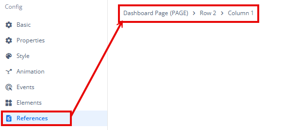
The Reference option becomes available when you open a Component, Task Group, or Business Rule from the page-level inventory that opens in the configurator, and the global inventory.
Since this inventory contains all the Components, Task Groups, and Business Rules created in Vahana vFlow 2.0, it can be challenging to determine where these entities are mapped within the application. The Reference option provides a structured overview of all locations or items where a selected entity is mapped, offering a clear dependency view.
Example Mapping:
- Form > Row 1 > Column 1

This feature helps in efficiently tracking and managing dependencies across different sections of the application.
