Prefix Input Field
The Prefixed Input Field element contains two adjoining boxes. The left box contains the prefixed value and the right box contains a value.
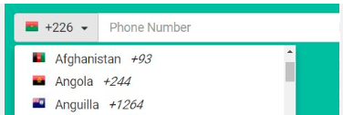
You can use the Prefix Input Field element when you want the user to enter the value after the prefix value. For instance:- you can use the Prefix Input Field element to get the mobile number from the end-user. In the Prefix Input Field, the user enters the mobile number in the right box based on the country code, while the left box displays the country code (for example, 91).
Apart from getting the mobile number, you can use the Prefix Input Field in several use cases. Like in other elements, you can display the value in the Prefix Input Field element as follows:
- By using the Static function
- By using JSON object/entity
Usage
| When to use |
| You can use the Prefix Input Field element when: 1. You want to display a pair of values (for example, Mr. or Miss. <<Person’s Name>>) 2. You want to take the input from the user after the prefix value 3. You want to display a value with the unit, currency, etcetera |
Prefix Input Field Configuration
The Prefix Input Field element contains the following segments to configure different properties:
- UI Configuration
- Data Configuration
- Security Configuration
- Event Configuration
UI Configuration
For the Prefix Input Field element, you can configure the following UI (User Interface) properties:
| Tab | Property Name | Description | Mandatory | New Default Values | Visibility Rules |
| Basic | Reference Name | Specifies a unique name of the element. At the application level, an element is identified and managed by the reference name. | Yes | PrefixInputField_XXXX | |
| Basic | Label | In this box, you can enter the label or title of the element. The application displays the label name above the element. | No | Label | |
| Basic | Prefix Text | In this box, enter a numeric or alphanumeric value. At the run time, the element displays this static value as a prefix value in the left box. | No | ||
| Basic | Prefix Key | In this box, you configure the prefix value as follows: <<To be discussed>> | No | ||
| Basic | Input Field Key | In this box, you configure the input field’s value. <<To be discussed>> | No | ||
| Basic | Input Type | In this list, select a specific data type of the value that the user can enter in the input field. To define a input data type, you can select one of the following options: 1. Alphabet:- Select it to allow the user to only enter alphabets. 2. Number:-Select it to allow the user to only enter numbers in the input field. 3. Alphanumeric:- Select it to allow the user to enter alphanumeric value, including numbers and alphabets. 4. Regex:-Select it to define a regular expression. To know more about regular expression, see the section: Configuring Regex. 5. Formatter:- Select it to define user-defined input format. To know more about formatter, see the section: Configuring Formatter. | No | Alphabet | |
| Basic | Aphabet Case | In this list, you can select one of the following options: –> Upper Case:- Select this option to enter capital characters in the element. –> Lower Case:- Select this option to enter small characters in the element. –> Any Case:- Select this option to enter the small and capital characters in the element. | No | Upper Case | |
| Basic | Special Character | If this check box is selected, you can enter the special character in the element. | No | Selected | |
| Basic | Visible | If this check box is selected, the user can see the element on the page. | No | Selected | |
| Basic | Business Rule | Click this list and then select a pre-defined business rule that will determine the element’s visibility. If the user’s action satisfies the condition in the business rule, the application will display or hide the element. To define a njew business rule, access the Business Rule Manager module. | No | ||
| Basic | Enable | If this check box is selected, the end-user can perform the function on the element. | No | Selected | |
| Basic | Business Rule | Click this list and then select a business rule to make the element active or inactive. If the user’s action satisfies the condition in the business rule, the application will make the element active or inactive in the application. To define a njew business rule, access the Business Rule Manager module. | No | ||
| Basic | Mandatory | If you click to select this check box, the user needs to enter the value in the element mandatorily. If the user does not enter the value in the element, the application will display the error. | No | Clear Check box | |
| Basic | Message On Mandatory | This property comes into view when you click the Mandatory check box. In the Message on Failure box, enter the error message that the application will display if the user does not perform the function on the element. | No | Required | If the Mandatory check box is selected. |
| Basic | Prefix Separator | If you click to select this check box, the element displays an edge between the prefix box and the right input box. | No | Selected Check box | |
| Style | Styles | Allows you to select a specific style for the element from the list of pre-defined styles. The vDesigner module offers pre-defined styles that you can apply to the element. | No | Default | |
| Style-Background | Color | Allows you to define the background color of the element. Click the left box to display the color canvas. On the canvas: 1. On the horizontal bar, move the circle to select the color. 2. In the canvas, move the circle to select the tone of the color. | No | #FFFFFF | |
| Style-Alignment and Spacing | Margin | Allows you to desirably define margin around each side of the element. It provides four different boxes to define the margin outside the right, left, top, and bottom border of the element. | No | 4, 4, 4, 4 | |
| Style-Alignment and Spacing | Element’s Alignment | This property contains three tabs. You can use these tabs as follows: 1. Left:- By default, this tab is selected. It aligns the element to the left of the page. 2. Center:- If you select this tab, it aligns the element at the center of the page. 3. Right:- If you select this tab, it aligns the element to the right of the page. | No | Left | |
| Style-Label | Font | Click this list to select the font type (For example: – Arial) of the element’s caption. | No | Open Sans | |
| Style-Label | Size | In this box, enter the font size of the element’s caption’s character in pixels. | No | 14 | |
| Style-Label | Color | Allows you to define the color of the element’s caption’s character. Click the left box to display the color canvas. On the canvas: 1. On the horizontal bar, move the circle to select the color. 2. In the canvas, move the circle to select the tone of the color. | No | #6F6F6F | |
| Style-Label | Weight | In this box, enter a value in the range from 1 to 9. This value specifies the thickness of the element’s caption’s character. | No | 4 | |
| Style-Label | Style | Click this list to select the style of font (For example:- Italic) of the caption. | No | Normal | |
| Style-Label | Line Height | In this box, enter a numeric value in pixels (for example:- 18). This value specifies the character’s height in the element’s title. | No | 18 | |
| Style-Label | Letter Spacing | In this box, enter a numeric value in pixels (for example:- 2). This value specifies the space between characters in the element’s title. | No | 0 | |
| Style-Placeholder | Text | In this box, enter the hint text (for example:- Please enter your mobile number). The placeholder text (hint) helps the user perform the function on the element. | No | ||
| Style-Placeholder | Size | In this box, enter the font size of the element’s placeholder’s character in pixels. | No | 14 | |
| Style-Placeholder | Color | Allows you to define the color of the element”s placeholder’s character. Click the left box to display the color canvas. On the canvas: 1. On the horizontal bar, move the circle to select the color. 2. In the canvas, move the circle to select the tone of the color. | No | #6F6F6F | |
| Style-Placeholder | Letter Spacing | In this box, enter a numeric value in pixels (for example:- 2). This value specifies the space between characters in the element’s placeholder. | No | 0 | |
| Style-Input | Font | Click this list to select the font of the element’s input value (text). | No | Open Sans | |
| Style-Input | Size | In this box, enter the font size of the element’s input character in pixels. | No | 14 | |
| Style-Input | Color | Allows you to define the color of the element”s input character. Click the left box to display the color canvas. On the canvas: 1. On the horizontal bar, move the circle to select the color. 2. In the canvas, move the circle to select the tone of the color. | No | #161616 | |
| Style-Input | Weight | In this box, enter a value in the range from 1 to 9. This value specifies the thickness of the element’s input character. | No | 4 | |
| Style-Input | Letter Spacing | In this box, enter a numeric value in pixels (for example:- 2). This value specifies the space between characters in the element’s input character. | No | 0 | |
| Style-Prefix | Color | Allows you to define the background color of the prefix box. Click the left box to display the color canvas. On the canvas: 1. On the horizontal bar, move the circle to select the color. 2. In the canvas, move the circle to select the tone of the color. | No | #FFFFFF | |
| Style-Shape & Decoration | Type | Under the Shape and Decoration section, this property has the two following options: Autofill:- If you select this option, the element will occupy the available space of the parent layout. Manual:- If you select this option, you can define a specific size of the element. | No | Autofill | |
| Style-Shape & Decoration | Width | This box becomes active after you click the Manual tab under Type. In this box, enter a numeric value (for example, 8) in pixels. This value specifies the width of the element. | No | ||
| Style-Shape & Decoration | X | Allows you to move the element along the X-axis. When the value increases, the element moves towards the right edge of the canvas. | No | 4 | |
| Style-Shape & Decoration | Y | Allows you to move the element along the Y-axis. When the value increases, the element moves towards the bottom edge of the canvas. | No | 4 | |
| Style-Shape & Decoration | Select Color | Allows you to define the element’s color when the user selects the element to perform the function on it. | No | #0F61FE | |
| Style-Shape & Decoration | Border Radius | Allows you to define the radius of one of the corners of the element. Defining the radius of the corner makes the corner of the element round. | No | 4 | |
| Style-Shape & Decoration | Border Color | Allows you to define element’s border’s color. Click the left box to display the color canvas. On the canvas: 1. On the horizontal bar, move the circle to select the color. 2. In the canvas, move the circle to select the tone of the color. | No | #C6C6C6 | |
| Style-Tooltip | Show Tooltip | Click this check box to make a tooltip available with the element. | No | Clear Check box | |
| Style-Tooltip | Show Tooltip On Hover (Web) | This property comes into view after you click to select the Show Tooltip check box. When selected, this property displays the tooltip after the user puts mouse pointer on the element. | No | Selected Check box | When you select the Show Tooltip check box. |
| Style-Tooltip | Message | This property allows you to define the tooptip’s text. You can configure the message by using the following options: a. By using Static function b. By mapping an attribute c. By mapping an element These three options are broadly described as below: 1. By Using the Static function a. Click in the Message box to display the Search box. b. In the Search box, enter Static to display the Static function. c. Select the Static function. 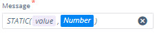 d. In the Static function, click the Number parameter to display a context menu. e On the menu, click to select String. f. In the Static function, click the Value parameter and then enter the text (for example, Enter the mobile number) 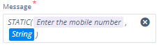 2. By Mapping the Attribute a. Click in the Message box to display the Search box. b. In the Search box, enter the attribute’s name that stores the text. 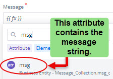 c. After you find the attribute’s name,click to select it in the list. Note:- To know more about defining the JSON structure that contains the attribute, click here. 3. By Mapping Element’s Value Though this option is not used conventionally, you can map an element’s value to display it as a tooltip’s text. To map an element’s value: a. Click in the Message box to display the Search box. b. In the Search box, enter the element’s name that stores the text. c. After you find the element’s name,click to select it in the list. | No | {{ fx }} | |
| Style-Tooltip | Choose Icon | Allows you to select an icon for the tooltip. To select the icon: a. In Add box, click the Edit icon (  ) to display the Material Icons dialog box. ) to display the Material Icons dialog box.b. In the Material Icons dialog box, click to select an icon and then click Select to select a material icon. | No | ||
| Style-Tooltip | Icon Color | Allow you to select the icon’s color. Click the left box to display the color canvas. On the canvas: 1. On the horizontal bar, move the circle to select the color. 2. In the canvas, move the circle to select the tone of the color. |
Data Configuration
| Tab | Property Name | Description | Mandatory | New Default Values | Visibility Rules |
| Data-Input | Entity Path | Allows you to map the entity or attribute when you want to fetch and display the data in the Prefix Input Field from the mapped entity or attribute. To map the entity or attribute: a. Click in the Entity Path box to display a Search box. b. In the Search box, enter the entity’s or attribute’s name to display it. c. After you find the entity’s or attribute’s name, select it in the list. 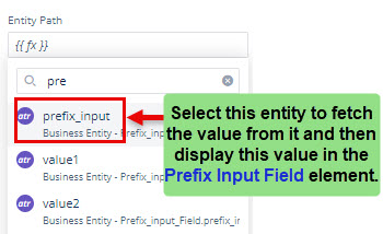 Note:- To know about defining the JSON structure to fetch data from an entity, click here. | No | {{ fx }} | |
| Data-Input | Submission Type | Click this list to select one of the following values: –> Next Focus:- If you select this value, the application will highlight the next selectable element after the end-user enters the value in the input field. –> Next Line:- If you select this value, the application will move the mouse pointer to the next line after the user enters the value in the input field. | No | Next Focus | |
| Data-Input | Keyboard Type | Click this list and then select one of the following types of keyboard that the application will open. The user can use that keyboard type to enter the value in the element. For instance: – If you select “Number“, the application will open a number-based keyboard that the user can use to enter the numeric value in the input field. | No | Becomes visible if the Read Only check box is clear. | |
| Data-Input | Read Only | If you click to select this check box, the user cannot edit the value in the element. | No | Clear Check box | |
| Data-Validation | Maximum Length | In this box, enter a numeric value (for example, 8) that specifies the maximum permissible number of characters that the user can enter in the prefix input field. | No | ||
| Data-Validation | Message On Max Length Failure | In this box, enter a message text that the application will display if the user attempts to enter more number of characters than the maximum permissible number of characters. | No | ||
| Data-Validation | Minimum Length | In this box, enter a numeric value (for example, 8) that specifies the minimum required number of characters that the user needs to enter in the element. | No | ||
| Data-Validation | Message On Minimum Length Failure | In this box, enter a message text that the application will display if the user enters fewer characters than the required minimum number of characters in the element. | No | ||
| Data-Validation | Real Time | <<To be discussed>> | No |
Security Configuration
| Tab | Property Name | Description | Mandatory | New Default Values | Visibility Rules |
| Security-Basic | Copy & Paste | This property provides the following values: –> Yes:- If you select this value, the user can copy and paste the value of the input element elsewhere. –> No:- If you select this value, the user cannot copy and paste the value of the input element elsewhere. | No | Selected Check box | |
| Security-Basic | Data Masking | This property allows you to mask the data. After you click to select the Data Masking check box, the following boxes come into view: 1. Masking Type 2. N 3. Masking Symbol | No | Clear Check box | |
| Security-Basic | Masking Type | Click this list to select one of the following options: 1. From Start This option masks a specified number of characters (for example:- **ample123) from the left. 2. From End This option masks a specified number of characters (for example:- Example1**) from the right. 3. From Start & End This option masks specified numbers of characters (for example:- **ample***) from the left and right of the string. 4. Except Start This option masks all characters except a specified number of characters (for example:- Ex********) from the left. 5. Except End This option masks all characters except a specified number of characters (for example:- ********23) from the right. 6. Except Start & End This option masks all characters except specified numbers of characters (for example:- Ex*****123) from the left and right. 7. All Alphabets This option masks all alphabets (for example:- *******123) in the string. 8. All Numbers This option masks all numbers (for example:- Example***) in the string. 9. All This option masks all characters in the string. | No | From Start | |
| Security-Basic | N | This box comes into view after you click the Data Masking check box. In this box, enter a numeric value that specifies the number of characters that are masked from right or left in the string. For example:- If you select From Start in the Masking Type list and then enter 4 in the N box, the data masking property masks four characters from the left. If you select From End in the Masking Type list and then enter 4 in the N box, the data masking property masks four characters from the right. | No | If Data Masking check box is selected | |
| Security-Basic | M | This box comes into view after you select From Start & End in the Masking Type list. In the M box, enter a numeric value that specifies the number of characters that the Data Masking feature masks from the right of the string. For example:- If you enter 4 in the M box, the data masking property masks four characters from the right. | Yes | If Masking Type = From Start & End | |
| Security-Basic | Masking Symbol | Click this list and then select one of the following characters that you can use as a masking symbol or character: 1. * 2. & 3. % 4. $ 5. # 6. @ 7. x 8. – 9. + |
Event Configuration
On the Prefix Input Field element, you can configure the following events:
- onFocusOut
- onCompletion
- onTextChanged
- onPrefixClick
- onCharRemove
Configuring Regex
You can find this property as an option in the Input Type list. This property allows you to perform one of the following activities:
- Select a pre-defined regex (regular expression) (for example:- PAN) to apply it to the input field
- Select Custom Regex to define a new regex and then apply it to the input field.
To define a regex:
- In the Input Field panel, click the Input Type list and then select Regex, and the Regex Type box comes into view.
- In the Regex Type box, do one of the following activities:
Case1:- (If you want to configure a pre-defined regex)
- Click the Regex Type list and then select one of the following available regexes:
- PAN
- AADHAAR
- Credit Card
- Date
- Time
- Mobile Number
Case2:- (If you want to defined a new regex)
- Click the Regex Type list and then select Custom Regex, and the Enter Regex box comes into view.
- In the Enter Regex box, enter a regular expression (for example:- ^[A-Z]{2}-[0-9]{13}$ (a regular expression for the Indian Driving License format)).
- After you define a regular expression, click Apply to configure the input type for the input field element.
Configuring Formatter
In the Input Field element, you can use this feature to configure a user-defined format. After you define an input format, the input field allows and helps the user enter the value based on the user-defined format.
This feature will not allow the user to enter a value that violates the configured user-defined data format.
To configure a user-defined format:
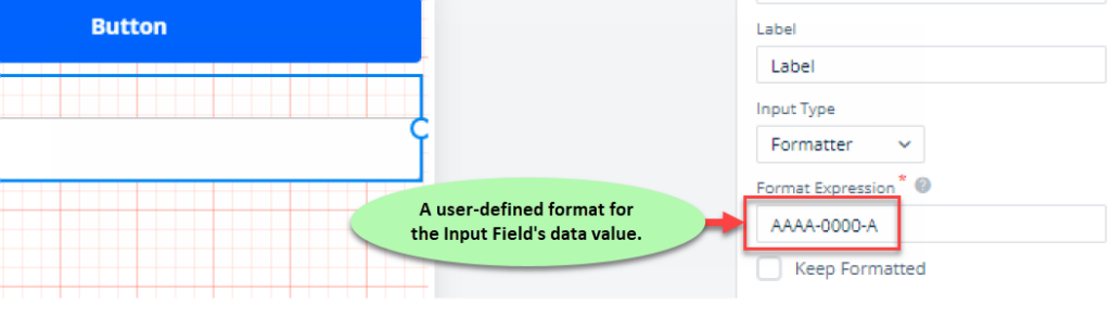
- In the Input Field panel, click the Input Type list and then select Formatter, and the Formatter Expression box comes into view.
- In the Formatter Expression box, enter a format as follows:
Sample Format:
AAAA-0000-A
Let us understand this user-defined format as follows:
In the format string:
- AAAA specifies that the data value will have the first four characters as alphabets.
- – (Hyphen) (a special character) specifies that the input field will automatically append a hyphen when the user enters a character after four alphabets. The input field will append the hyphen after four alphabets and before a new character.
- 0000 specifies that the data value will have four digits (numeric values) after the hyphen.
- – (a second hyphen) specifies that the input field will automatically append a hyphen when the user enters a character after four digits. The input field will append the hyphen after four digits and before a new character.
- The last character, A, after the second hyphen, specifies that the Input Field will have the last character, an alphabet.
Let us see how the user enters the value in the Input Field that vDesigner’s user configured to accept the value that matches the user-defined format.
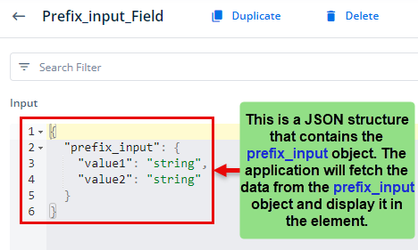
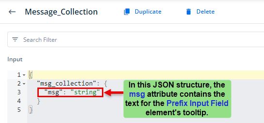
A JSON structure to fetch the text for Prefix Input Field’s tooltip
A JSON structure to fetch the values of Prefix Input Field