
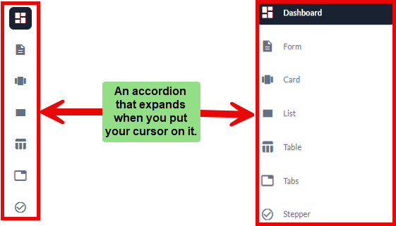
Accordion
An Accordion is a user interface component that allows users to toggle between showing and hiding sections of related content. It is commonly used for organizing information in a compact and efficient manner.
The Accordion is useful for displaying large amounts of content without overwhelming the user. Only the most relevant sections are expanded, while others remain collapsed, giving users control over what they want to see.
Key Features
- Collapsible Sections: Easily expand or collapse content to view or hide details.
- Customizable Appearance: Modify the look and feel to match application design.
- Event Handling: Trigger actions based on user interactions, such as on expand or collapse.
Common Use Cases
- Interactive Forms: Provide collapsible sections for filling out specific parts of a form.
- Step-by-Step Instructions: Display processes or workflows, with users expanding sections as needed.
- Content Categorization: Group related information into collapsible categories.Improves readability by showing only focused content.
Creating an Accordion
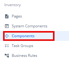
- Under Inventory (
 ), click “Component“, which is on the second left panel.
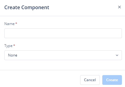
- Click Create placed on the second horizonal panel from the top, and a dialog box “Create Component” pops up.

- Select Type as “Accordion“, Name it in the text box and click “Create“.
- When you click Create (
 ), Basic option of Config menu for the Accordion opens.
 - Now you will see the following menu options:
- Basic
- Properties
- Style
- Data
Lets discuss them one at a time:
Basic
| Basic Properties | Description |
| Type | The Component Type indicates the type of component you are adding. In this case, it defaults to “Accordion” and cannot be changed here. This selection is made initially when you create the component. |
| Reference Name | The Reference Name is a unique identifier assigned to the component for internal use. This name is visible only to vFlow users, and is not displayed to end-users. The Reference Name is intended for your convenience, helping you easily identify and manage the component throughout. |
| Description | The Description field is intended for use by application designers or administrators (vFlow users) to provide additional context or details about the component. This description is not visible to end-users and is used solely for internal reference to assist with component management. |
Properties
| Properties | Description |
| Header | It is displayed on the top of the component. To know more about header, click here or see the Header section under the System Components. |
| Footer | It is displayed on the bottom of the component. To know more about footer, click here or see the Footer section under the System Components. |
Style
- Large Screen Width: The accordion width is adjustable by entering a percentage value in the text box. For example, in the image, the width is set to 100%, meaning the accordion will take the full width of the screen on larger devices.
- Transparent: When you click to select this checkbox, the accordion will have a transparent background, allowing it to blend into the background of the page or layout.
Custom CSS Class Name
- Class Name
- Users can enter custom CSS class names in the provided input field to apply additional styles.
- Multiple Classes Names can be provided, If needed. They can be applied by separating them with commas, as indicated by the example (
classA, classB).
- After customizing the accordion settings, click the Save button to apply the changes made to the component.
This interface allows for easy configuration of the accordion’s width, background, and styling using custom classes.
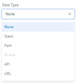
Data
If you want to fetch and show some data in the accordion, select one of the data type that fits best for the business requirements:
Note: To know more about Data, click here or check the post under configurator.
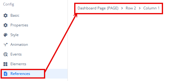
Reference
The Reference option becomes available when you open a Component, Task Group, or Business Rule from the page-level inventory that opens in the configurator, and the global inventory.
Since the global inventory contains all the Components, Task Groups, and Business Rules created in Vahana vFlow 2.0, it can be challenging to determine where these entities are mapped within the application. The Reference option provides a structured overview of all locations or items where a selected entity is mapped, offering a clear dependency view.
Example Mapping:
- Form > Row 1 > Column 1
This feature helps in efficiently tracking and managing dependencies across different sections of the application.