
Breadcrumb
Introduction to Breadcrumb
A breadcrumb is a navigational aid that helps users understand and keep track of their location within a website or application. It typically appears as a horizontal list of names of the page, showing the hierarchical path from the homepage to the current page using different separator, such as (>, >>, ->, \, !>). Please click here to learn how to make Breadcrumb.
Creating a Breadcrumb
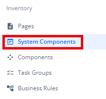
- Under Inventory (
 ), click “System Component“, which is on the second left panel.
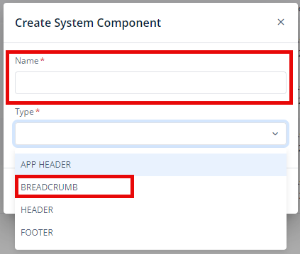
- Click Create placed on the second horizonal panel from the top, a dialog box “Create System Component” pops up.

- In the dialog box, type the Name of the system component. and Select “Breadcrumb“.
- When you click Create (
 ), Basic option of Config menu for the Breadcrumb opens.
 - Now, you will see two options under the config menu:
- Basic
- Properties
Basic
| Basic Properties | Description |
| System Component Type | The System Component Type indicates the type of system component you are adding. In this case, it defaults to “Breadcrumb” and cannot be changed here. This selection is made initially in the “Create System Component” dialog box when you first set up the component. |
| Reference Name | The Reference Name is a unique identifier assigned to the system component for internal use. This name is visible only to vFlow users, and is not displayed to end-users. The Reference Name is intended for your convenience, helping you easily identify and manage the system component throughout. |
| Description | The Description field is intended for use by application designers or administrators (vFlow users) to provide additional context or details about the system component. This description is not visible to end-users and is used solely for internal reference to assist with component management. |
Properties
| Properties | Description |
| Display on Mobile | To enable the the breadcrumb display for mobile devices, click on the checkbox to select it. |
| Display on Tablet | To enable the the breadcrumb display for Tablet devices, click on the checkbox to select it. |
| Display Home as ICON | To configure the display of the Home link, showing it as an icon instead of text for a more visual-friendly experience, click on the checkbox to select it. |
| Separator | You can Customize the separator between breadcrumb levels, such as using the “>, >>, ->, \, !>” symbol. |
| Event Type | You can make breadcrumbs clickable by defining an event on them, allowing users to navigate back through previous sections with ease. |
Was this article helpful?
YesNo