
Header
Introduction to Header
The header is a fundamental element of the user interface (UI) that appears at the top of a page or component. It serves primarily as an identifier for the associated page or component, helping users understand the current context within the application. The header not only plays a critical role in enhancing navigation but also provides key information that improves the overall user experience.
In addition to acting as a label or title, the header can be customized by incorporating various elements such as navigation links, search bars, icons, or user profile information, depending on the needs of the application.
Creating a Header
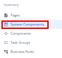
- Under Inventory (
 ), click “System Component“, which is on the second left panel.
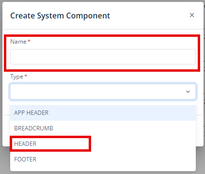
- Click Create placed on the second horizonal panel from the top, a dialog box “Create System Component” pops up.

- In the dialog box, type the Name of the system component. and Select “HEADER“.
- When you click Create (
 ), Basic option of Config menu for the Header opens.
 - Now, you will see four options under the config menu:
- Basic
- Style
- Data
- Elements
Basic
| Basic Properties | Description |
| System Component Type | The System Component Type indicates the type of system component you are adding. In this case, it defaults to “HEADER” and cannot be changed here. This selection is made initially in the “Create System Component” dialog box when you first set up the component. |
| Reference Name | The Reference Name is a unique identifier assigned to the system component for internal use. This name is visible only to vFlow users, and is not displayed to end-users. The Reference Name is intended for your convenience, helping you easily identify and manage the system component throughout. |
| Description | The Description field is intended for use by application designers or administrators (vFlow users) to provide additional context or details about the system component. This description is not visible to end-users and is used solely for internal reference to assist with component management. |
Style
The Style option allows you to personalize the appearance of the Header. This includes adjusting various visual aspects to ensure it complements your application’s branding and overall design. Here’s a breakdown of different settings that you can make adjustments to:
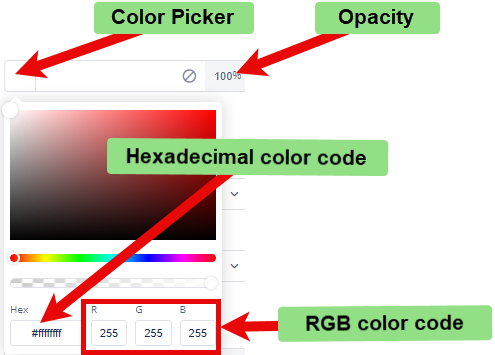
- Background Color: To choose the background color for the header, you can use a color picker or enter a hexadecimal or RGB color code. The default opacity is set to 100%.
- Background Image URL: You can input the URL of the background image you want to use for the header.
- Font:
- Family: You can select the font family for text in the header. If no specific font is chosen, “None” will use the default font.
- Size: You can specify the font size in pixels (px).
- Color: You can set the font color using the color picker or a hexadecimal or RGB color code. The default opacity is 100%.
- Alphabet Case: You can choose the text case (e.g., uppercase, lowercase) or select “None” to keep the original case.
- Text Alignment: You can set the text alignment (e.g., left, center, right) or select “None” for default alignment.
- Dimension:
- Height: You can define the height of the header in pixels (px).
- Maximum Height: You can set the maximum height to prevent the header from exceeding this limit.
- Width: You can specify the width of the header in pixels (px).
- Maximum Width: You can define the maximum width to prevent the header from expanding beyond this size.
- Spacing:
- Margin: To adjust the space around the header, enter values for top, right, bottom, and left margins in pixels (px). Default is 0px for all sides.
- Padding: To set the internal space within the header, enter values for top, right, bottom, and left padding in pixels (px). Default is 0px for all sides.
- Border Radius: To define the curvature of the corners of the header, enter values for top-left, top-right, bottom-right, and bottom-left in pixels (px). Default is 0px for all corners.
These settings allow you to tailor each header and, consequently, the header to your specific design preferences and requirements.
Data
To dynamically fetch and display data in the header:
- You can Select “Object” as the type in the configuration panel.
- You can enter the desired data path (e.g.,
getVal("tempObject.userObject")) in the corresponding text box. This allows the system to retrieve data from the specified object path and display it in the header.
If you want the header to display a fixed, unchanging value:
- You can select “Fixed” as the type.
- You can enter the desired value in the “Value” textbox. This will hardcode the value in the header, ensuring it remains static.
Elements
You can add various elements to this system component such as Buttons, Hyperlinks, Timer, Image, Mat-Icon, Input, Select, Multiselect, Date, Timer, Group-element, Label, and Type-and-search.
To read more about the elements, click here (Elements).